Deep reflections on my #MakeoverMonday viz from this week.
Eva and Andy are in Germany now, which was the reason for this week’s vehicle stats for Makeover Monday.
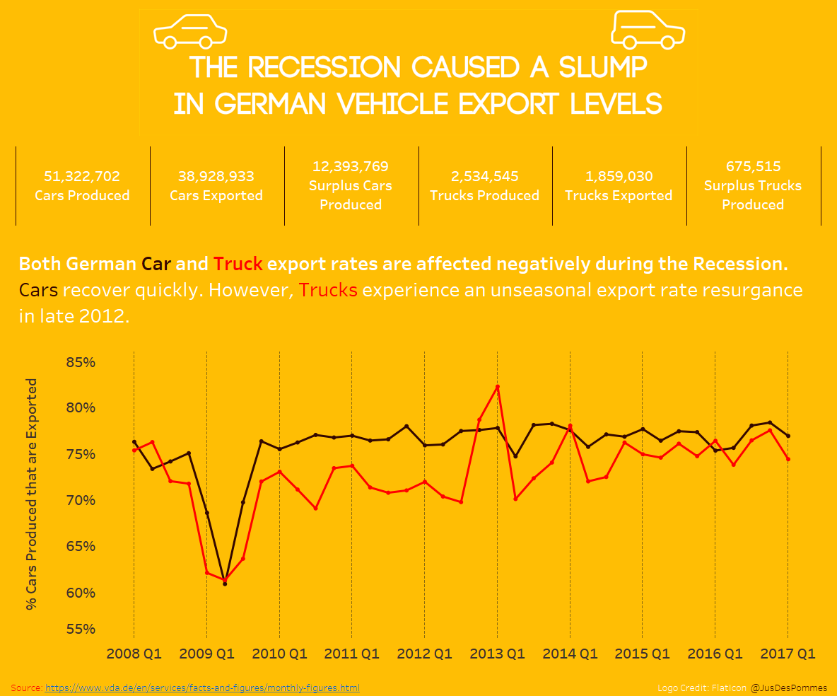
The consensus within the DS6 was that the only insight to be drawn from this week’s dataset was that the 2008 recession affected the levels of German vehicle production and export. With that in mind, and with a real need to continue practicing using Tableau, I wanted to attempt to highlight this insight in a novel way – different to the rest of the Tableau community, or at least before someone else posted it. No mean feat.
German car stats meant one thing – German flag color scheme. To me the choice was obvious – it was either subtle hues of the red, yellow, and black OR garish saturated tones. Naturally, I went with garish as I wanted to push myself away from the white backgrounds and pastel tones. This was a given; however, the rest of the content was still up-for-grabs.
Here was my thought process:
- Toy with the data – clearly, we have a dataset that is based on time, therefore line chart jumps to mind
- I wanted to analyze the difference between Production and Export – therefore created a calculated field to look at this, broken down by Cars and Trucks to examine for any individual trends
- I produced several graphs that showed the gap between Production and Export – I felt this was the headline from the data
- I decided upon only using one line graph (getting rid of dashboard junk)
- A good tip – that I took on board from David Krupp – I employed some B.A.Ns (Big Ass Numbers) to emphasize the figures at each point along the timeline when hovered over
- To try something new, I added a custom-made title and some logos that I mocked up briefly in Photoshop – this is something I’ve seen on other people’s vizes and wanted to try it out. I would advise in Photoshop setting then canvas to the same pixel size as your dashboard and then stretching out when imported.
- The finishing touch was to float all objects on the dashboard – as this, according to David Krupp again, ensures the dashboard uploads in a good resolution to Tableau Public.
Generally, I was happy with the content – but the color scheme and logo let me down for the final product. I would have toned the colors down, realistically, and spent more time on a building a good logo to create more of a professional finish. All great learning points – and regardless I take on so much from each viz I produce.
Here is the final output:
Special thanks to Andy and Eva for running the sessions each week!
AJ