Friday at the Data School, we had Rhiannon Fox in to run a workshop about her design process and how the Data School can apply that to their work. If Rhiannon’s name is familiar, it’s because we used her great Bermuda population growth infographic for week 30 of Makeover Monday.
We like to expose the team to multiple viewpoints throughout their training. Not every process resonates with every person, so providing them broad opinions helps them find their own way and their own process. Personally, I really enjoyed the workshop with Rhiannon as it opened my eyes to a whole new way of researching ideas and getting inspiration.
As a bit of context, the first day of every Data School cohort starts with me teaching them about data viz best practices, making choices, and critiquing visualisations. We use a lot of A2 paper and crayons! Then, about a month into their training, we have Caroline Beavon come in run a workshop. Caroline’s workshop is based more on infographics and storytelling as she comes from a journalism background. Her workshop builds upon mine. Rhiannon’s then builds upon Caroline’s, however, her approach is more from a graphic designer’s perspective.
I‘ve learned a ton from both of them, but don’t want to give away all of their secret sauce. Contact either or both of them if you’d like to hire them to run a workshop for you. Both of the workshops are absolutely amazing!
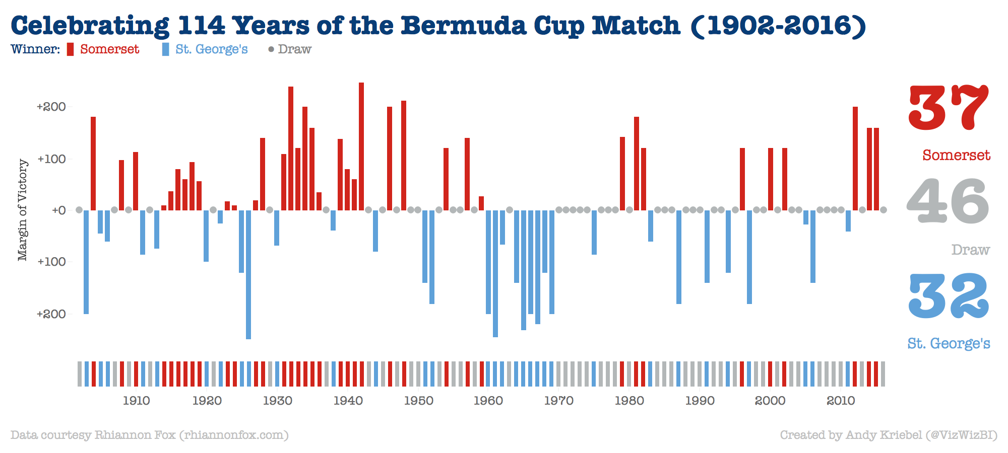
In Rhiannon’s workshop, I ended up missing out on a lot of the sketching parts due to meetings and the team presented some really amazing drawings they did for their project. The hardest part was NOT using Tableau to explore the data. In fact, the data exploration is done through the drawings themselves. Since I was not able to catch up, I cheated and used Tableau. Here’s what I built in about an hour or so. Click on the image for the interactive version.