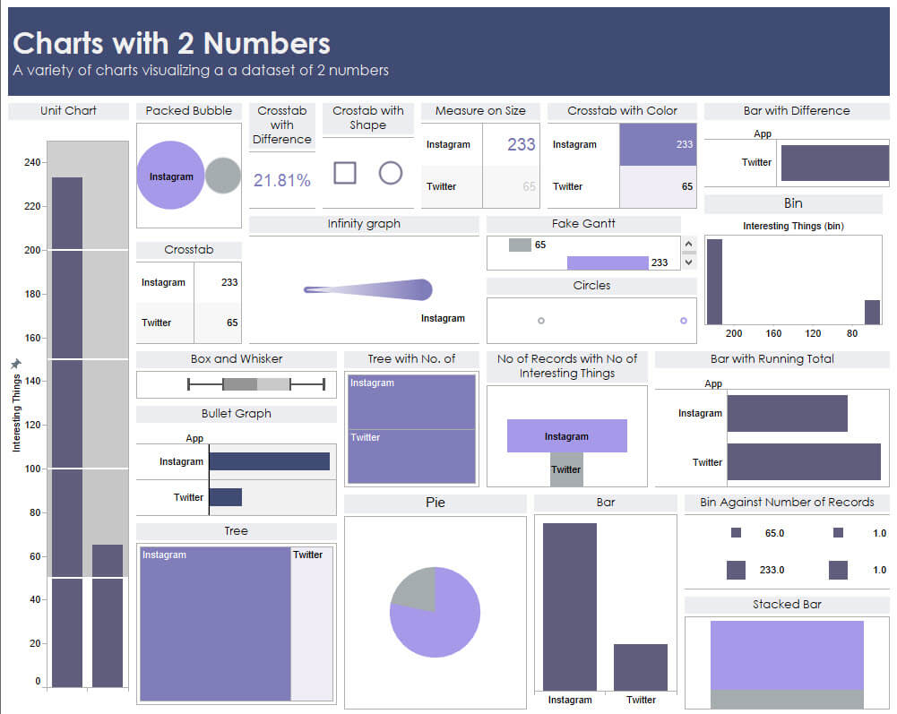
Yesterday I built a dashboard with 2 numbers. It’s a fantastic mental exercise in testing your understanding on how to build charts, even the nonsensical ones (pie charts anyone?).
I was able to build around 22 charts (not bad for 2 numbers!). Ways in which I extended my “analysis” included integrating Number of Records and binning in histrograms, and table calculations.
We also had a session on color which I tried to put into practice here. Moving forward I’m going to try and stick to 1 color and adjust shading to convey depth. This is a technique which one of our own, Tim Ngwena, uses regularly. There are already so many visual elements that the shades in purple hopefully unite a very disjointed analysis.
I’ll be taking a closer analysis at Andy’s Dear Data Two for this week once he’s posted it. He’s just shared his with us in the Data School “War Room”, and I really liked how it felt very like a list of charts and iterations that was “mutually exclusive, collectively exhaustive”. Really great educational resource!
Overall, it was a great exercise in building charts. Kind of reminds me that I’ll need to review donut and DNA charts. I don’t have a scatterplot on here but I make too many of those already 🙂
Thanks for reading!