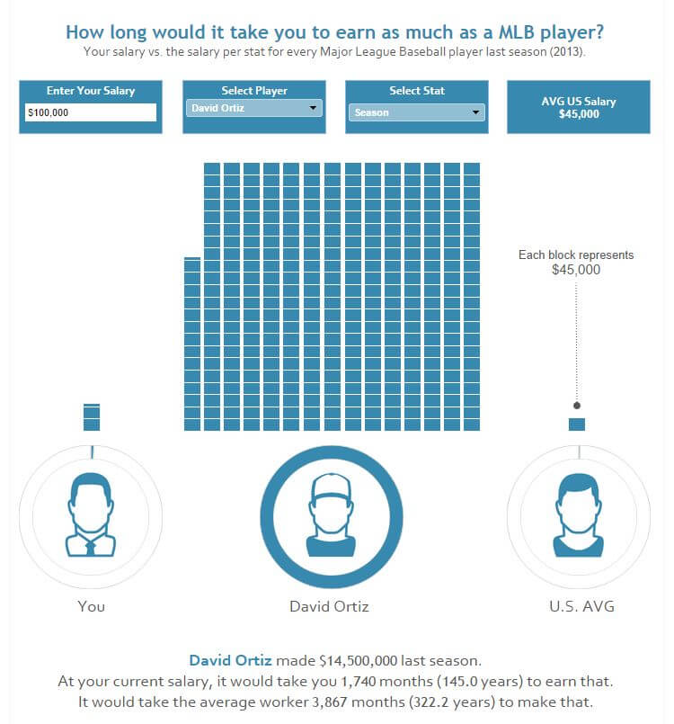
I recently saw this viz and was immediately overtaken with a Tableau “Magic Moment”. Here’s the image but its a must see because given the ROI of “Magic Moment” to “how the heck do I build this”, the return is fantastic!
I’m going to walk you through how we can build this unit chart in a couple of steps. It’s a bit long but I quite like it :D. There are quite a few parts to the original viz, so I’m just focusing on how you can create the 1st column (entering your salary with dynamic units)
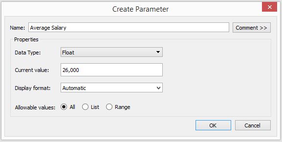
Step 1: Determine What Your 1 Unit Represents and Create a Parameter with This Value
I’m currently working on a dashboard exploring the top 100 earners in eSports, so I’ll use this as my dataset.
I’ve also found that the average salary in the UK is £26,000, so I’ll use that value as my 1 unit. Here’s how I’ve set mine up.
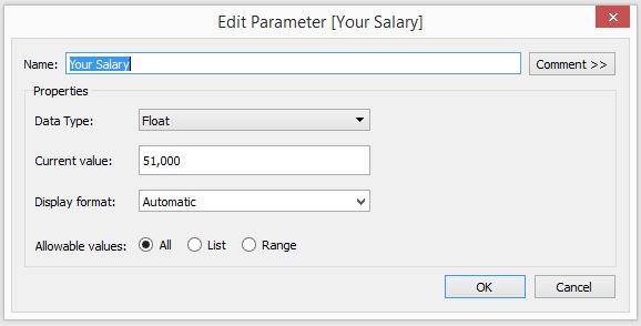
Step 2: Set up a Parameter and Calculated Field for Your Input
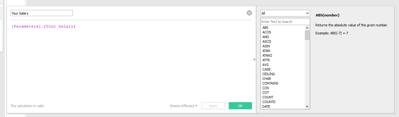
Parameter setup:
Calculated field setup:
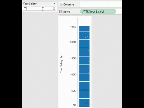
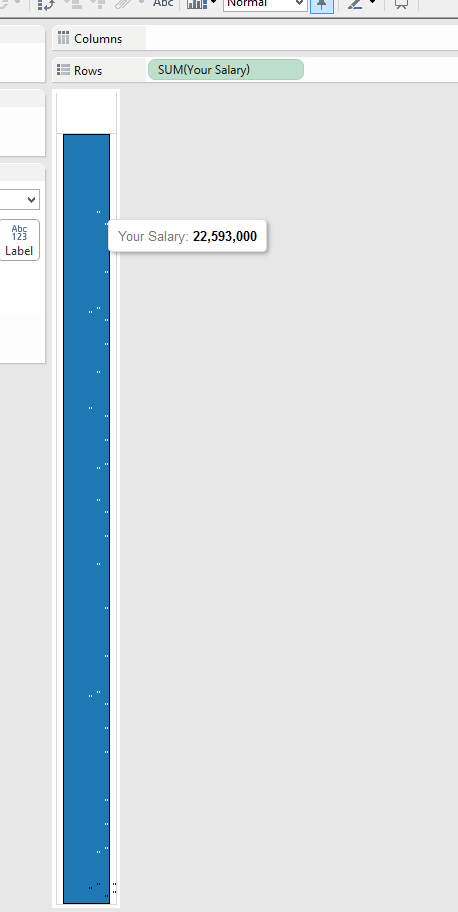
Step 3: Drag Your New “Your Salary” Pill into Rows to Build a Single Bar Chart
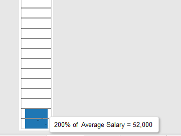
You’ll notice that the tooltip is not what you’d expect– the salary is way over inflated as it multiplying the salary value by the number of rows in the dataset!
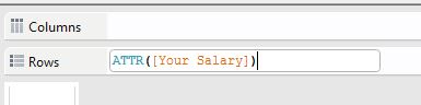
To get rid of this, double click on the pill and change the sum() into attr().
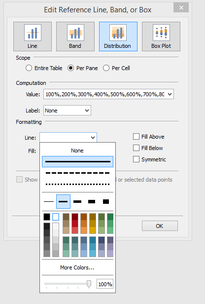
Step 4: Add a Reference Line and Configure Distribution Bands
Here’s my window for how I’ve configured this.
Don’t forget to clear labels values! We just want the line to exist, but with no text.
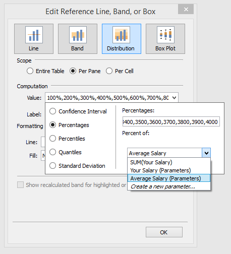
You’ll notice that the numbers get a bit crazy within percentages. This is because we’re telling Tableau “for every value of [average salary], build me a reference line at 100% that value, 200% this value, 300% this value etc”. I’ve got it up to 40X the value, just in case 🙂
If you’re not particularly interested in typing out these numbers, just copy and paste the below:
100,200,300,400,500,600,700,800,900,1000,1100,1200,1300,1400,1500,1600,1700,1800,1900,2000,2100,2200,2300,2400,2500,
2600,2700,2800,2900,3000,3100,3200,3300,3400,3500,3600,3700,3800,3900,4000
Step 5: Format the line to be the same colour as the background.
Here’s the real piece de resistance of the trick. The white line blends into the background, giving us its the illusion of multiple bars stacked on top of each other. Brilliant right?
And now you have a magical unit chart without shapes!