Coach Andy recently showed me how to change up displaying legends with unicode characters. It’s super simple and provides a cleaner look on a dashboard.
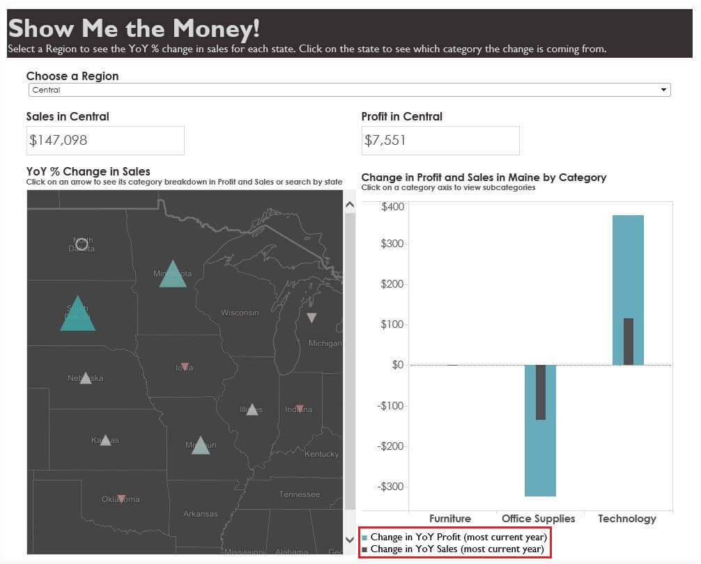
The original one was for a client project so I’ve built a dashboard expanding on my tip on Monday – how to utilize shapes in KPI dashboards.
Here’s the viz for context with the legend in the red box. Feel free to download it and follow along.
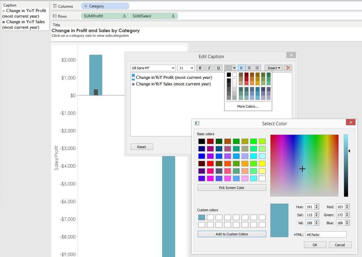
Step 1: Pick Your Unicode Character to Represent Your Color.
I went to fileformat.info and picked a simple square box for my icon. Here are a couple of common ones to use:
| Character | Description | Browser | Font used |
| U+25A0 | BLACK SQUARE (U+25A0) | ■ | arial_unicode_ms |
| U+25CF | BLACK CIRCLE (U+25CF) | ● | arial_unicode_ms |
| U+25B2 | BLACK UP-POINTING TRIANGLE (U+25B2) | ▲ | arial_unicode_ms |
Step 2: Copy and Paste the Character into Captions and Match Your Colors.
Just change the unicode character just like you were changing the colour of a word.
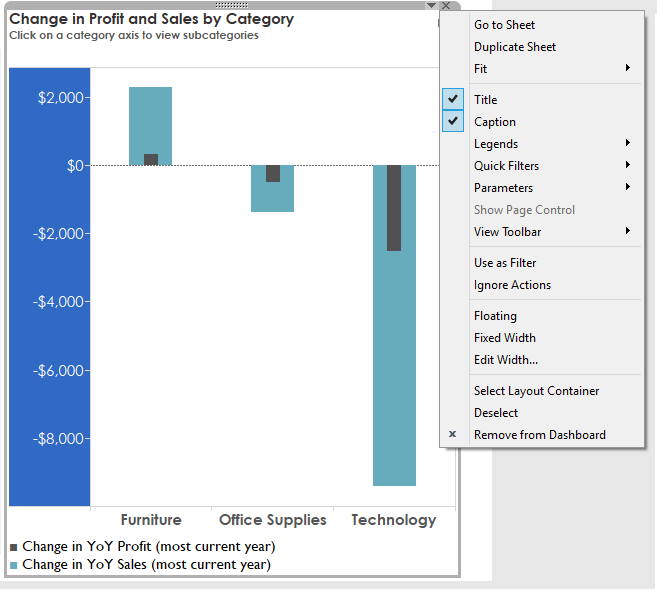
Step 3: Add Your Worksheet to a Dashboard and Select Show “Captions”.
Then drag and drop your caption with ease!
Happy Vizzing!