Good KPI dashboards make their key numbers really pop out of the screen. You want to look at a dashboard and instantly know exactly where things stand. This often means having a whacking great number right at the top. This blog will show you how to make one of those.
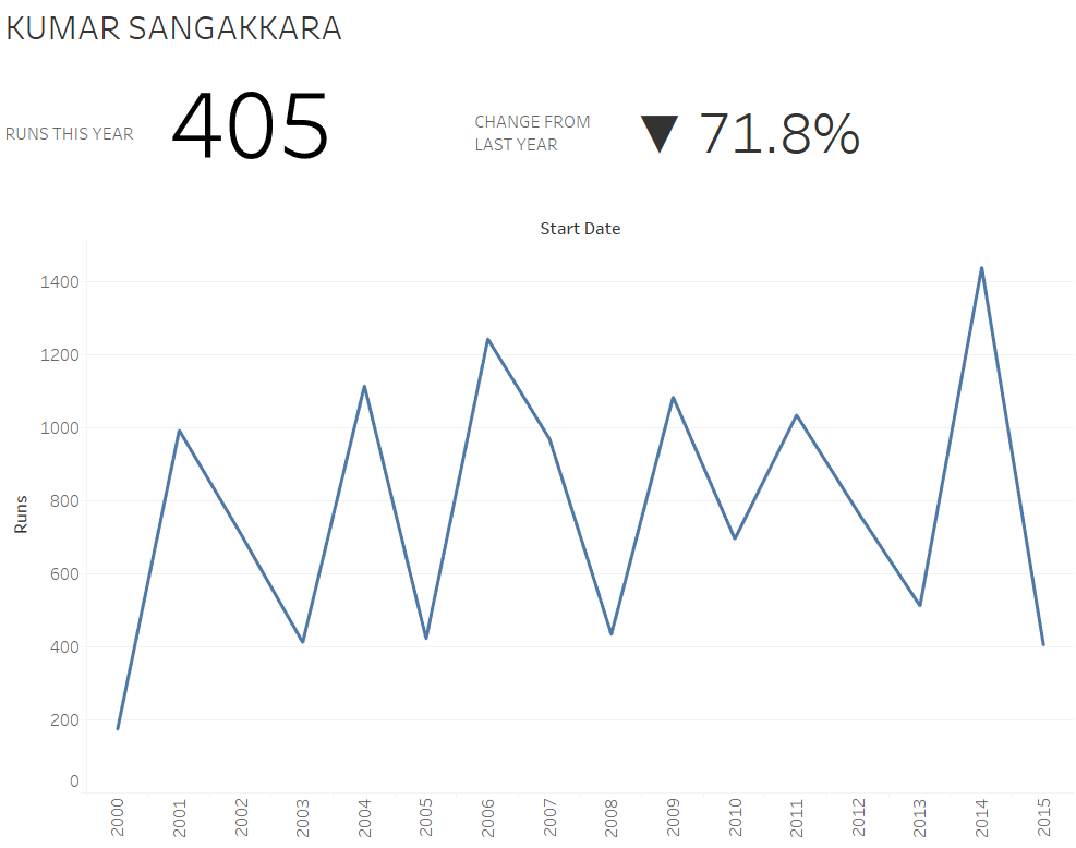
For this blog, I’m using cricket data. I’ve taken the Test batting stats for Kumar Sangakkara, my favourite Sri Lankan number three and a generally excellent man, and I’m looking at how many runs he scored a year over his career. I’m also going to grossly simplify cricket and pretend that runs are the only thing that matter. In 2015, the final year of his Test career, he scored 405 runs, which was 71.8% worse than his performance in 2014 (although to be fair, he did retire in August 2015). Look how obvious those numbers are in this dashboard:
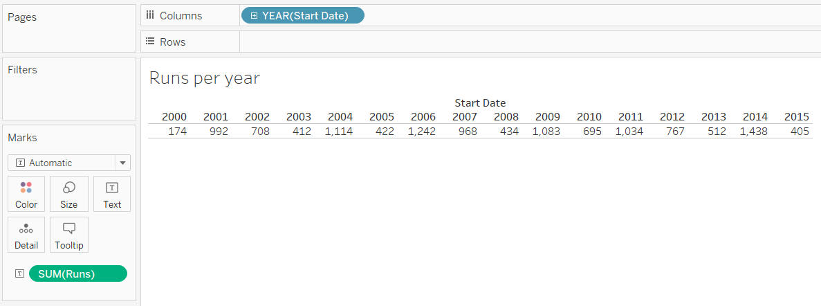
First, let’s create a table. Yeah, I know, that’s not what Tableau is for (despite having “table” in its name). Drag the date and sum of runs into the view as follows:
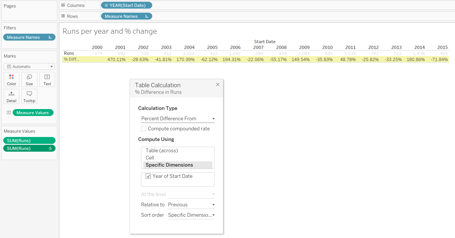
Next, drag sum of runs into the view again on the next row, and add a table calculation to work out the percent difference from the previous year:
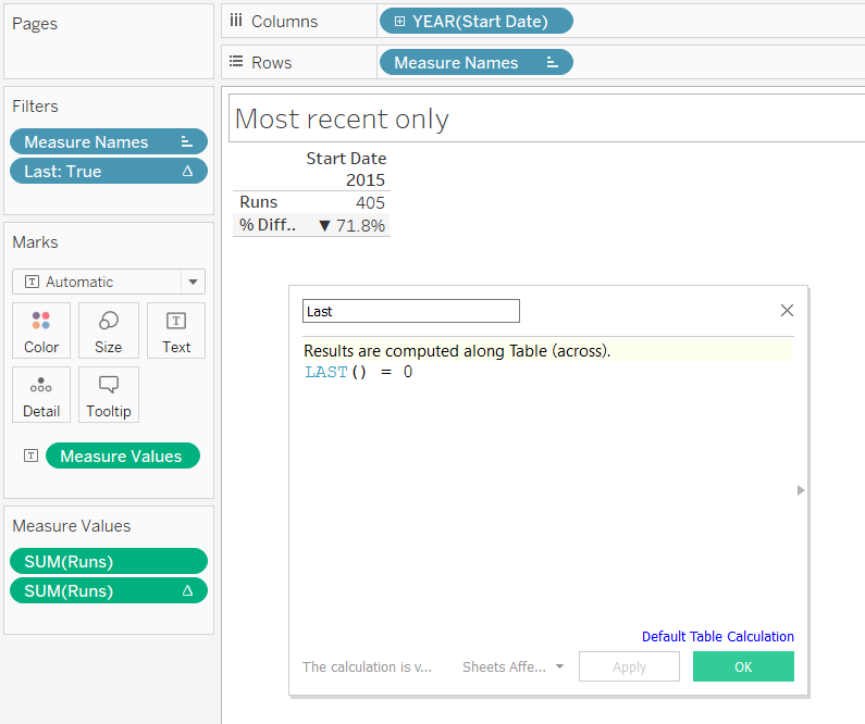
Now we’re ready to isolate the last two numbers in the view. To do this, create a calculated field called “Last”, which is just the expression LAST() = 0. The LAST() function looks at what’s in the view and indexes them in the opposite way to the INDEX() function; the last one is 0, the one before that is 1, and so on. This calculated field creates a boolean calculation; either something is the last thing in the view (in this case, year 2015), or it isn’t. Drag this Last field onto the filters shelf and set it to TRUE only:
Now, duplicate the worksheet so you have two of them; one for the number of runs, one for the percentage change. Remove one of the fields from the Text shelf, hide the sheet title, hide the header, hide the field labels, and format the text so that it’s massive:
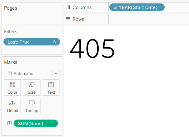
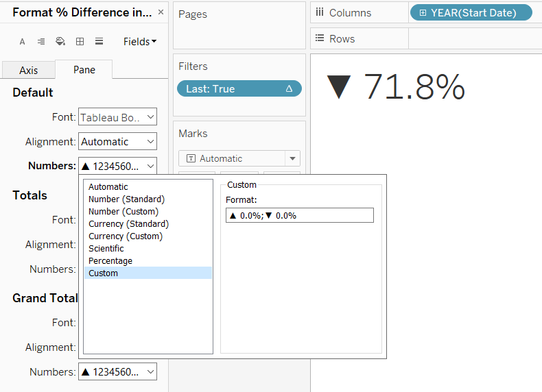
In the percentage change worksheet, you can also change the number format to include ASCII arrows showing whether it’s gone up or down. That expression is “▲ 0.0%;▼ 0.0%”, and you change it like this:
That’s all it takes! Bring the big number worksheets into your dashboard, label them however you like (I use text boxes on the dashboard, it helps control spacing more tightly), and you’re done.
Feel free to download this workbook from Tableau Public to see how it’s put together: https://public.tableau.com/profile/gwilym#!/vizhome/Bignumbersblogworkbook/Dashboard1
