Visual Analytics
Week 3 of DS6 began with an overview of visual analytics best practices. This blog will explain and provide examples of principles I found particularly useful:
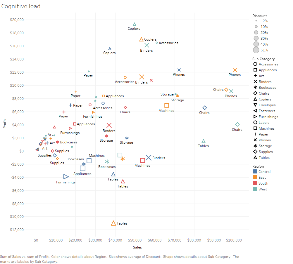
Cognitive Load
When first interacting with a visualisation it is essential that the user doesn’t digest too much information. If presented with too much information the mind becomes scrambled and is unable to analyse the data it is presented. An example of a bad cognitive practice is assigning colours, text and shapes to a scatter plot.
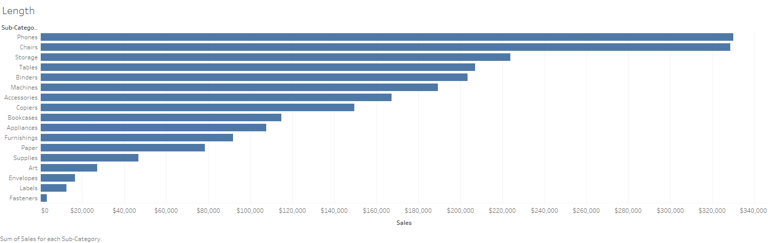
Length for Measures
One of the most effective ways to distinguish measures is by using length. Length allows the target audience to both compare and contextualise information quickly. Horizontal bar charts are a great way of demonstrating the use of length. With a simple sort, the longest line becomes apparent and the eye can easily locate outliers.
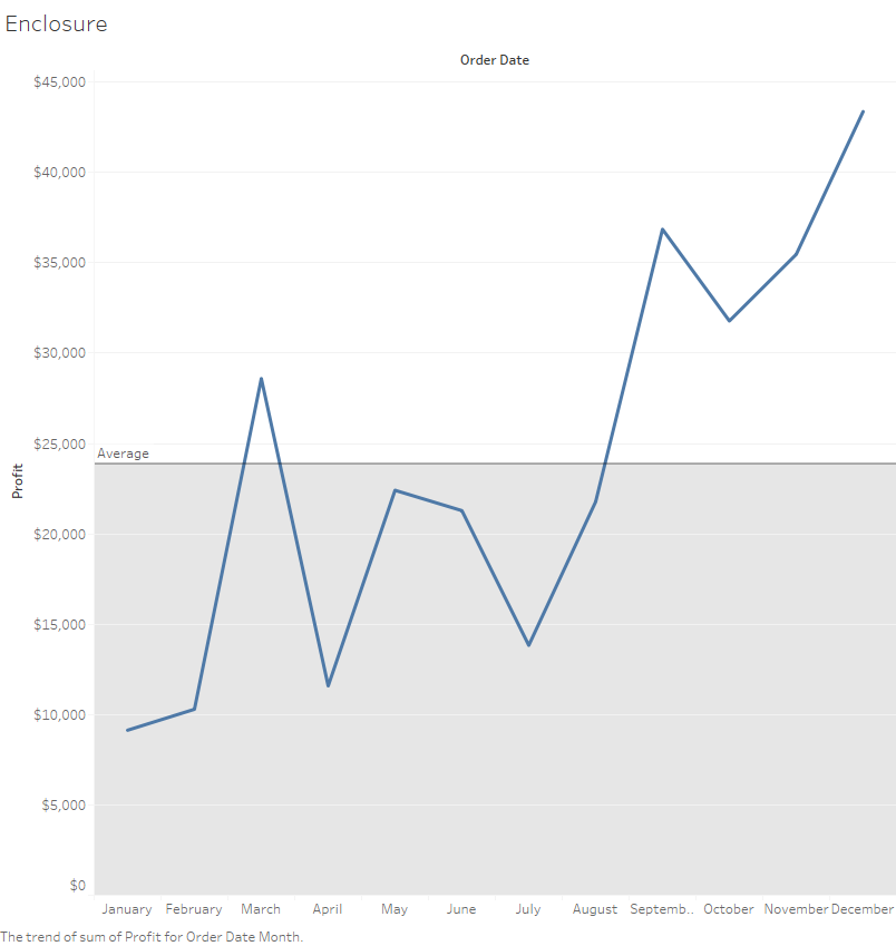
Enclosure
Enclosing a section of a graph is one of the simplest yet most effective Gestalt principles. Fundamentally, enclosures prevent misinterpretation of data by immediately guiding the audience to the pertinent area of a graph. Upon first interpretation, they also lower the time it takes to analyse the data.
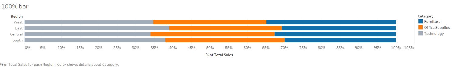
Comparing parts to a whole – 100% bar
Using 100% bars, instead of stacking amounts, enables the audience to easily compare parts of different dimensions in relation to the whole. As the length of each bar is the same, direct comparisons can be made more intuitively. Conversely, stacked bars can often end in confusion as the size of the parts can vary a lot despite representing the same percentage of the whole.