Introduction
Chart decisions and dashboard decisions make or break the quality of analytics delivered to the end user. This is why it is vital to get these components right early on your analytical career. In light of our visual analytics class today I figure there is no better time to go over some of the key things to avoid when building a dashboard.
Maybe some people will disagree with me on some elements of this post but I have definitely made mistakes and learned from doing bad dashboards and I feel like it is important to share what I find to be the most common “mistakes” early on with creating dashboards. You only realise how ineffective your work is when you look back and understand how much strain you put on your viewer when you produce a badly designed, badly implemented dashboard. What exactly do I mean by a bad dashboard? This can encompass many things including dashboard clutter in the form of:
- Lots of charts/bad layout
- Wrong/meaningless use of chart types
- Lots of text
- Lots of/meaningless colour
- Crazy fonts
- More plot than Game of Thrones
- Crazy formatting
- Meaningless proximity
- Nonsensical layout structure
So let me jump into an example of said bad dashboarding which features some of the above.
Let the Bad Dashboards Come
So what bad habits does this dashboard fall prey to?
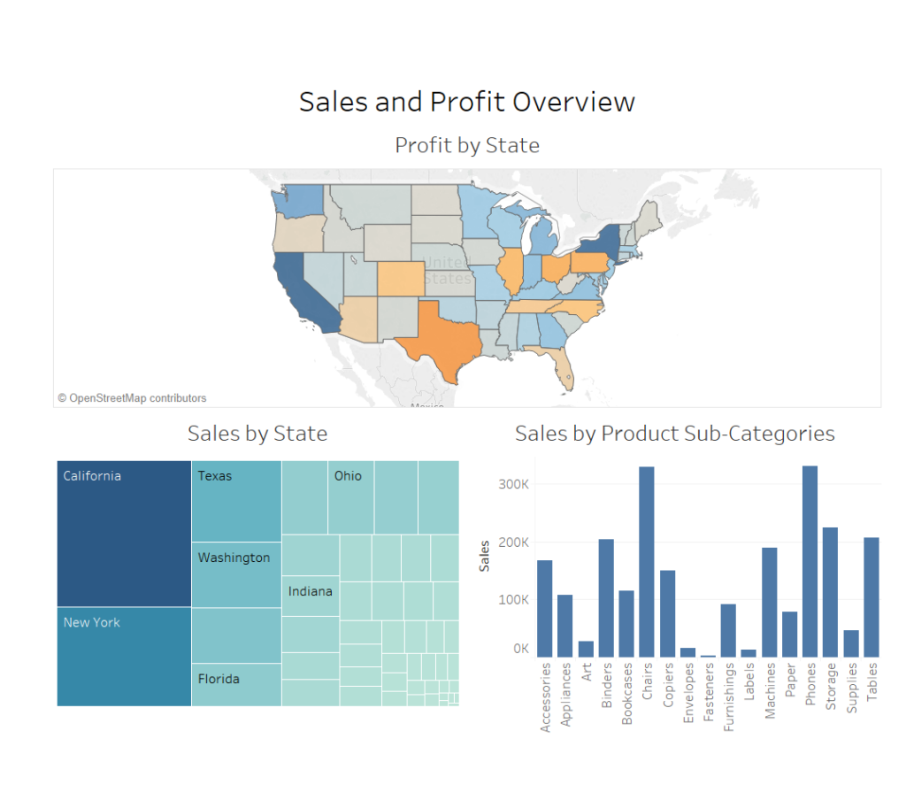
First of all this dashboard has that hard to break tendency of shoving vaguely related charts together, aka “More Plot than Game of Thrones”. There are too many story lines which could be told, and none are delivered in the end because together these charts clash for the storyline. In view, there is profit by state on the map, sales by state on the tree diagram and sales by sub-category on the bar chart. Is sales the story, just sliced in different ways? No, it can’t be. Or profit? Or sales against profit? In this case, there is no rhyme or reason for these charts to be on the same dashboard, they have simply all just been dragged in without thought, explanation or direction. Data visualisation need not always have a story line but in the cases where it does not, it should follow a logical, structured design. Neither approach is evident here.
The chart choice also has little logistical reason, the design was simply erupted from trying out different charts in Tableau. This can clearly be seen with the use of three chart types where one, bar chart, would suffice for the data visualised.
The third major problem of this dashboard is there are so many different colours:
- Solid Dark Blue
- Gradient Teal
- Gradient Blue to Orange
By using too much colour the dashboard has to experience sensory overload and it detracts from the data and charts in view. These colours were not even selected by the designer intentionally but rather were the default colour tableau placed in view. This illustrates why Tableau’s default colours/scales are definitely not good enough to leave as they automatically appear. It is very important to be proactive and invest time into colour choices (or lack thereof).
Not only is too much colour a problem but also the similarities in colours could be a problem. The similarity in colour can be seen as relating the values in view when they are not related. In the case above there are two different measures, sales and profit, but by colour, one might assume there is only one. Expecting the viewer to unpick what is meaningful and what is not inside a dashboard is what I would deem a poorly designed chart or dashboard.
General Advice
At the highest level, a dashboard needs to have either a theme/story or structure to tie all the elements together on the dashboard. At the next lowest level down the designer should dictate the layout based on a consumption chronology or interactivity chronology but also on a visual level of spacing and proximity. Spacing and partitioning make elements on the dashboard easier to isolate and consume but also the proximity of elements can convey their relatedness if used appropriately. Selecting a colour palette helps to restrict colour usage to a range and helps develop a theme or brand. Following visual best practices will help each chart to tell the best story it can to selectively encode the data (i.e. highlighting, length, enclosure, orientation, etc.) see http://bigbookofdashboards.com/ for a great further reading.
I hope that some of these design tips were useful and that you will continue to hone your data visualisation skills alongside me as we try to design intuitive and efficient analytical tools.