Tables are something that people often ask of data analysts, mostly because its something they’ve gotten used to over the years using Excel spreadsheets. Tables have their time and place, but there are often better ways of presenting data to gain valuable insight (e.g. EVERYTHING we’ve been doing at the Data School for the last few months *wink* *wink*). Granted, I’m not a fan of tables. But it’s something people ask for often, and its something that Tableau can definitely do. Here’s how.
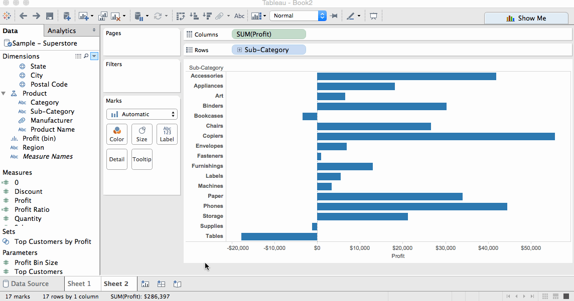
Let’s say we’ve got our trusty superstore sales and we want to give our basic black-and-white excel table. It’s as simple as a few double clicks:
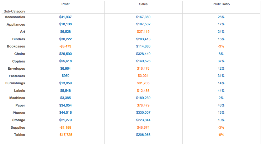
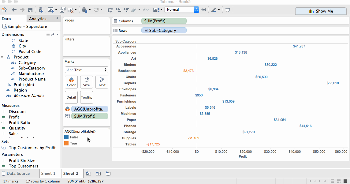
By first double clicking a dimension and then our measures, Tableau automatically creates shared axes that generate a table. Great! But what if we wanted to add some colour? Maybe we want to highlight some figures on our table, like which subcategories are unprofitable (i.e. Profit < 0), which subcategories have a total sales figure below $100,000, and which subcategories have a negative profit ratio. Like so:
In order to create this, we cannot use a table created with shared axes. This is because, as I mentioned in my Apples and Oranges post, shared axes don’t allow you to have two different chart types in the same axis. Essentially by colouring your table, you have one chart type that is text-based showing your figures, and another one that is colour-based showing your different highlight formulas. If you were doing one table with one highlight calculation, you could use a shared axes table and just drag your highlight calculation to colour. But you would end up with something like this:
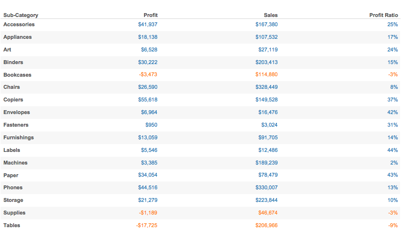
Not exactly what we’re looking for. This table is only highlighting values where profit was less than 0, and highlighting subsequent profit ratio and sales figures. Instead, what we are trying to do is highlight figures based on different calculations for each metric.
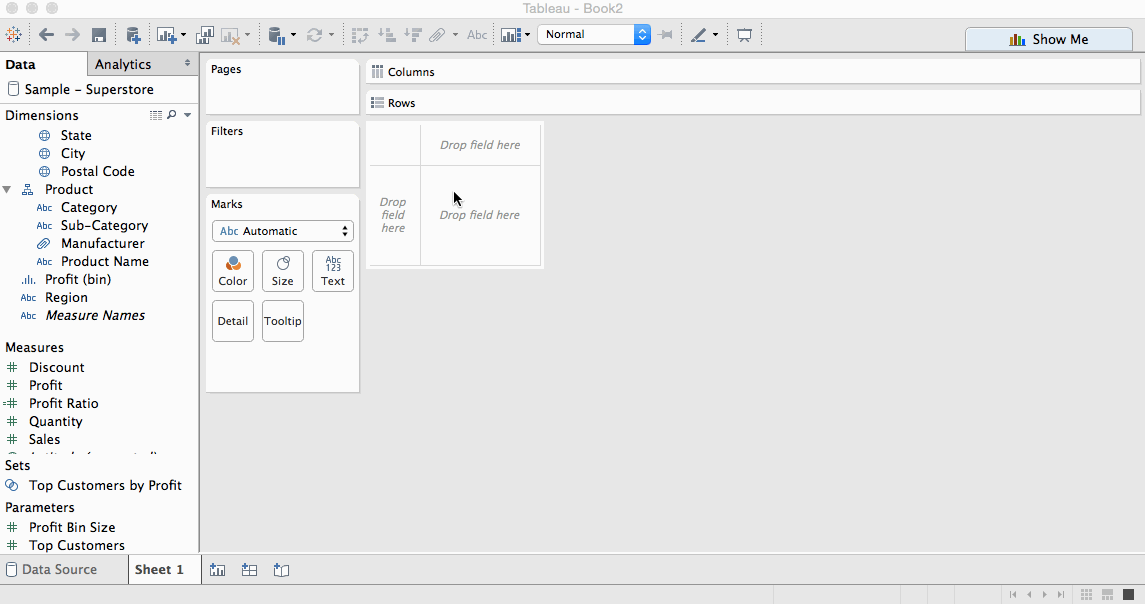
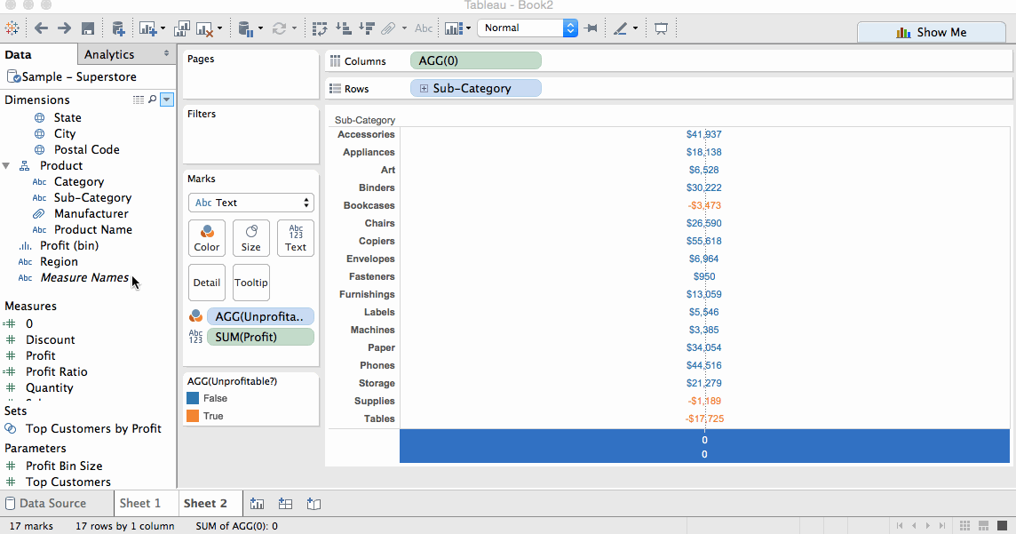
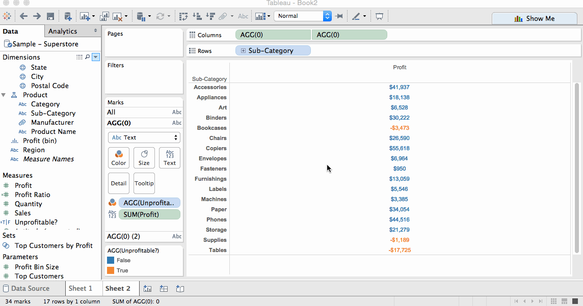
The first thing to do when building a dual axis table is build your first metric with its highlight values. Because we’re creating a dual axis table, we need to put the metric in our columns shelf:
Uh oh, that doesn’t look right. What Tableau is doing is what it’s supposed to do – build a visualisation based on best practices. In this case, it has seen you are trying to display a metric based on a dimension and it has decided the best way to do that is create a bar chart. Thank you Tableau, but that’s not what we want.
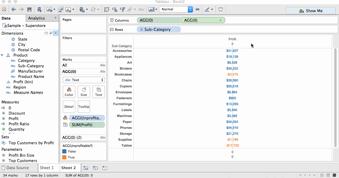
In order to force Tableau to draw text rather than bars, you can change the mark type to text and drag your metric into the view:
STILL not what we want! Okay this is the golden piece – if you want Tableau to draw your values in a straight horizontal line, you have to force it. You do this by dragging an aggregate measure onto the columns shelf that will be the same for all of the items in your dimension. This can be something like the AVG(0). Once you’ve created a calculated field for AVG(0), drag it onto your columns and you end up with something like this:
Getting closer. Now we want to label this column as our “Profit” column. However, the only axis we can rename is at the bottom. This is where the dual axes come in. In order to put a header at the top, like you would in a shared axes table, you have to create a dual axis that will give you the option to edit the top:
In order to remove the tick marks and 0 values, edit your axes and format your view to remove the zero lines:
Yay! You’ve got your first metric! Now you repeat the same process for your other metrics, but you replace the “Unprofitable” calculation in the colour shelf with whatever highlight calculations you’ve created for your other metrics:
Just remember to reduce transparency on the second axis you overlay on your metric, otherwise you might end up with text on top of your figures.