Clusters are a powerful way to group data and both Tableau and Alteryx offer tools to do that. However, the result is slightly different as you can see in this post
My last mission at The Data School was to give a class about Predictive Analytics in Alteryx (an amazing mission considering that my background is in Journalism and I have spent my last ten years primarily working with words, not numbers).
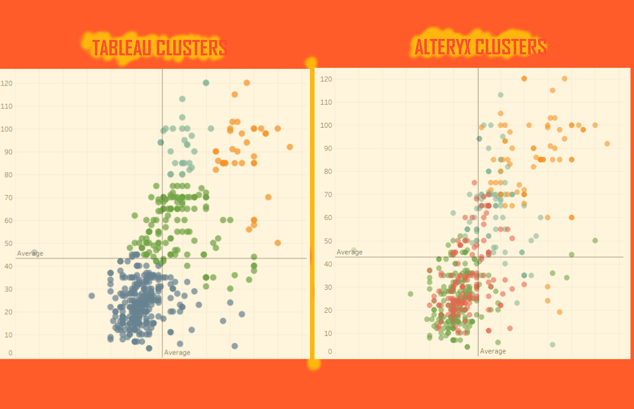
A thing that immediately called my attention is how different clusters generated by Alteryx and Tableau can be. In this post I will reply the example I did during the class, showing how to create clusters in both, Alteryx and Tableau, and comparing the final results.
What is cluster analysis?
Before starting, for those not familiarised with this predictive method, a quick explanation: clusters are a powerful way to divide and group your data. In few words, when creating clusters the algorithm will try to put together the points, minimising the distance of the points within the same cluster (so they will be as similar as possible) while maximising the distance between clusters (to guarantee that the groups are as much different as possible).
READ ALSO: Predictive Analytics in Alteryx Part 1 – Clustering (by Benedetta Tagliaferri)
In data science, this method is called “unsupervised learning”, once the algorithms will try to find a structure from unlabelled data. In my next post I will show an example of “supervised learning”, that is when you first train the algorithm to then apply it to a set of data.
Cluster analysis in Alteryx
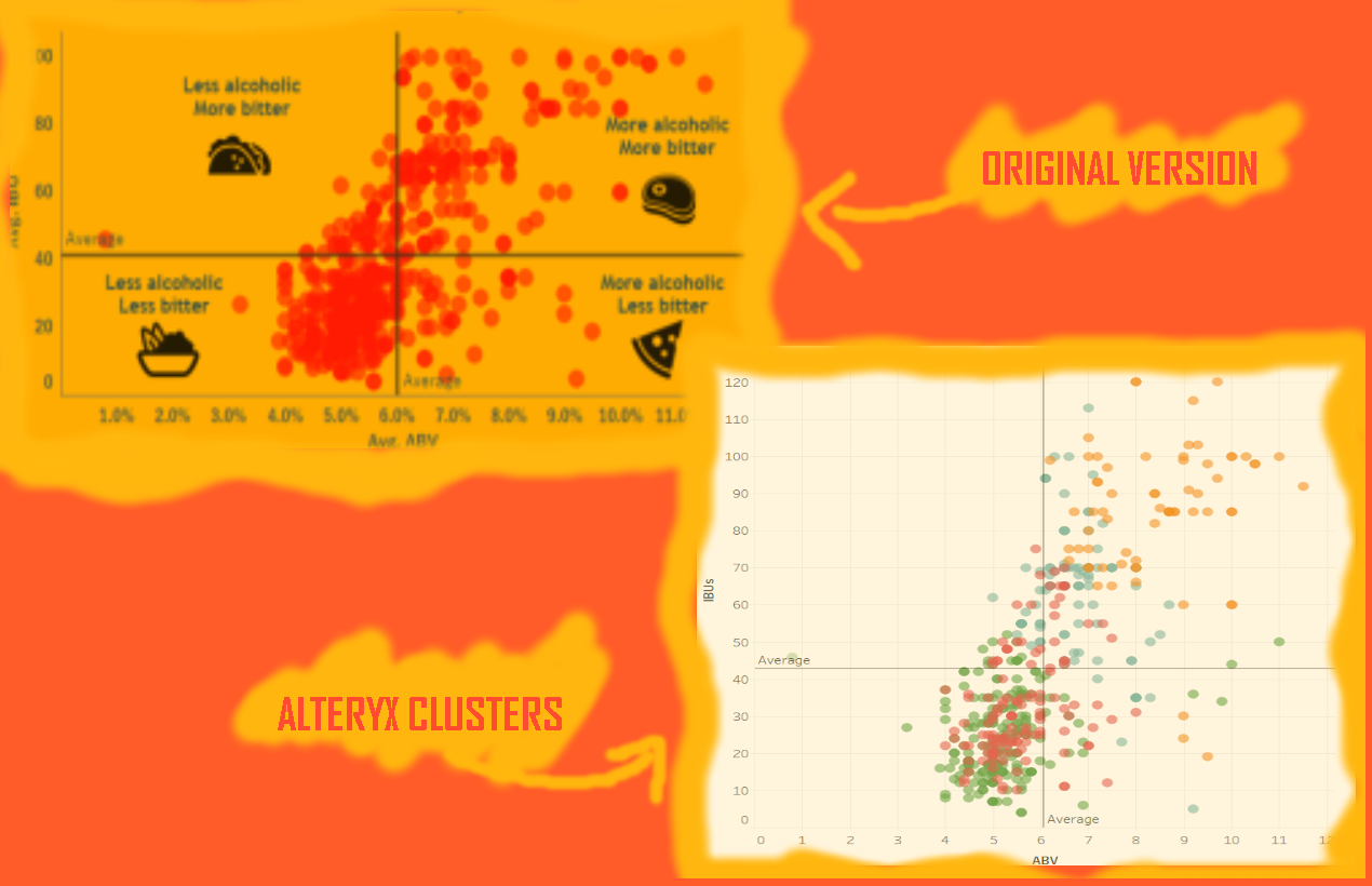
In the case I presented during the class, the use of cluster method was an alternative to visualise a dataset containing the ABV (Alcohol By Volume) and IBU (International Bitterness Units) of a selection of beers.
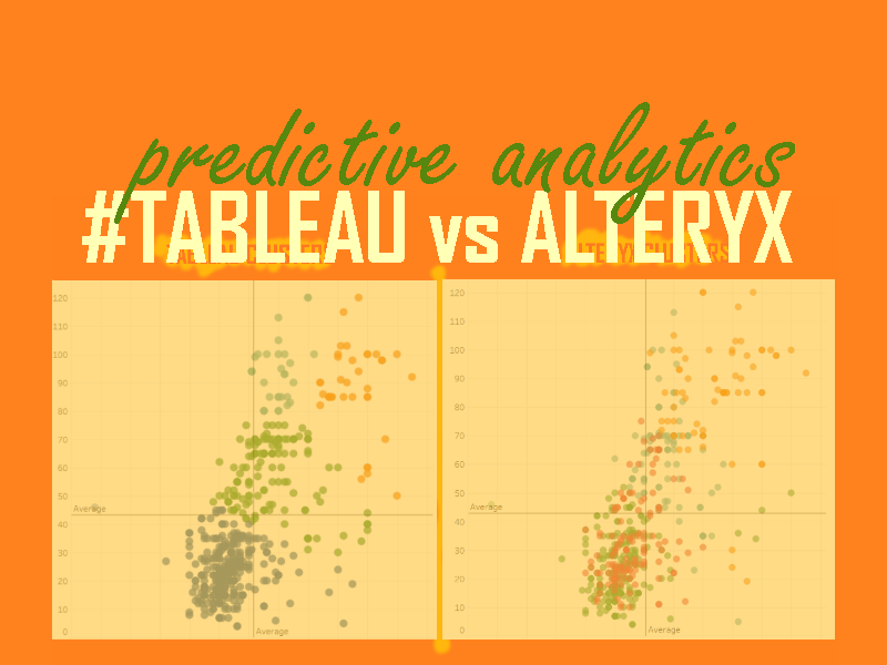
In the original visualisation (here you can read about the original viz), the average lines suggest four main groups. I kept the same number of groups while grouping the beers by cluster. Above you can check that the format of each group is more fluid. They don’t respect the average lines anymore. The idea of this new version was to create groups of similar beers to use in a beer app that would suggest new ones to the user based on his/her preferences.
The first step to create a cluster analysis in Alteryx is to input the data you would like to analyse using “Input Data”. It is also great to check if the imported data is in the right format, which can be done using the “Select” tool. In this case, as we will perform a k-mean analysis on the variables we will use to create the clusters need to be numbers – I opted to change them to “double”, a good option in those cases in which the original data contains decimal numbers.
Then, you should drag and drop the “K-Centroids Cluster Analysis Tool” and connect it to your data. In this point you should select the fields you will be using as well as the number of clusters. If you would like more guidance about this tool, you can find more information about it in Alteryx documentation.
After running Alteryx (pressing the “play button”), it will generate two outputs: the first one, accessible via the “O”, consists of a table showing the size and the calculations used for each cluster. The other, accessible via the “R” shows a report containing the statistical summary.
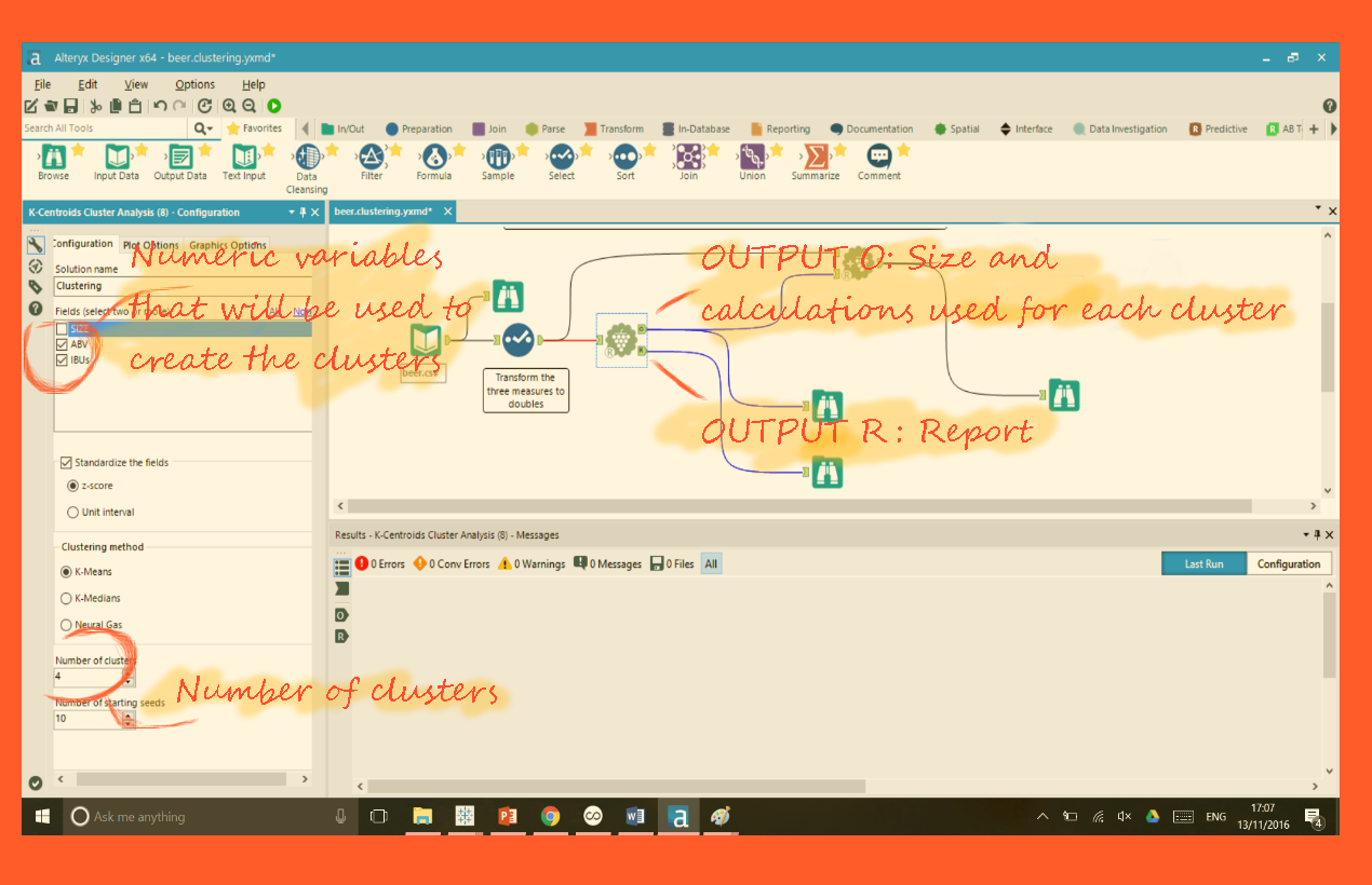
Once you have the calculations, you should reconnect that to the original data using the “Append Cluster” tool. It will automatically generate a new column with the assigned cluster to each row.
The last step in Alteryx is to drag and drop “Output Data” and export the data in the chosen format (In this case, I am exporting as .tde to continue the analysis in Tableau).
Visualising Alteryx generated clusters in Tableau
Once you already have a column with the cluster values all you need to do in Tableau is to:
- Drag and drop the chosen measures to the rows and columns shelve (In this case, “ABU” and “IBV”);
- Add the dimension you are analysing to “Detail” (in this case, “Beer”);
- Make sure the clusters’ field is identified as a dimension. If it isn’t, drag and drop the field into dimensions first and then add it to “Colour”.
Creating clusters in Tableau
Above I showed how to visualise in Tableau clusters created in Alteryx. However, Tableau also offers a way to create clusters.
The two first steps are the same. Once you have a scatter plot chart, you should go to the “Analytics” column, and drag and drop “Cluster” into the chart. A window will pop up showing the option to edit the variables used to create the cluster and the number of clusters you would like to create.
The result, as you can check bellow, is different from the visualisation using the clusters generated by Alteryx. It happens because the analysis performed by both programs is not identical. If you would like to learn more about why they are different, read this text by Naledi Hollbruegge.