Tableau doesn’t come with an automated option to create unit charts (or pictograms), but it doesn’t mean that it is impossible to generate one. In this tutorial, I will show how I generated a unit chart using Alteryx
Today we had Chris Love (Alteryx Ace and Tableau Zen Master) with us all day teaching how to use Alteryx to prepare the data before creating visualisations in Tableau.
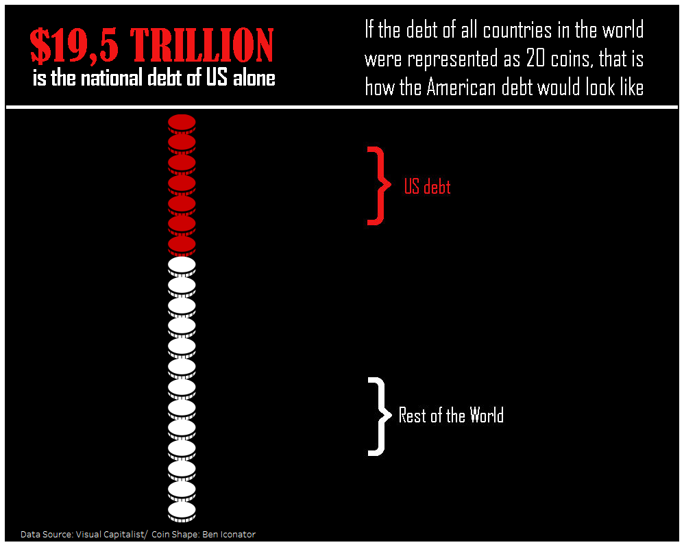
As today was also #MakeOverMonday I decided to do both things at the same time: to learn a little bit more about Alteryx and to create my #MakeOverMonday about the American debit.
Before coming up with this idea of combining both things, I was trying to do all the steps in Tableau. However, Chris suggested to use Alteryx to make it easier to create what I would like: a unit chart to visualise the data.
I came up with this idea because the dataset Andy Kriebel chose had only two records. Yes, ONLY TWO RECORDS! The first one with the debt of US and the other with the debt of the “Rest of the World”.

My initial plan was to create a column made of 100 coins and colour them to represent US and the “Rest of the World”.
As you can check in the following image, I changed my mind in the middle of the process when I realised that I was crazy when I thought that representing 100 coins in a column could be a great idea.

So I did all the Alteryx process again and created a new file, more realistic, with only 20 rows (that turned into 20 coins).
How to create a unit chart in Alteryx?
STEP ONE: Generating a value that you will use after to create the rows
Instead of inputting data, I used the “Input Text” tool and created a value of 20, that is the number of rows I would like to create on my viz (Each one of the rows is one coin in the final visualisation).
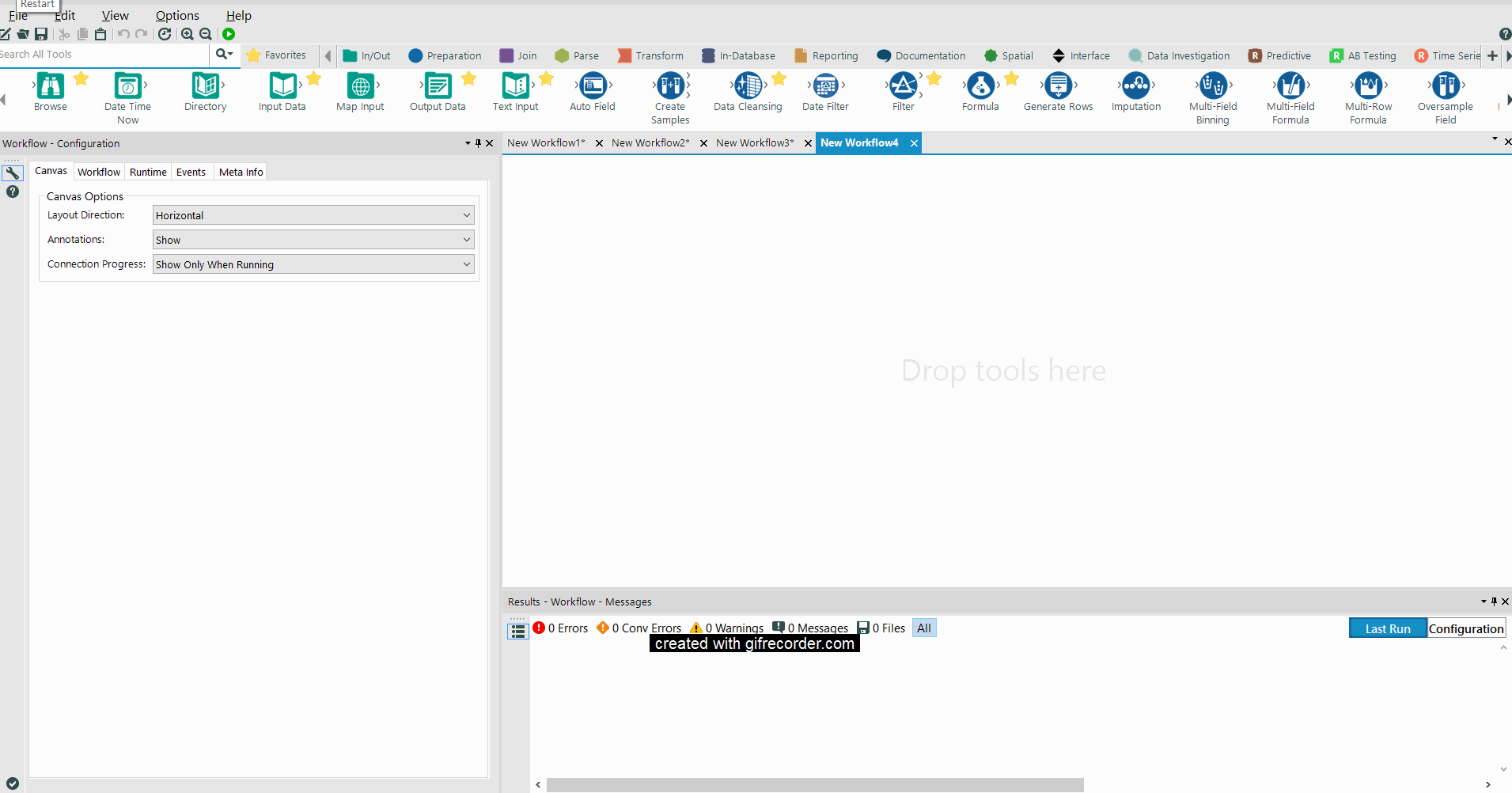
STEP TWO: Generating 20 rows
Now all I need to do is to drag and drop the “Generate Rows” toll and instruct it to transform the number (20) into rows.

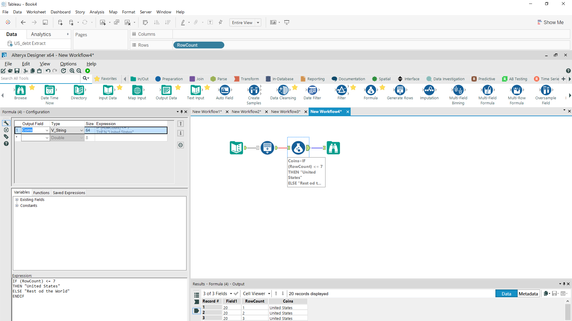
STEP THREE: Assigning which rows are “US” and which are the “Rest of The World”
In this part I created a “Formula” to:
- Generate a new Column called “Coins” (to store the strings “US” and “Rest of the World”), and
- Determine which rows should be filled as “US” and which should be filled as the “Rest of the World”. (Statistics, forgive me but I rounded up the value to avoid a half-painted coin). That will make it easier to colour the coins after in Tableau.
In this case, I need seven rows corresponding to “US” and the remaining filled as “Rest of the World”. To do that, I created a formula defining that IF (RowCount) <= 7 THEN “United States” ELSE “Rest of The World” ENDIF.
REMEMBER: the IF condition in Alteryx ends with an ENDIF (and not only with an END like in Tableau).
STEP FOUR: Out putting the data
The final part was to out put the data as a Tableau Data Extract (tde.) file. All those things done, I opened my new file in Tableau and generated my column shaped as coins. You can check the result above:
BONUS: If you would like more advanced guidance in creating unit charts, I would recommend this post from Chris Love. In it he shows how to build a unit directly from Tableau when you already have an ID column.