I discovered Tableau about three months ago, and promised to add it to my list of things to attempt to expert over the summer following university – I’ve spent 4 years at the University of Plymouth studying for BSc (Hons.) in Economics, with a placement year between my second and third year.
I think there are key points in a lot of peoples life; for me, not looking back since starting at Plymouth and doing my best to actively get involved in as many opportunities as possible. Of course, I also wanted to enjoy myself and use my time at university to do all those ‘things’ that people say are benefits of attending. But for me, the best time of my life, in terms of getting a clearer vision of what I want to do with myself has come since 2012, and turning 19.
Volunteering at the London 2012 Olympics was incredible, my second year at Plymouth lead to my placement year – and in that year, I became frustrated with my academic performance, and that was I think one of my first instances of self-problem solving. Fast forward to 2013-14, and my placement. Spending a year working, actually using the ‘soft, transferable’ skills all careers advisors tell you that you need to have and developing my approach to work was greatly developed by having some amazing influencers around me. The advice, guidance and simply working with those individuals helped me switch my mind toward the working world, and more importantly understand the sheer amount of jobs that are out there.
This is where I realised, if I could hone into something I was really interested in being a part of, working with and developing – It wouldn’t be a job.
The summer of 2012 I watched Moneyball. The year after, I discovered StatsBomb, and the work of Ted Knutson, Colin Trainor, Dan Altman and a Twitter community bursting with people who were contributing and debating the best uses of data in sports. As a child, I was interested in Journalism, followed by being encouraged toward a career in Law – Neither had aspects which captured my interest. But data; data made sense to me, I enjoyed working on storytelling and developing presentation skills.
My final year at University was great – We created an intramural football team for our course, I met some more new, brilliant people and found myself engaged and interested in the courses I was working on. Employment-wise, I kept an eye out for jobs which interested me, rather than a scatter-gun approach to applications. And it wasn’t until a train journey back to Plymouth after Easter until I discovered The Information Lab, and subsequently the Data School.
I’d been using Tableau on and off, and it was on my list of things I wanted to teach myself over the summer, were I unable to find myself a job. Neil Charles posted a really good blog on how to use Tableau for visualising football data from WhoScored. And the role at the Data School was offering to train me, and offer an experience like no other working with two of the Tableau Zen masters.
Fast forward through the speed dating interview process, and I have started along with 7 others as part of the inaugural Data School UK. And this week has been more than I could have imagined.
> Tuesday
The Data School was launched! I met the other students, and were told about the Information Lab’s vision and spent the afternoon with A2 paper and jumbo crayons. The task was 4 different visualisations for four pairs each, where we had to quickly constructively critique and then create hand-drawn vizzes using the tools in front of us. I’d only drawn out slides before, and various other notes for my dissertation – and certainly hadn’t touched crayons for years; this exercise was brilliant for being able to take viz back to basics. I feel like once fresh data sets are given to us, the practice of drawing and planning will become very useful.
The evening celebrations saw us all be introduced to a lot of the team, as well as a few clients.
> Wednesday
This was an internal Tableau Zen training day, taken by the in-house Zen Masters Andy Kriebel and Craig Bloodworth. To make a quick step from jumbo crayons to advanced table calcs was stunning – That’s not in a positive way either!
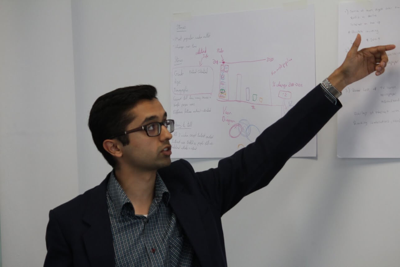
I think this image sums up my general feeling about how it was going.
I found myself understanding parts, and giving each exercise a good attempt – but it was a really good opportunity to see the team collaboratively stretching Tableau to its limits. This whirlwind ride was finished off with Chris Love giving us a whistle stop tour of Alteryx; boy that software is powerful – It makes so many processes easier and will save SO much time.
> Thursday
Following a ‘primer’ into the Tableau fundamentals, where we looked at the official terminology basics around Tableau – I’d not used features such as CustomSQL, groups, hierarchies or folders, so for me this was a really good addition to my growing ‘toolbox’ of data analysis. Then in classic Kriebel fashion, we were thrown in the deep end to just do the practice Tableau certification exam. It was longer than I expected, and a bit tougher as it included areas of the software which I hadn’t used. But I enjoyed the challenge, and found areas of Tableau during the exam in order to answer the questions they were asking. It was also handy to understand the format of the exam (oh, which we are taking in two weeks..)
In the evening, I attended an event where my mentor, Brian Prestridge , was presenting on the subject of Empowering the Experts. Other speakers included John Burn-Murdoch from the Financial Times and Sam Lloyd who was from a company called Hudl. That company (not affiliated with the low-end Tesco tablet) had some amazing software which took tracking and made it affordable and relatively easy to do. This would make video analysis so much easier, in my opinion. Another bonus for this event was meeting a bunch of the ‘Twitterati’ – People who I’d followed and debated/discussed with on the subject of football analytics but never met. So that was pretty cool.
> Friday
The last day of the week rolled around, and the ominous first presentation loomed. I’d worked on it on and off throughout the week, but my real “Okay, here’s what I’ll do” moment didn’t come until the twenty minutes I spend playing with the data before bed on Thursday night. A key part of our ‘school’ process will be to take an existing visualisation, and perform a ‘makeover’ every week. This week, mine was one by Robin Kennedy, and it was titled ‘Police Number by London Boroughs’. More on that shortly.
The huge coup that Coach Kriebel pulled off this week was getting Tableau CEO Christian Chabot to come in an spend some time with us students. He is an incredible speaker, with real energy and charisma, and it as really great to understand not only his vision for Tableau, but the fundamentals and the core idea on which the company was built. It was simply awesome. Another in our series of speakers was Stu Wilson, VP for Alteryx EMEA – This was another really great talk. Given that we’d only been introduced to Alteryx on Wednesday afternoon, to understand the company (it’s only four years old!) and the capabilities was interested. Also helpful for me was to understand how Alteryx fits within the spectrum of software which currently exists.
Back to our weekly project. (also found here on my Tableau Public profile!)
This is what Robin’s Viz looks like – it literally does what it says on the tin, and shows the average number of policemen per year and also the percentage change year on year of the average number of policemen per borough. Make sense?
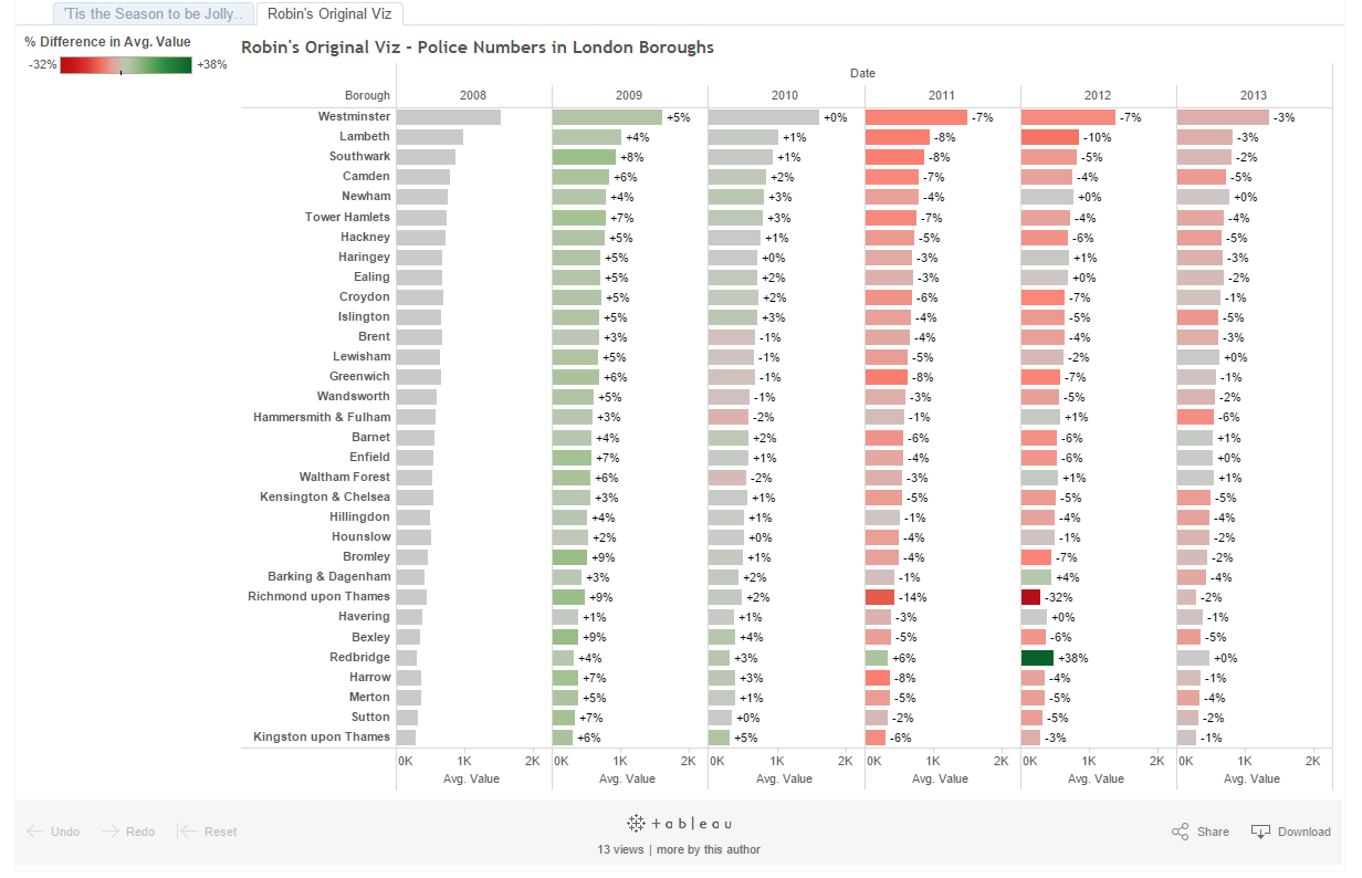
A very simple viz, and the data source was straightforward – It had the number of policemen, the date and the borough. That’s all.
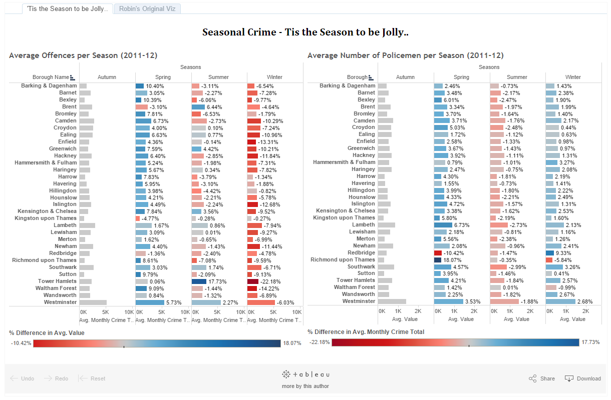
So I set about with a few iterations, messing around with bar charts and lines, I decided to leave the format as it is – but to enrich it with a second data set. What I tried to do was blend the data, first using Alteryx (unsuccessfully, but I think I could do it if I tried again now) and secondly on Tableau (with little success…)
In the end, I drew data from two separate sources, and recreating the viz.
Here’s (what I thought was) the nifty part. To differentiate myself from Robin, and take into account my date limitations of my data, I decided to show the change in both average number of policemen and average number of crime. This was then taken from 2011 and 2012, as my data overlap included those years in full, and I cleared a few outliers which did not belong (i.e. TP Boroughs, Other, Heathrow Airport). The bit which I thought was pretty cool was the calculation. On Wednesday, we worked on table calculations at the Zen Training day – and this is when I had a play around with IF/When/Else statements. So (with a little help from Google) I was able to group together my months and sort them by season.
And here is my finished piece.
Disaster struck when I began my presentation, and I realised (super belatedly) that Autumn did not come before Spring and after Winter. Lesson number 1, manual column sorting. Secondary feedback included potentially doing a scatter chart (which I will look into when using data blending – with two separate data sources, I wasn’t sure if I could do this) and also reversing the red-blue to show negativity (ie. growing crime rates) as red. With these, and a few aethetic points, I went away this weekend and made a makeover, of my makeover!
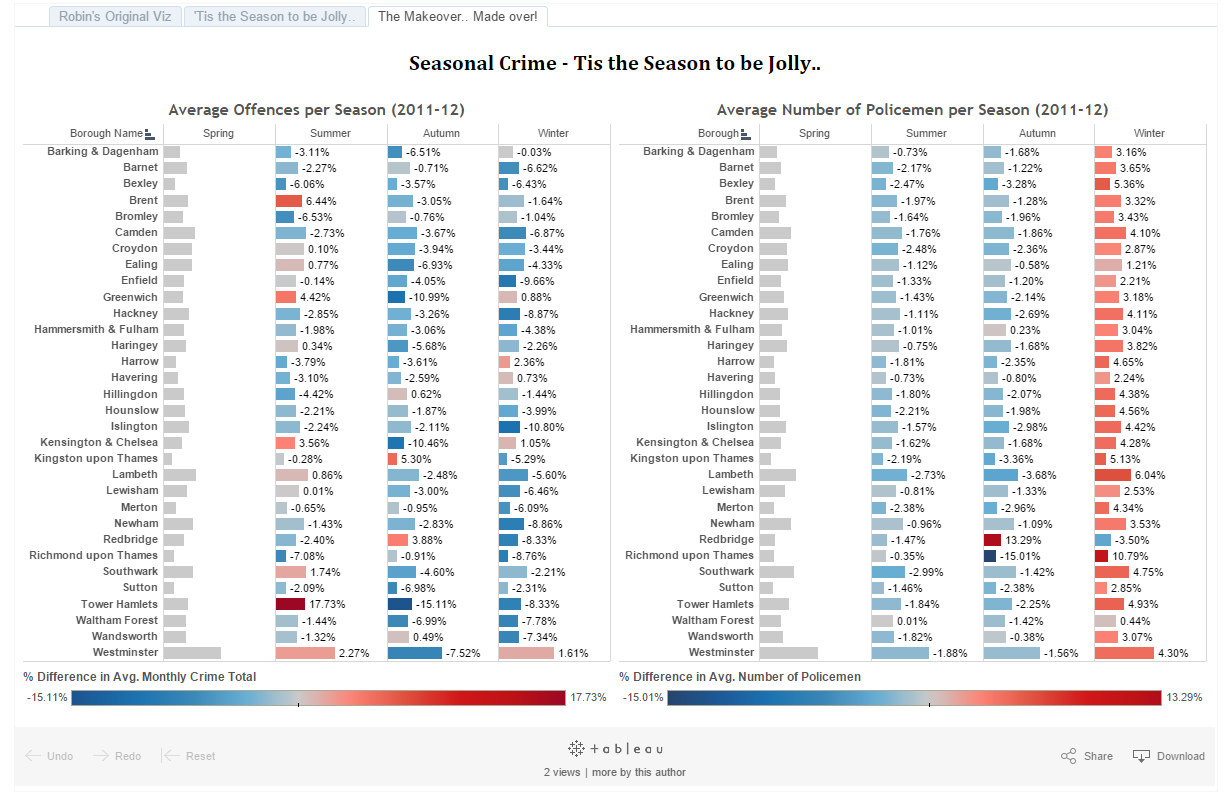
I will probably look to re-do this, or show an alternative to see what he results are for one where a scatter chart is used.
So reflections on my first week at the Data School are largely, woah, I’ve walked into something that’s so much bigger than I could have anticipated; and an understanding that the next three months are going to be as rigorous, if not more, than the last.
And I cannot wait to get going again!