The time has come, DS53's last day of training. It has been an incredible 4 months of training and I'm immensely grateful for the patience, knowledge and from the coaches and of course our top tier cohort for all all the laughs through some stressful days.
I'm looking forward to embracing more challenges on placement for the rest of my time at TIL.
Now onto the good stuff, the final task of Dashboard Week!
The Brief:
Tackle the NFL Big Data Bowl 2026 Analytics Challenge with the aim of building one clear visual that explains something meaningful about pass-play dynamics using Tableau Prep and Tableau Desktop.
The Data:
The dataset came in three parts:
Input files (ball release snapshot)
State of every tracked player at release, plus the predicted landing spot.
Key fields include:
- IDs:
game_id,play_id,nfl_id - Release frame:
frame_id - Player details + side: offense/defense
- Position & movement at release:
x, y, s, a, dir, o - Ball flight:
num_frames_output,ball_land_x/y
Output files (post-throw tracking)
Player positions for every frame after the throw:
frame_id= 1 →num_frames_outputx, yper frame
Join input ↔ output on (game_id, play_id, nfl_id) to get release context + full in-air trajectories.
Supplementary data
Play context (down, distance, teams, description, etc.) joined on (game_id, play_id).
Scope and Planning:
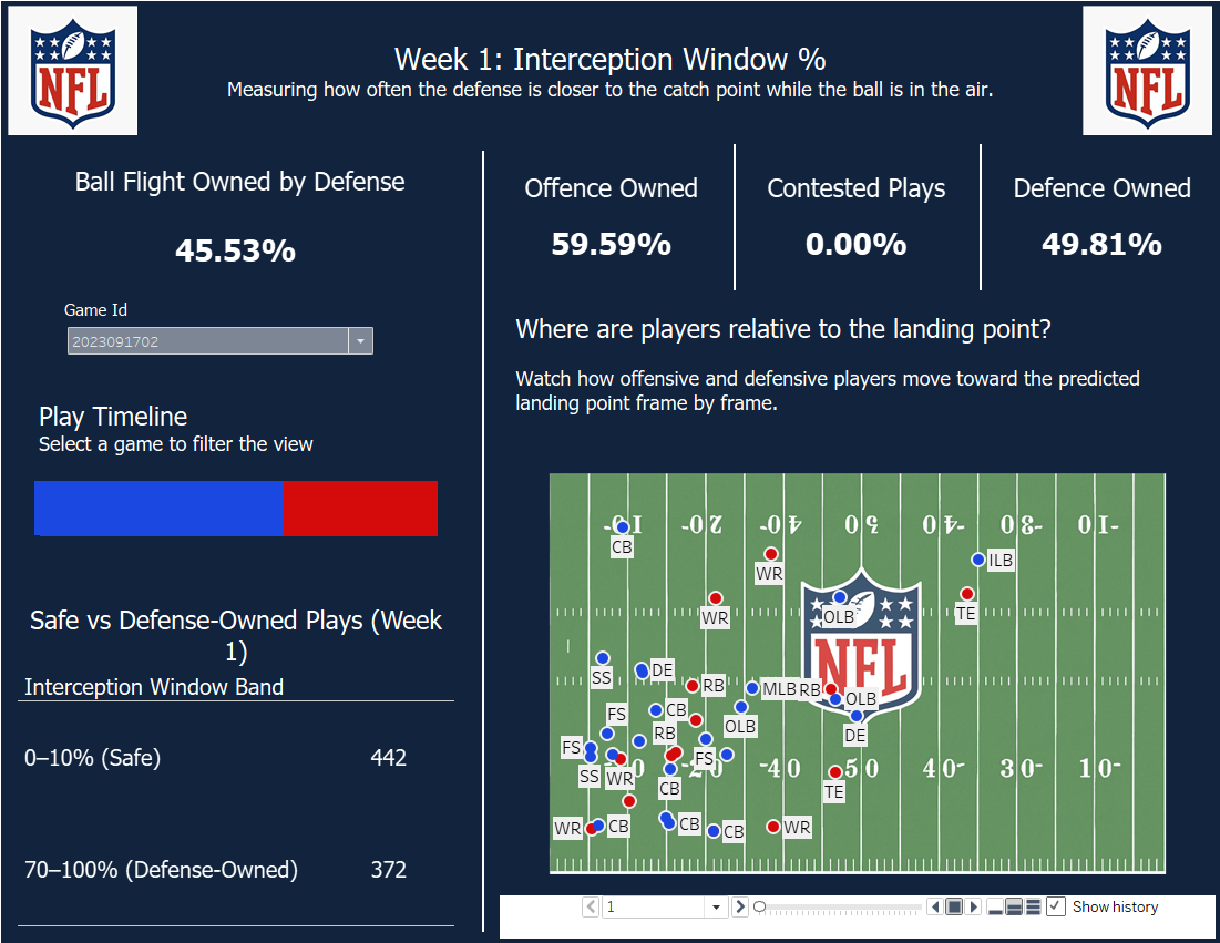
To keep this sprint manageable, I built a proof-of-concept on Week 1 only.
I wanted to explore the Interception Window %. As we know the ball’s estimated landing point (ball_land_x/y). For every post-throw frame, I was able to compare:
- closest offensive player to landing spot
vs - closest defensive player to landing spot
If the defense is closer, that frame counts as danger time.
I calculated the metric as follows:
Interception Window %
= % of flight frames where defense is closer than offense
How to read it
- 0% → offense owned the landing spot all flight → safer throw
- 100% → defense owned landing spot all flight → risky throw
- mid values → contested / 50-50 ball
Why it’s useful: it compresses complex tracking into one intuitive number per play, and should line up naturally with outcomes like breakups and interceptions.
The Sketch:
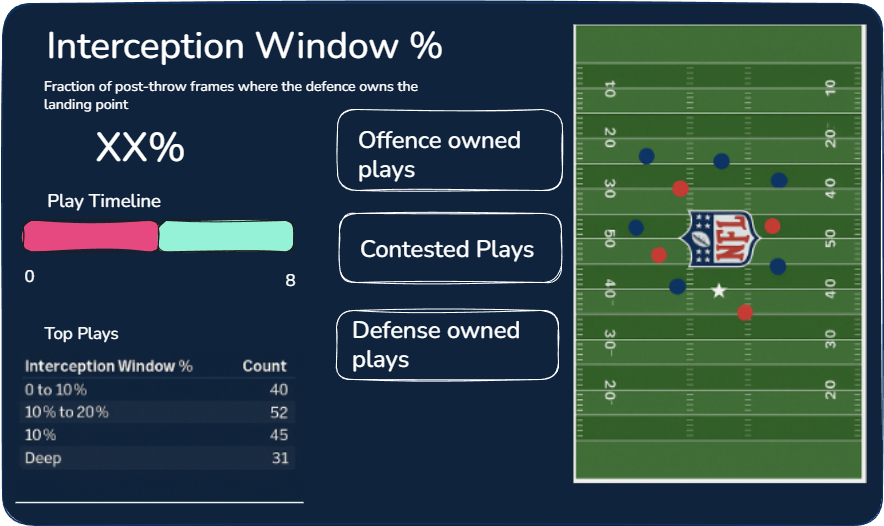
I did alter some of this sketch based off of feedback from earlier in the week, by shifting the KPIs to the top to take up less real estate and gave the pitch a bit more space at the bottom.
The Data Prep:
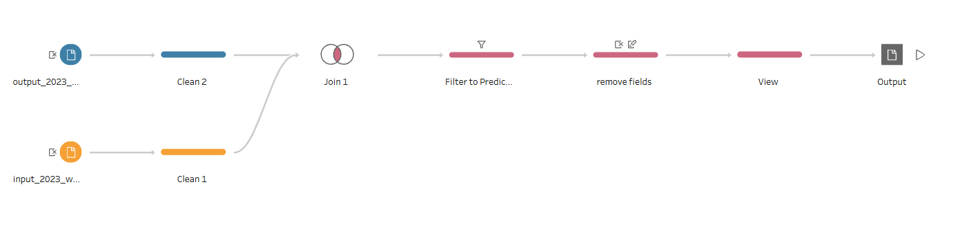
For the Data Prep I kept the flow very simple by joining the input and the output together and giving me a dataset that I was then able to use to compare the interception windows for.
The Dashboard: