


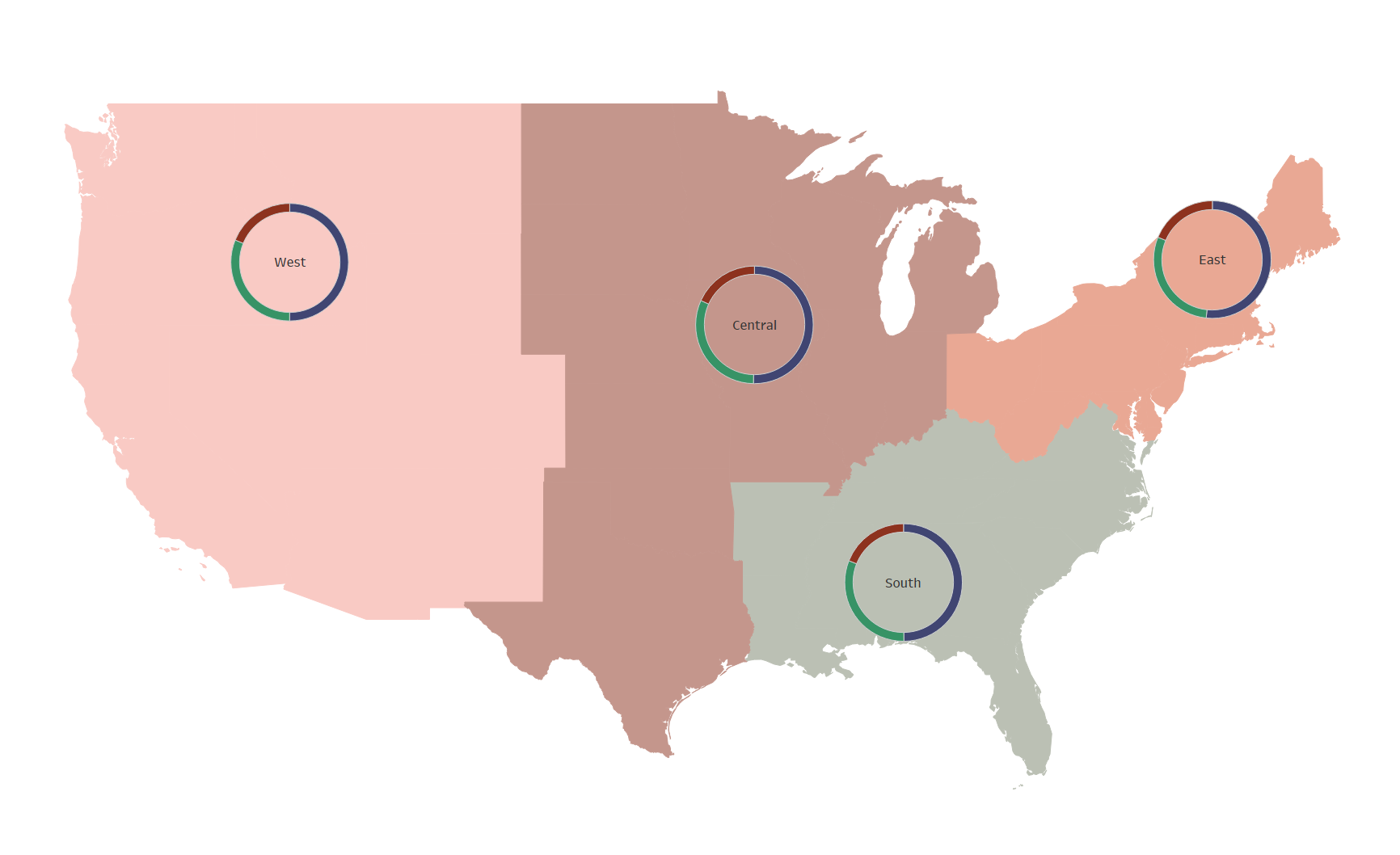
Have you ever wanted to show donut charts hovering over locations in a map in Tableau but didn't know how without floating the donut charts? Maybe you were able to achieve pie charts over the map but couldn't get the center to cut out?
Here's a step-by-step guide using Tableau's built-in Superstore data with screenshots of each step.
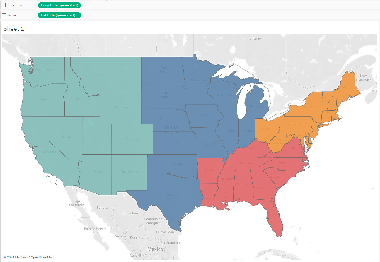
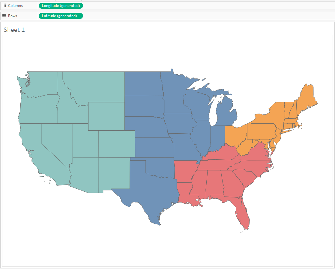
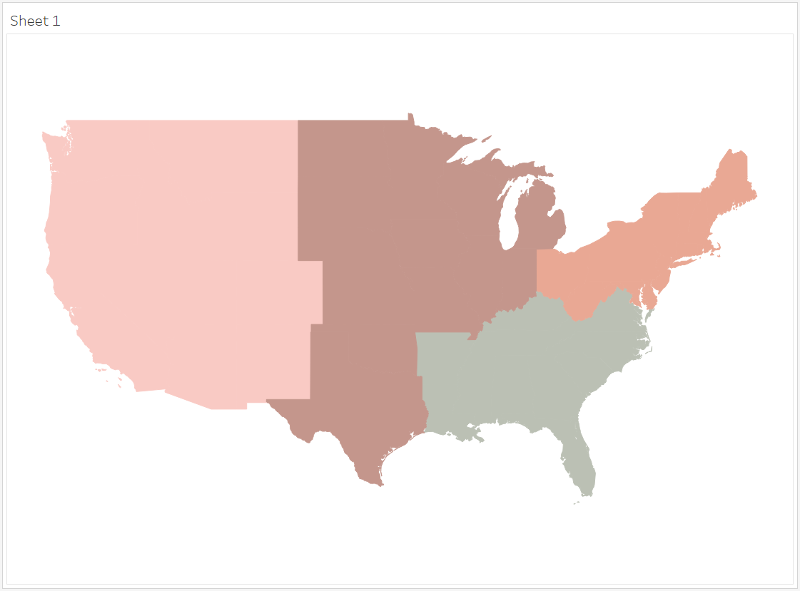
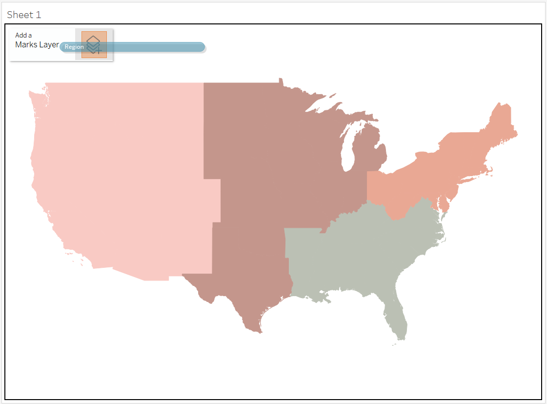
- Create your filled regions map.
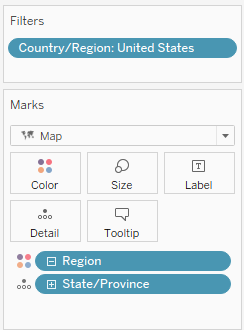
- Drag 'Country/Region' to the Filters Card and select 'United States.'
- Drag 'State/Province' onto Detail on the Marks Card.
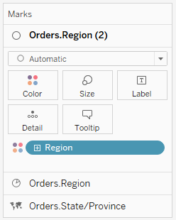
- Drag 'Region' onto Color on the Marks Card.
- Using the drop down in the Marks Card, set the Marks Type to Map.
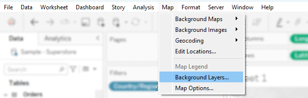
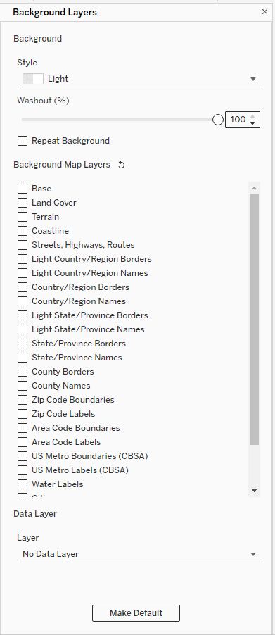
- Format the Map Layers.
- Open the Map menu in the Menu Bar and select 'Background Layers...'
The Background Layers panel will open on the left side of your window. - Use the slider to set 'Washout (%)' to 100%.
- Uncheck all of the Background Map Layers.
- Click the [x] in the upper right corner of the panel to get back to your Data panel
- Open the Map menu in the Menu Bar and select 'Background Layers...'
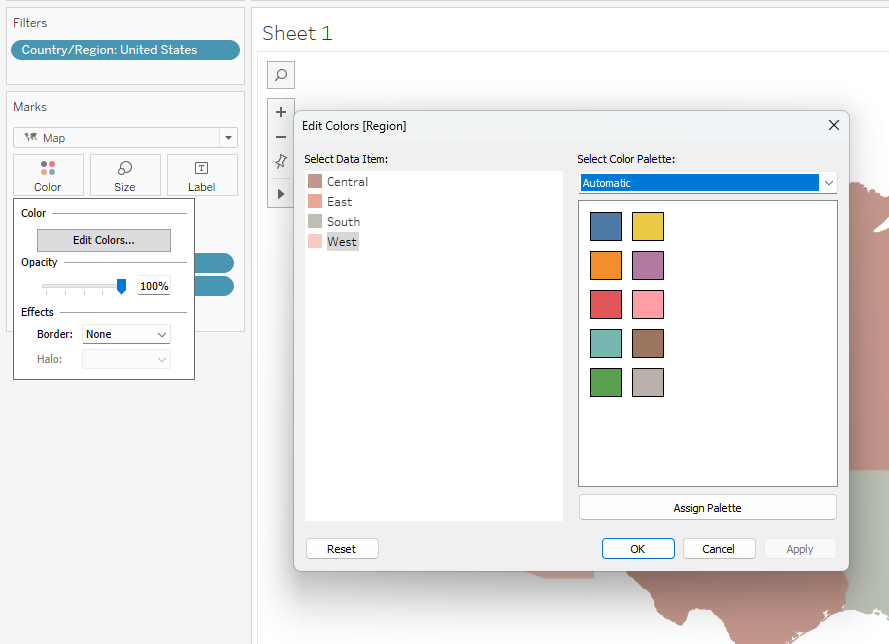
- Format the Map Colors
- On the Marks Card, click into the Color menu.
- Set 'Opacity' to 100% using the slider.
- Set 'Border:' to 'None' using the dropdown.
- Click into 'Edit Color...' to change your colors, if desired.
- Add a new Marks Layer to your map.
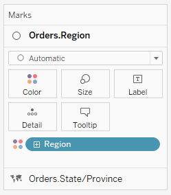
- Drag the 'Region' pill from the Data panel to the upper left corner of your map.
A box will appear there that says 'Add a Marks Layer' - Drop the 'Region' pill onto the layers icon in this box. The icon will turn orange when you can drop your pill.
You will now see a new section in your Marks Card where you can control this layer.
- Drag the 'Region' pill from the Data panel to the upper left corner of your map.
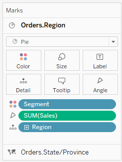
- Set this layer to show pie charts.
We will create pie charts of Sales by Customer Segment- Using the drop down in the Marks Card, set the Marks Type to Pie.
- Drag the 'Region' pill onto 'Detail.'
This creates one mark for each region. - Drag the 'Sales' pill onto 'Angle.'
- Drag the 'Segment' pill onto 'Color.'
- Click into 'Size' and make the pie charts as large as you would like.
- Click into 'Color' and click 'Edit Colors...' if you want to change the color palette.
- Add another marks layer to your map.
Follow the instructions from Step 4.
- Set this layer to create the donut holes for the donut charts.
- Using the drop down in the Marks Card, set the Marks Type to Circle.
- Make sure the 'Region' pill is on Color. Since we already set colors for each region, the new circles should already match the backgrounds!
- Click into Size and use the slider to make these circles almost as big as your pie charts.
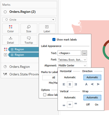
- Drag 'Region' onto Label.
- Click into Label, click the dropdown for Alignment, and set it to center alignment both horizontally and vertically.
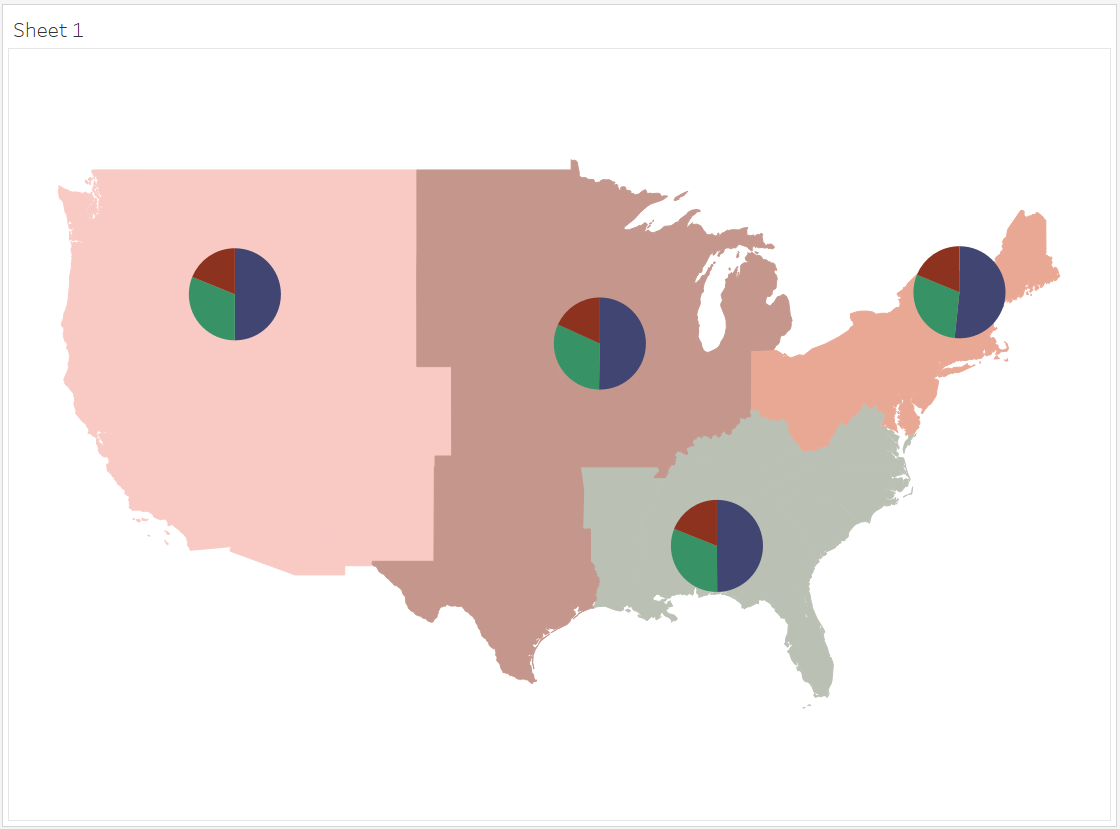
Voila! You've created a filled map with donut charts!
You can see my Donut Map Dashboard and download the workbook.

Now that you know the process, you can tweak the formatting to your liking or replace 'Region' with any other geographic object. I recently used this method to create 'Acorn Charts' (like donut charts but with acorns in the center instead of circles) marking NYC parks and showing the percentage of squirrels with different colors of fur for my Squirrels Dashboard.

EDIT TO ADD: Removing state borders on Tableau Public
Originally, when I uploaded this dashboard to Tableau Public, the borders for the states popped back up. I tried taking 'State' off of Detail on the filled map, but then Canada reappeared on my map, which I didn't want. Thanks to a suggestion from Salome Grasland, I added a data source filter to only show the US instead of dimension filter.
[Read: Tableau: Apply Data Source Filters by Nitesh Shrestha]