At the end of May, I created two additional Tableau visualizations for Asian American and Pacific Islander (AAPI) Heritage Month; one is on the topic of children's literature and the other is about Drag Race. Without further ado, let me introduce them!
Colorful Narratives: Diversity in Children’s Literature
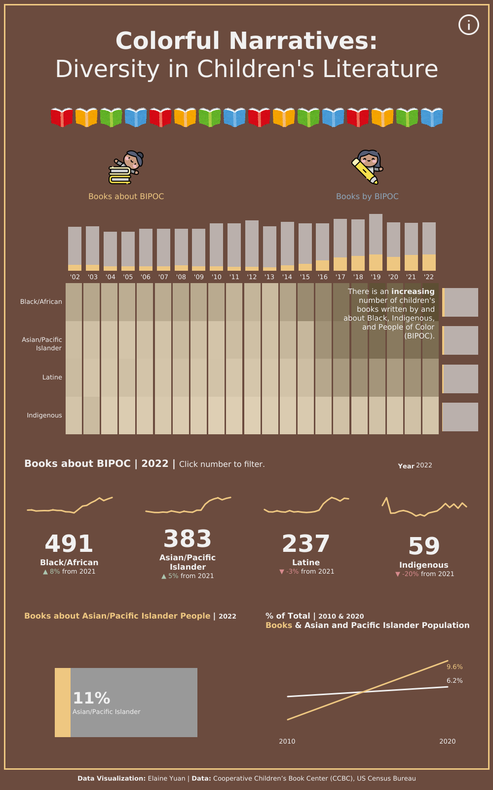
I was very excited to find diversity statistics for children’s books from the Cooperative Children’s Book Center (CCBC), a library of the School of Education at the University of Wisconsin-Madison. The CCBC has been documenting books it receives annually by and about Black, Indigenous, and People of Color (BIPOC) since 1994! You can access the data here.
Initially, I wanted to focus on books written by and about Asian and Pacific Islander people because this is AAPI Heritage Month. However, I didn’t want to ignore the work of other BIPOC authors.
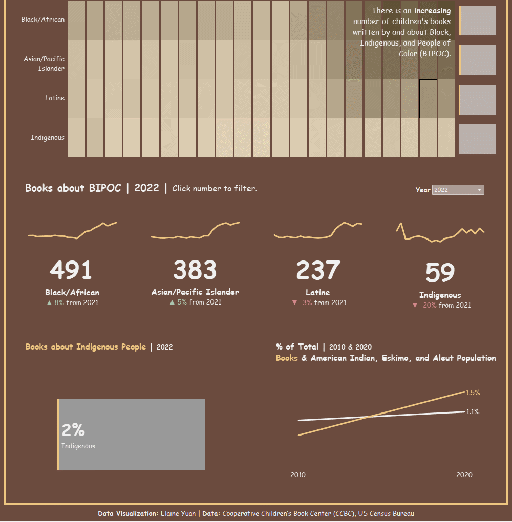
I placed the marginal histogram at the top of my visualization to immediately illustrate the increase of books written by and about BIPOC. Under the marginal histogram are big numbers for each group, which can be clicked to filter the rest of the visualization. The story starts big, but the user can drill down later.
In my data analysis, I found:
📚 in 2022, more than a third of books (34%) were about BIPOC and 44% were by BIPOC
📚 the percentage of Asian/Pacific Islander books now exceeds than their percentage of the US population
📚 the percentage of Indigenous books meets their percentage of the US population
📚 meanwhile, the percentages of Black/African books are growing to match their percentage of the US population
📚 unfortunately, the percentages of Latinx books does not reflect their percentage of the US population
Drag Race Represent-Asian
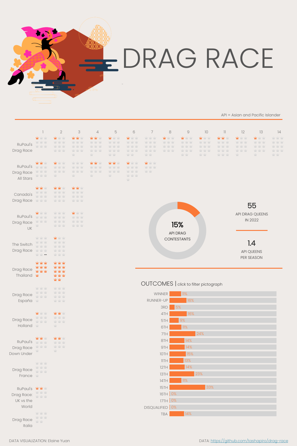
As a fan of Drag Race, I have wanted to design a Drag Race visualization for a long time. I have searched high and low for data about the show and its contestants. I found the No Key No Shade: A RuPaul's Drag Race API, which is unfortunately dead. Thankfully in my search, I came across a Drag Race Github project (here) and downloaded data web scraped from the Drag Race Wiki last year.
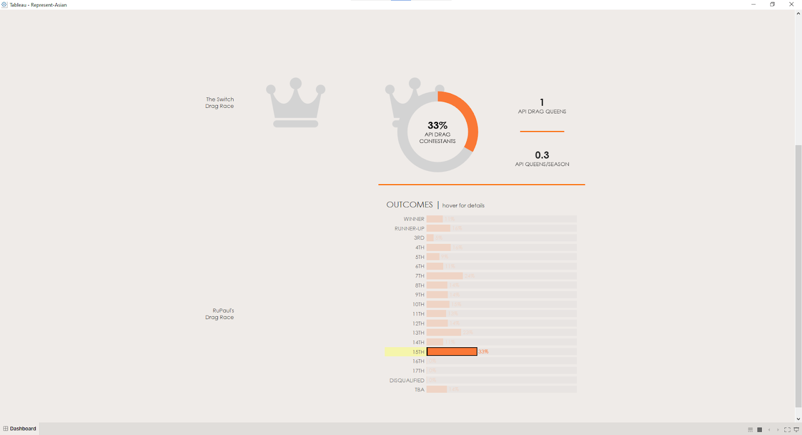
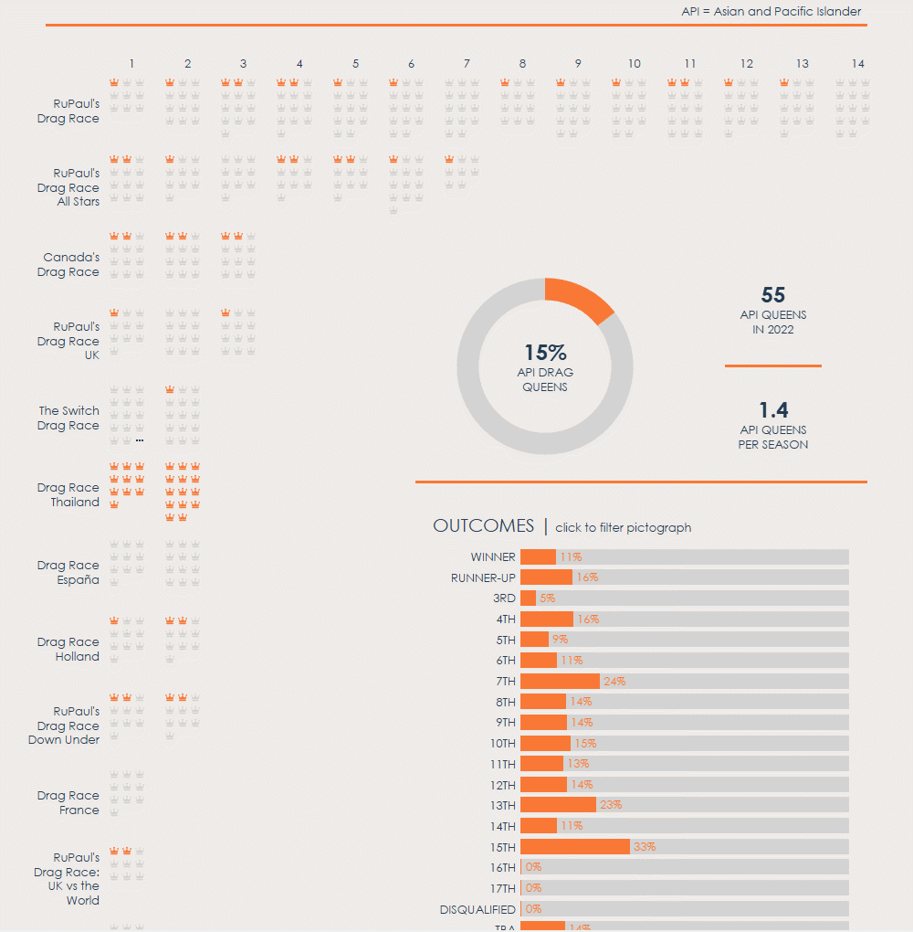
I always root for the Asian queens on Drag Race and wished to visualize the Asian and Pacific Islander (API) queens in each franchise and season, as well as their overall placements.
At first, I wanted to build a network visualization because it would be striking. I used the Network Generator to help me develop one.
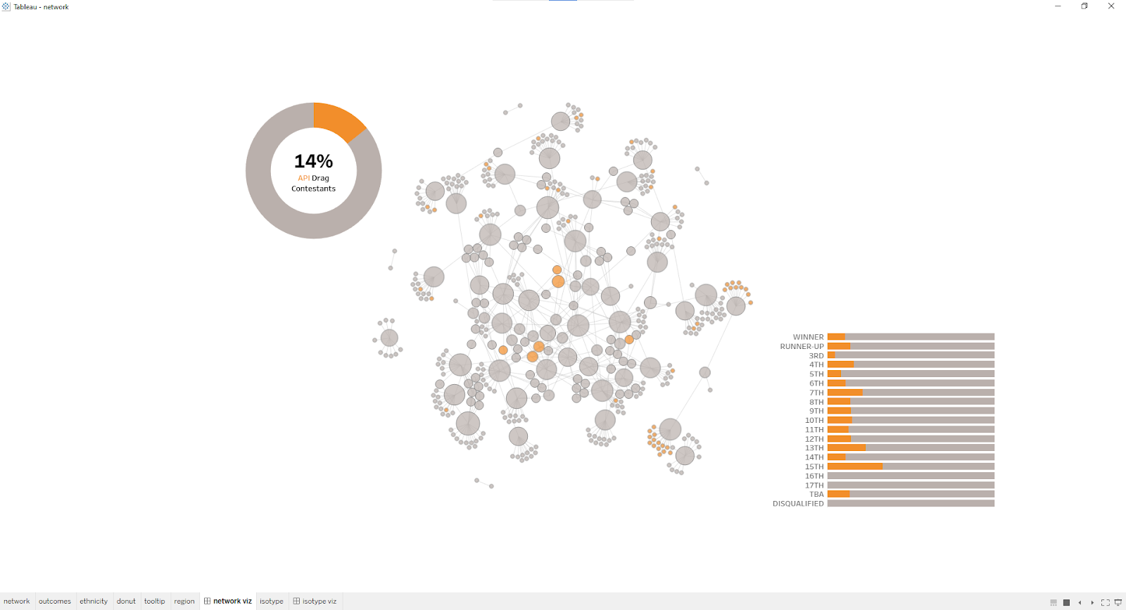
However, in Tableau, I noticed it is limited in user interactivity. The nodes of the network include not only the drag contestants, but also the franchises and their seasons. If I filtered by outcome, only the drag contestants would remain and their nodes would be untethered.
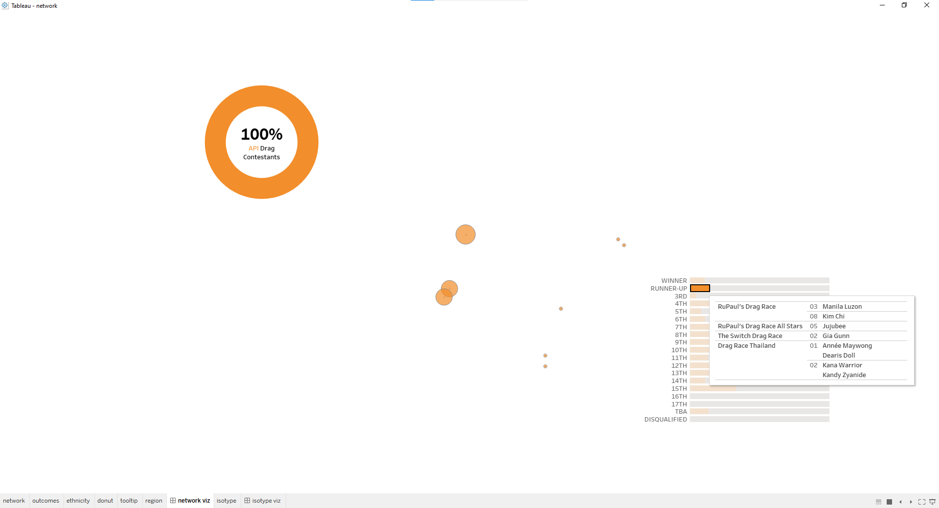
I changed gears and decided to try an isotype chart or a pictograph. It was neater than the network visualization and easier to filter. Then, I built the rest of my visualization around the pictograph.
In promoting user interactivity, I noticed an issue with filter actions. When I selected an outcome, the pictograph would filter accordingly, but in doing so, the view would change and be unideal. The following screenshot illustrates the flawed view.
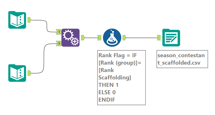
I needed some way of maintaining the headers of season number and franchise name. After consulting with my mentor, Collin Smith, I decided to scaffold the data. In Alteryx, I appended all the potential outcomes to the dataset of contestants. There were 19 outcomes, so the original 472 records multiplied to 8,968 records. I also added a Rank Flag column to mark the true placement of each contestant.
After adding the new scaffolded data into Tableau. I could use parameter actions to “filter” my pictograph in the way I envisioned!
In my project, I learned:
🏁 scaffolding data isn’t as intimidating as I thought it would be and image roles are very fussy
🏁 there are 1.4 API drag queens per season - although this number is skewed heavily by the all-API cast of Drag Race Thailand, the global, North American, UK, and Down Under franchises usually have at least one API queen per season
🏁 Gia Gunn competed on the second season of The Switch Drag Race, the Chilean spin-off of RuPaul's Drag Race, which means she she can speak fluent Spanish
🏁 in 2022, there were only 4 API Drag Race winners, the first being Raja in Rupaul’s Drag Race season 3 (2011) and the most recent being Priyanka in Canada’s Drag Race season 1 (2020)
Earlier this month, I built two Tableau visualizations for AAPI Heritage Month, which I write about in a blog post here; one is a map-based visualization of bubble tea shops in New York City and the other is a celebration of Michelle Yeoh and her remarkable career.
As a Chinese-American, I am delighted by the AAPI Heritage Month vizzes I created this month. I hope to continue to create more throughout the year because I found some really neat datasets in May! I also hope to create at least another viz for Pride Month! There are a lot of fun projects ahead, so feel free to connect with me on Twitter (@datadrawnYuan) and LinkedIn (yuanelaine) for more content.