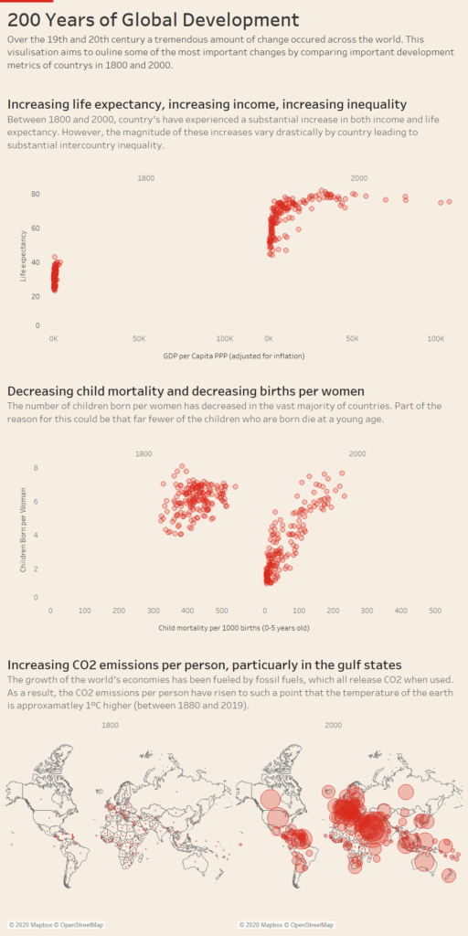
For today’s challenge we were tasked with visulising development data of countries between 1800 and 2018.
My approach today was to focus on a direct comparison of the start of the 19th and end of the 20th century.
For a long time, I have loved the work of the data team at the Financial Times (particularly John Burn-Murdoch ). Therefore, today I did my best to replicate their style of visulisation and tell a solid story using the data.
Anyhow, I’m out of time now so here is the link for the viz: