Day 3 of dashboard week and day 2 of the Accessibility journey. Over half way, we're on the home straight now team.
In today's dashboard challenge we were tasked by Glasgow City Council to make the city’s data more accessible to their residents, showing a FixMyStreet dataset which a sample of road repair data.
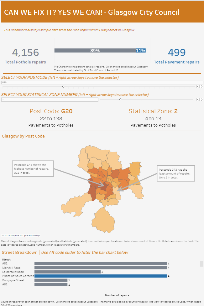
We had to a product which allows users who are currently not well served by current interfaces to access data about their surroundings.
The key implementations
- All key figures and BANs were dynamic from the filters and were included in the titles of the worksheet. This allowed all words to be read aloud from the narrator for visually impaired users.
- The colour palette I used were all colours included in the Tableau colour blind palette.
- I used italic font to distinguish instructions from subheadings which were descriptive to inform users how to interact and get the most out of the dashboard.
- The Tooltips were removed as users who cannot use a mouse wouldn't have been able to access these.
- The Map was annotated which key findings that may have usually been included in the tooltips.
- The Auto-captions were included and edited to give a better descriptions of what was seen in the charts.
- Percent total bar depicted the difference in overall repairs between Categories. Helpful for dyscalculia users.
Limitations
- The non-bold and italic headings were in a thin font which was hard to read on the light grey background.
- The order of the charts were confusing to interpret. The filters changed bar charts at the very end of the dashboard.
- Include more legends to remind users of what each colour relates to in each category.
- The shading on the map of one colour can be hard to read for certain colour blind users.