Did you ever want to learn how to create a custom shape out of data points? Where each data point stands for a certain name or ID, but then the dots create a larger image? It's actually much easier than it looks. Here are some examples of how this would look like in practice:
1) Amur Leopard by Asha Daniels

2) Marvel Sign by Asha Daniels

3) A Rose for Palestine by Lisa Hitch
For my dashboard on Palestine's fatalities and attacks, I built a rose out of the names of killed children. Each dot is a mini rose and represents one child who died. The overall shape creates the rose and then I added an image as a background to add the green leaves to it.

So let's take the Palestine rose as an example and build it together:
Step 1: Data Wrangling Original Data Source
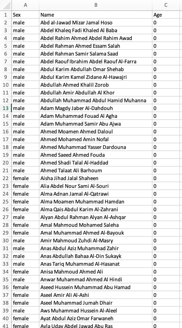
The first step is to make sure that your original data source (where you store the names or IDs) is in the right format. For this, we would want one ID or name per row, but not repeated. You may have to pivot your data if it is not in this long format. This is how my data source looked like. You can also find it below if you want to follow along with this blog post.
Download the dataset below to build the rose:
Step 2: Find image you would like to plot
The next step involves finding an image of what you would like to plot. In my case, I chose the picture of a rose.

I looked at the picture and decided that I wanted the data points to be on the red flower part of the rose.
Step 3: Use WebPlotDigitizer to set up your image
When you found your image, you can upload it to WebPlotDigitizer ("Automeris") to create coordinates for every single data point.
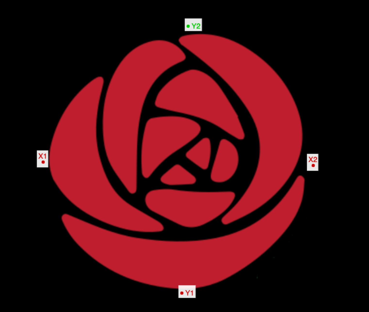
To do that, navigate to the website and then click 'Launch online'. That should give you a website with a sample graph. You can ignore this part as you will upload your own image. Click on the right side on 'Load image' and upload the chosen image from Step 2. A pop-up will appear where you choose '2D (X-Y) Plot' and then click "Align axes". In this step, you will click on points on your image that create axes around your image. You have to click on the points in a particular order:
First X1 (the point that is furthest to left), then X2 (the point that is furthest to the right), then Y1 (the point that is lowest), and finally Y2 (the point that is highest). The click 'Complete' on the right side.
For my image, it looked something like this:
Another pop-up will ask you whether these are the coordinates that you would like to choose. I opted to set my range from -1 to 1 instead of 0 to 1, but this is personal preference. I also checked the box that skips the rotation correction. Then click 'OK'.
Step 4: Use WebPlotDigitizer to get your coordinates
Now that we uploaded our image, it is time to create the coordinates for all of our data points. For this, we navigate to the menu on the right side where it says "Automatic Extraction".
First, you need to change the color to "Background color" and choose the same color of your image's background. In my case this was black.
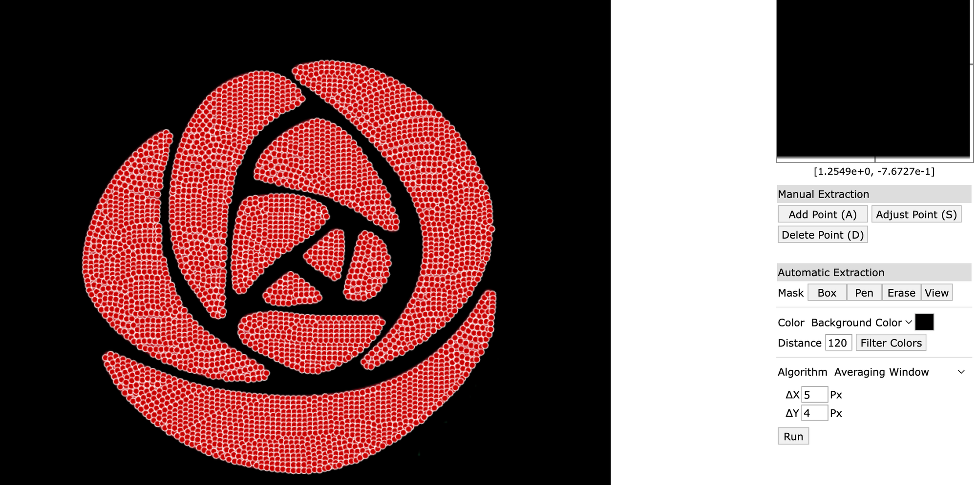
Then, under Algorithm where it says Delta X and Delta Y, you can play around with the numbers. The higher the numbers here, the fewer data points you will get. The lower the numbers, the more data points will be created.
Here is an example with high Delta numbers that created very few data points.
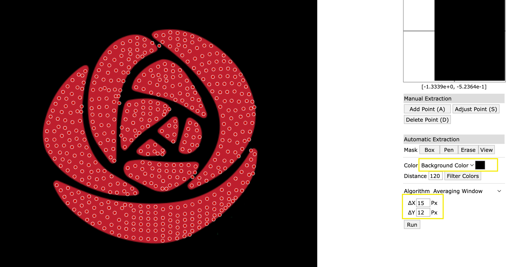
When you look on the left side, you can see how many Data Points were created. In this case only 536 data points were created. Generally, you would like to have the data points to be as close as possible to your dataset. My dataset contained ~4200 names, so I had to change the Delta numbers to create more data points. This is how my final configuration looked like and it contained only about 50 more data points that my dataset:
Step 5: Download coordinates and add to original data source
When you click on the left side on "View Data", a pop-up window will show you the X and Y coordinates for every single data point. You can download this list by clicking "Download .CSV".
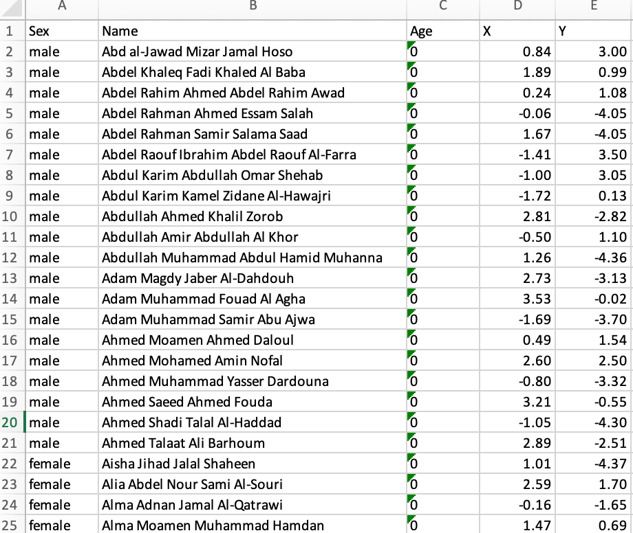
Now we have the coordinates, but now we need to merge that to our original dataset with the names/IDs. The easiest way is to simply copy and paste the X and Y coordinate columns into your dataset and append them to the right of your names.
But caution: This would work perfectly if you have exactly as many data points as you have rows in your dataset. But that will most likely not be the case. Since the coordinates are ordered, we can't just delete some coordinates or a particular part of our rose would be missing (e.g. the bottom left corner). But if we randomize the coordinates and delete a few, it won't be as noticeable.
So, before you put the two datasets together, open your coordinate dataset that you just downloaded and insert a header. I label the first column as X and the second column as Y. The third column I label as "Random" and insert the function =rand() for all rows that contain data. It will look something like this:
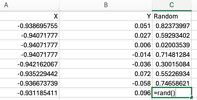
I then sort the dataset based on the Random column (does not matter whether it's ascending or descending). Now that we randomized our coordinates, we can add the X and Y coordinates to our original dataset. It will look something like this:
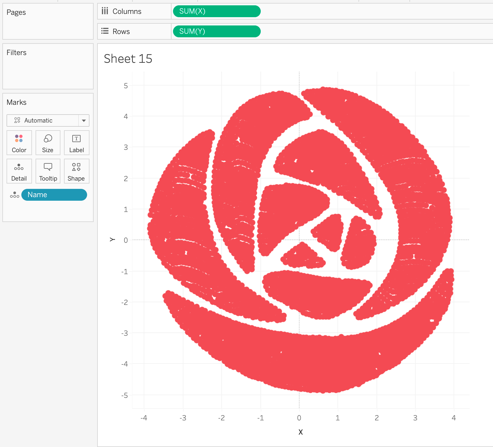
Step 6: Visualize in Tableau
Now we are finally ready to visualize it in Tableau, which is probably the easiest part. After loading the data into Tableau, drag the X field onto the columns shelf and the Y field on the Rows shelf. Drag your name (or ID) onto detail.
And et voila!
Your rose is created! Now you only need to change the color (or use a different shape for the individual data points if you want), and hide gridlines and axes.
Did you try out creating your own shape? I would love to hear how it went! Reach out to me via LinkedIn
Big, big shoutout to Asha Daniels for her excellent instructions and recommendations that served as foundation for this blog article.
First two images created by Asha Daniels.
Screenshots from Tableau 2023.3 and WebPlotDigitizer, taken by Lisa Hitch.
Feature image by Lisa Hitch, created in Tableau 2023.3