During this weeks client project, I am tasked with creating a KPI dashboard with some quite complex calculations. Instead of creating a KPI for 'current', 'previous', and 'difference from previous' with a simple measure, some of the calculations included multiple 'if-then' statements, and different aggregation methods for different measures. This means that some approaches using Level of Detail expressions were difficult, and I found a really useful work-around using Table Calculations.
I usually stay away from Table Calculations as they can be a bit tricky to configure, but they've saved my life this week. I thought i'd share a method of how to create a KPI + Sparkline card in just one worksheet, which I actually think might be easier than the common LOD approach we usually take.
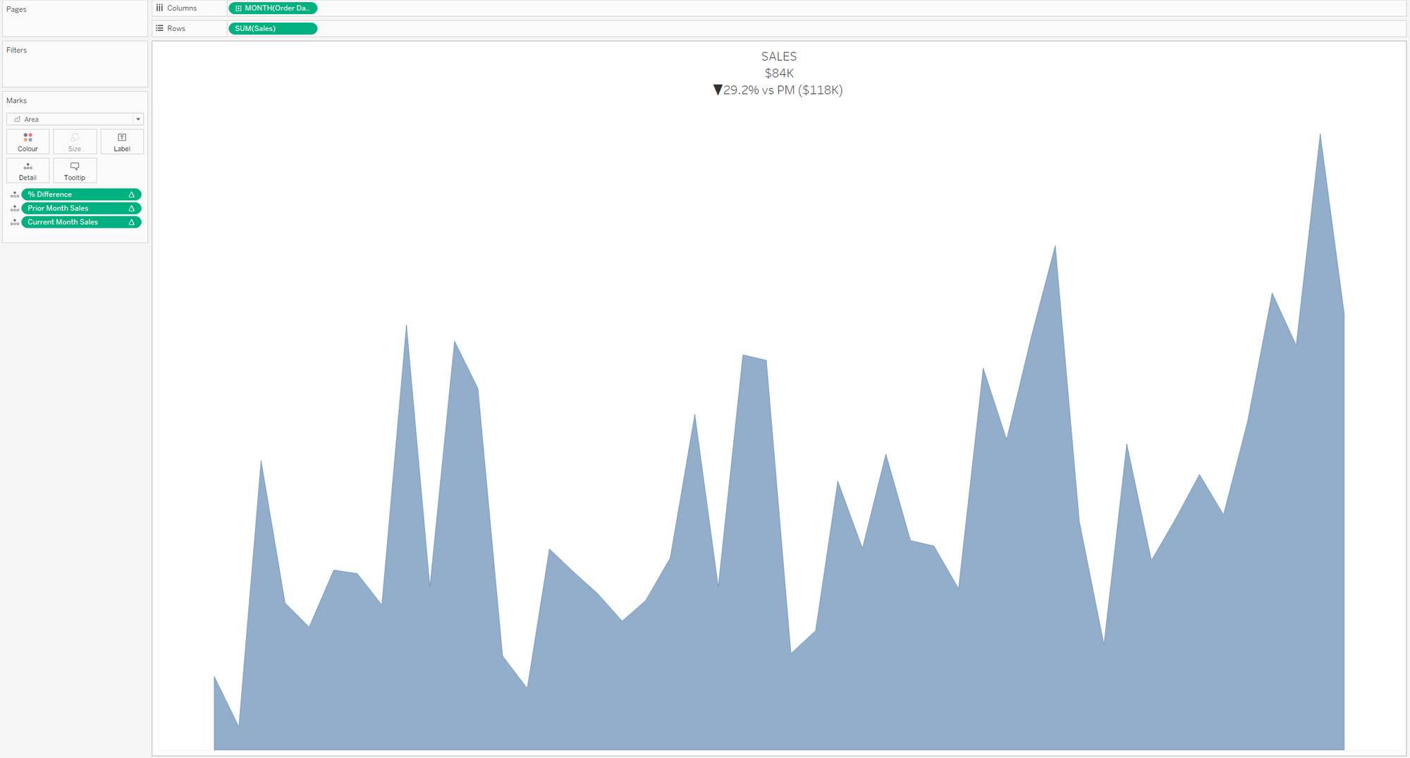
For reference - lets create this following visualisation using an LOD and a Table Calculation

Using a Level of Detail (LOD) Expression:
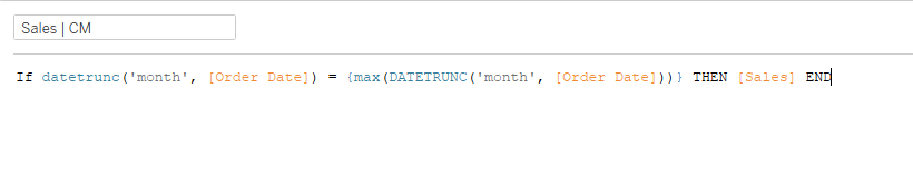
This approach uses the following logic:
- Find the most recent month
- Return sales if the date matches the most recent month
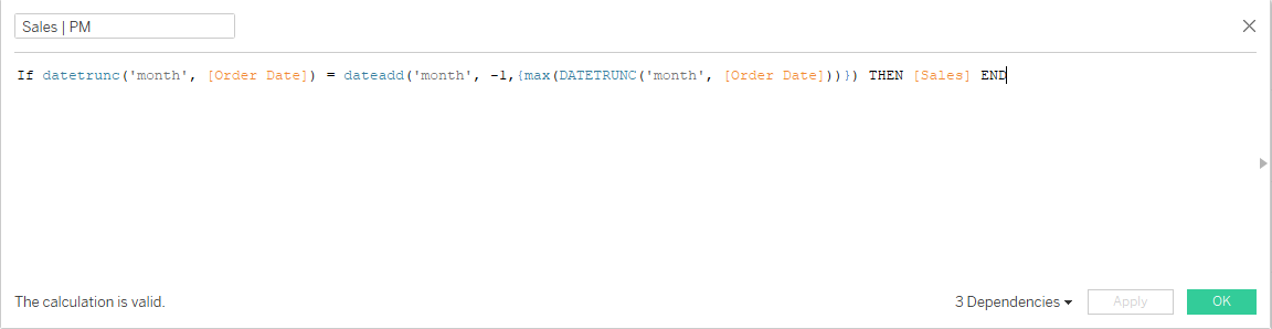
- Apply the same logic but for the previous month
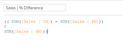
- Calculate the % difference
This looks something like this:
To calculate the percentage change:
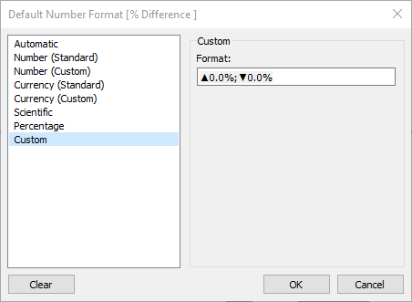
We now have the backbones of the workbook, drag all of them to detail, add continuous months to columns, and the sum of sales to rows. Change the marks type to an area chart, do some formatting - and for the final trick (to get the up/down arrow). Right click on the Percent difference field, click 'Default properties', and select 'Number format'. Click on 'custom', and paste the following: ▲0.0%;▼0.0%
Finally, in the title of the workbook, you will be able to insert the values for Current and Previous Month Sales, and the % difference.
Using Table Calculations
While the formatting is the same for this chart, the calculations are different (and maybe even easier?).
Since we will be using months in our view, which will ultimately be used in our table calculations, we can rely on 'LAST()' to help us here. Let's take a look at what the function does in a table form...
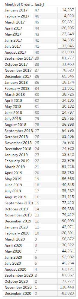
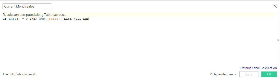
So, we need to access December 2020, and November 2020. We need two calculations for this - which are actually quite easy.
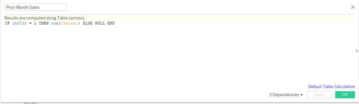
We now repeat this for our previous month sales!
Here's where things might get slightly confusing - so I'll use a crosstab to hopefully explain it better!
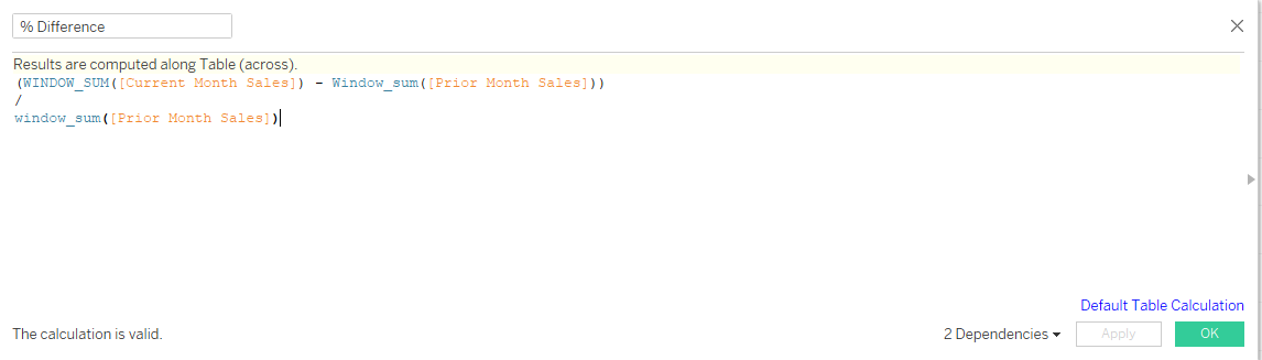
At the moment, we have our values for Current and Previous Month sales. We can also build our chart out, and nothing will break. However, to get the % difference, we need to take advantage of the window functions.
But why?
Well, if we don't use Window_sum() then 'None' will appear in the title. Here's why:

The following image is a crosstab of the worksheet we are creating - but the top row (which is entirely blank) is what happens when we don't use window_sum(). When we do use window_sum() (2nd row), the calculation we use is done via the summation of everything in the view for that specific measure.
Can you see how our values for 'Current Month' and 'Prior Month' do not align in the crosstab? We need our calculation for the % difference to take place across the entire view, otherwise it will not work. Without the window_sum(), the calculation would be:
(84k - [null]) / 118k
Therefore, we need to use the window_sum() to calculate each measure across the entire view.
As you can see, we have 3 table calculations, and an identical worksheet to when we were using Level of Detail expressions.
While I have used this on a very simple example, if you ever run into the problem of having to work with an aggregated calculation when trying to create a KPI / Sparkline worksheet, give this method a go!