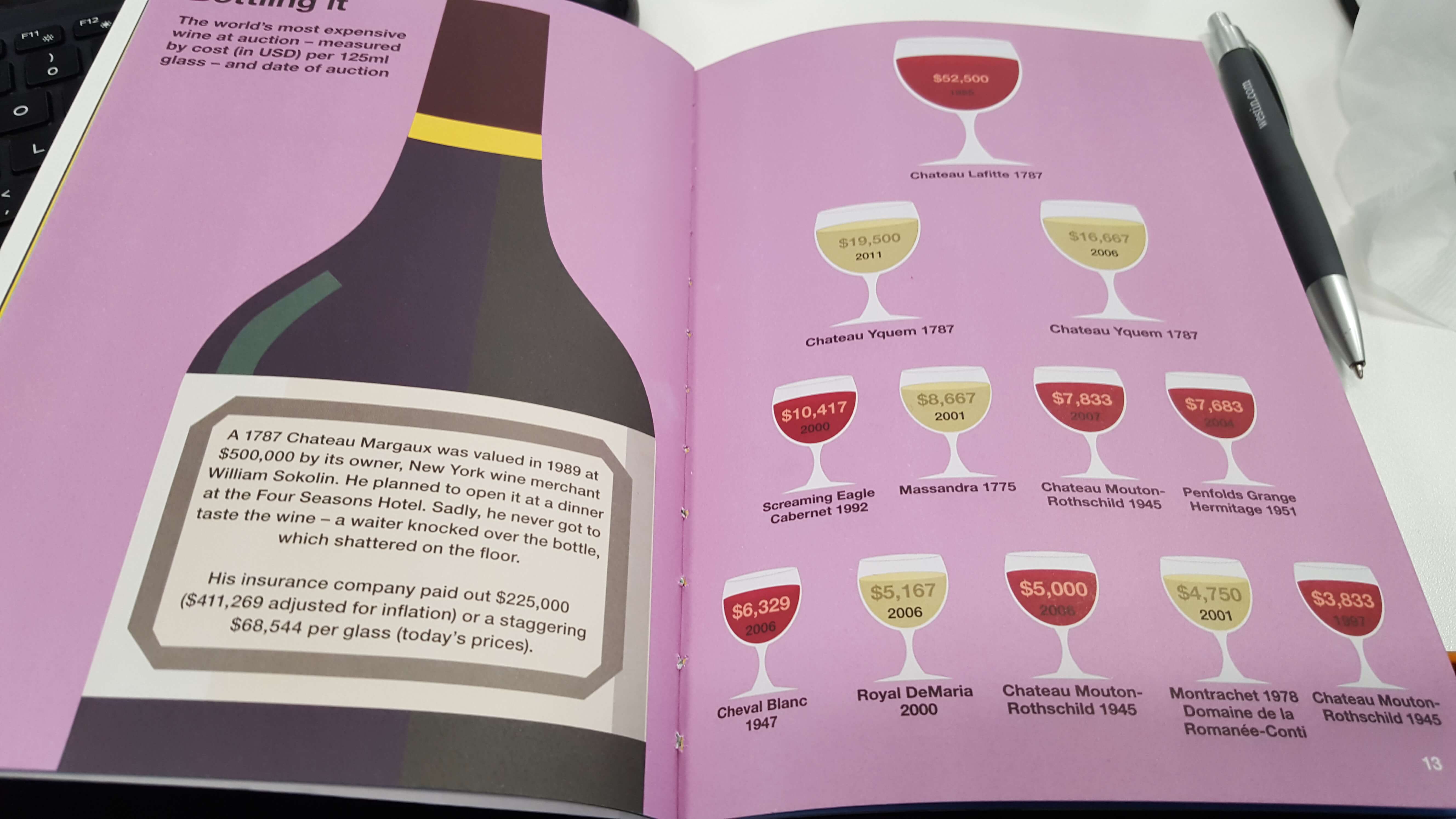
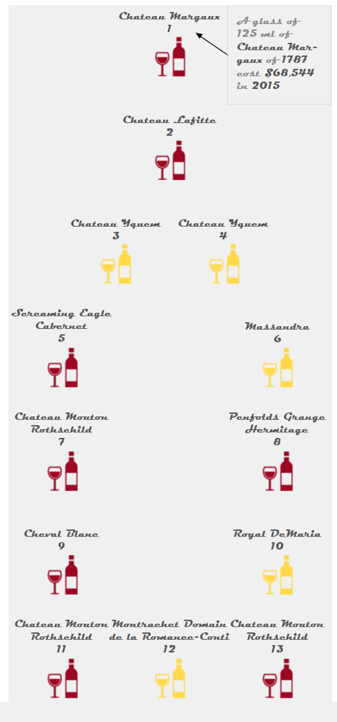
It is actually possible! I have found this infographic, showing the most expensive glasses of wine in the world, into one of Ben’s books (Infographica – Martin & Simon Toseland) and I decided to build it in Tableau:
How?
STEP 1 – Collect the data
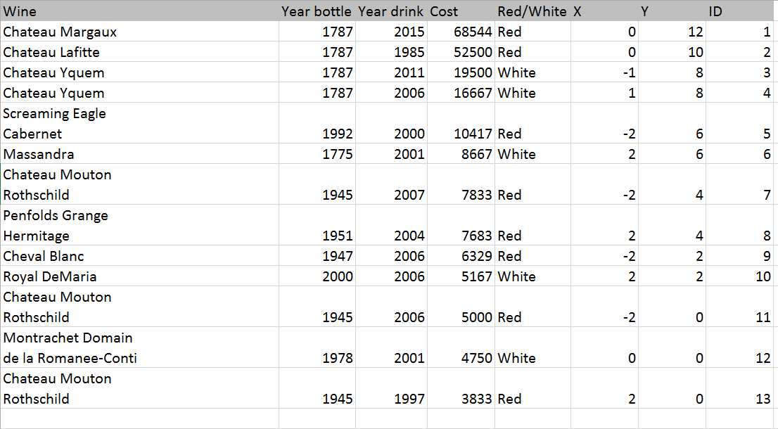
I have created two additional colomns (X and Y) in order to plot the coordinates for positioning the objects in the visualization. I have done some trials before in order to get the shape of a bottle in Tableau with these coordinates and at the end I made it!
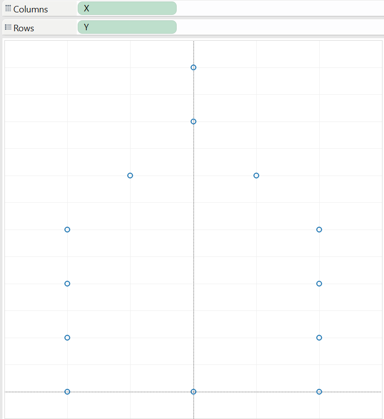
STEP 2 – Create the viz
Put X in columns and Y on rows and disaggregate them (analysis > aggregate measure)
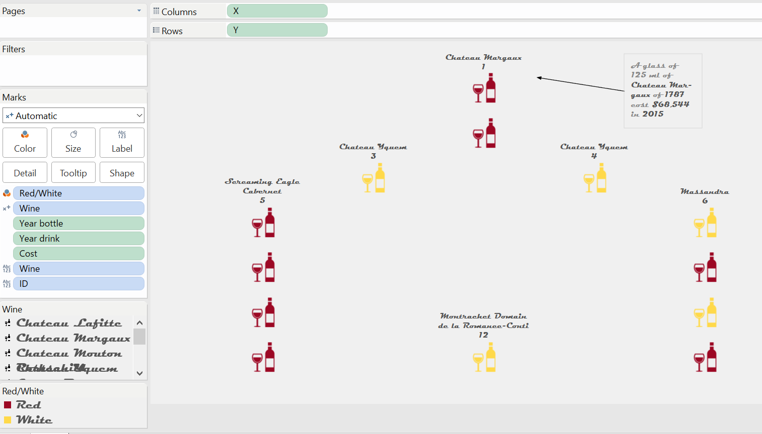
- Select Shape in the Mark shelf and put Wine on the Shape card (select the shape desired)
- Put Red/White on colour
- Put Year bottle, drink and cost on detail
- Wine and ID on Label
After formatting, this is the worksheet you get:
And here the view in the dashboard:
I hope you enjoy it.
A presto!