Welcome to Part 2 of my #HowTo on how to build a circular calendar chart in Tableau - before following this blog, please make sure you are up to date with Part 1.
1. Load the dataset you created following the previous blog's instructions into Tableau.
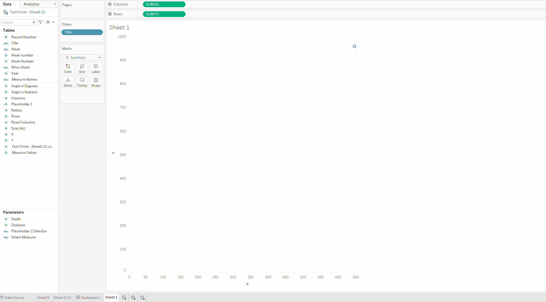
2. Drag the X field to the columns shelf and drag the Y field to the rows shelf
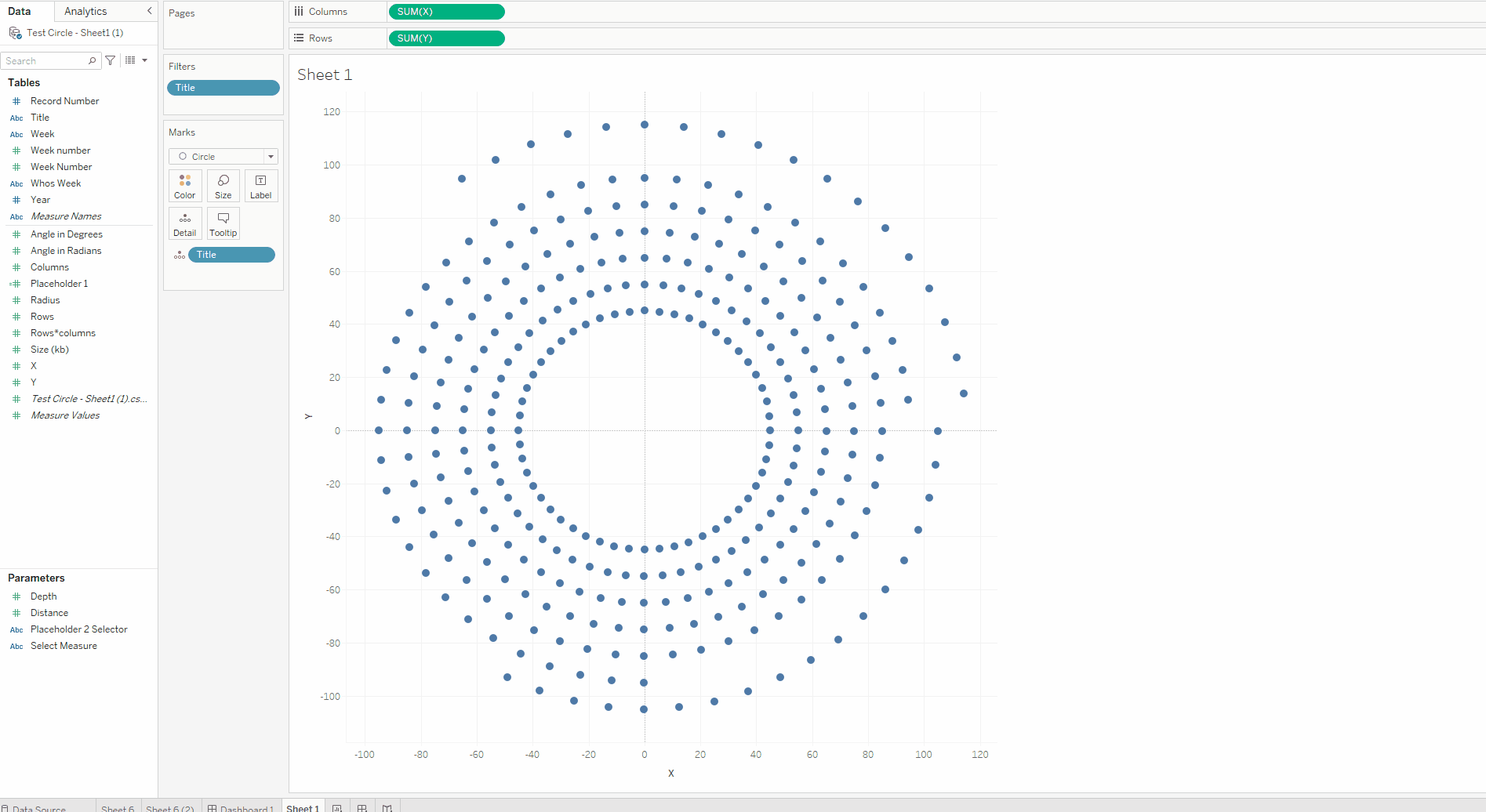
3. Drag in the field that you want to use to break up your view - for me this field is my Titles field, and is my lowest level of granularity. Now we can see our chart beginning to take shape.
4. Now go through final formatting changes, for example, I am going to add my year field to colour so that each circle is it's own distinct colour, and I am also going to remove gridlines.
Now you have a basic calendar chart - congrats!
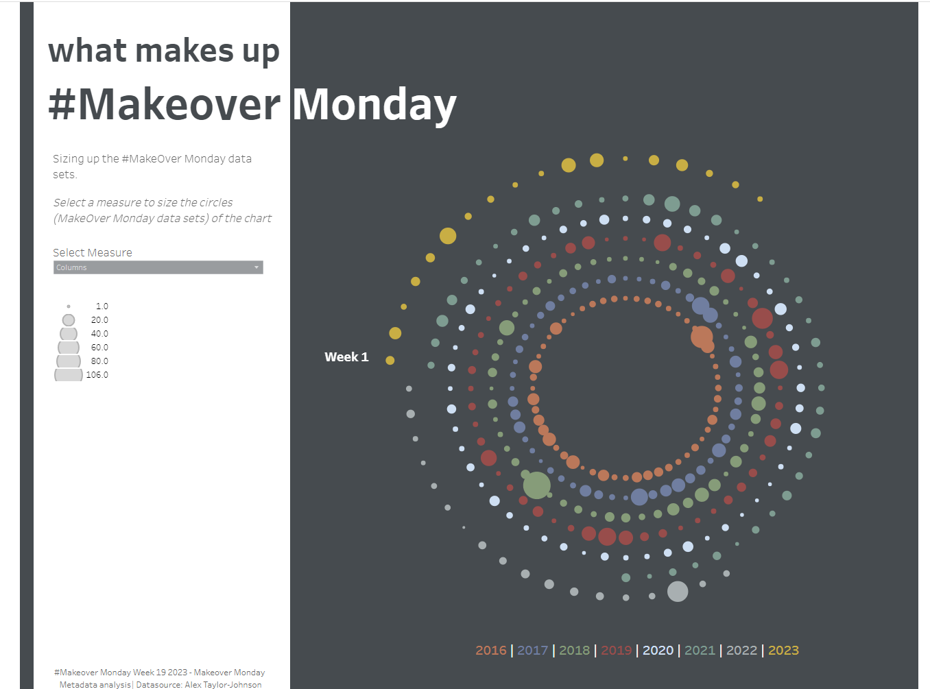
If you want to find out how to change the measure shown on a chart with a parameter as I've done in my final calendar chart above - check out this blog.