


Todays dashboard was using marketing data in order to create a report in Power BI.
The brief:
Using the data provided on the RWFD site, DS54 will need to:
- Explore and understand the structure of the dataset
- Prepare and model the data as required in Power BI
- Design and build a KPI dashboard suitable for a senior marketing audience
The primary stakeholder is the Head of Marketing, who requires a yearly, high-level overview of campaign performance and key metrics to support decision-making and reporting.
The dashboard should focus on:
- Communicating campaign success clearly and efficiently
- Highlighting key performance indicators (KPIs) relevant to marketing performance
- Allowing the stakeholder to quickly assess what is working well and where performance may be lagging
The final dashboard should feel polished, purposeful, and presentation-ready, reflecting real-world expectations of executive reporting.
My first step was to open the data in Power Query to get a feel for the metrics that were available in the data. When exploring the data, I noticed that the date field had not be read as a date format. It was showing as a string and was in the American date format. This meant that trying to change it to a date in the usual way of just changing the data type caused the column to error.
I got around this by right clicking on the date header and selecting change type and then using locale.
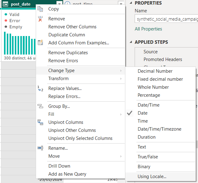
This allowed me to read the date in the UK format and then switch it.
Also whilst exploring the data, I noticed that the "Target Audience" column had what could essentially be three fields in it.
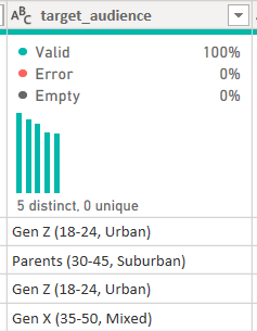
So I split the column to give me 2 more columns. One being target audience age and the other being Target Audience Area.
Using the knowledge I had gained from exploring the data, I started sketching based on the brief.
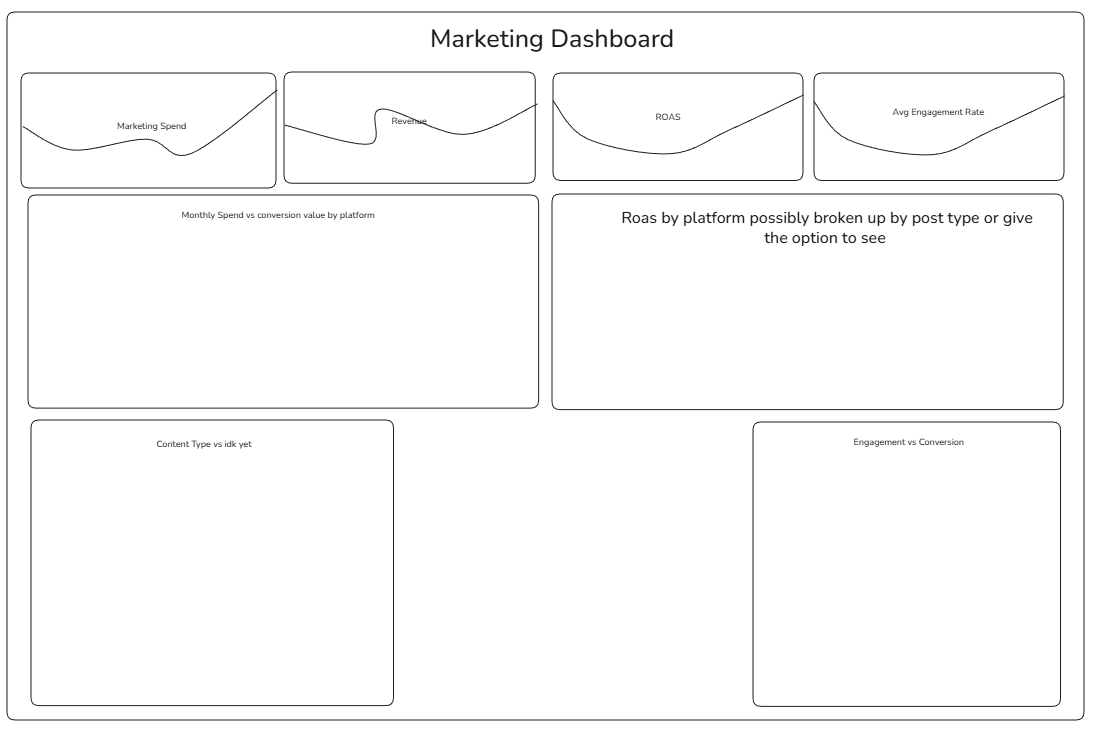
The sketch I came up with was a very basic sketch but it allowed for flexibility later down the line as I gained more knowledge about the data.
I then started the calculations I would need in order to make the charts in my sketch.
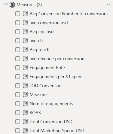
I wanted all of the calculations to be in one "folder" in the data pane in order to keep them organised and separate from the other metrics within the original data. I did this by selecting enter data in the home tab and creating a blank table.
I then renamed this table to "Measures" and I was able to create calculations within this without them being mixed up with the original measures.
I then used these measures to create the charts in the sketch.
After creating those charts, I realised that there was still a lot of things that I had not included that a marketing executive might have wanted to see.
This is when I decided to pivot from the original sketch. I chose to have 3 sections in the dashboard.
- Conversion (The money made from the ads. Essentially revenue)
- Spend (Where the money was being spent)
- Engagement (How were people interacting with the posts)
Working with Power BI today was interesting. I felt I got into a groove with the chart building and calculations. However when it came to formatting, I found that the Power BI UI is not very user friendly. It was very hard to find specific things during formatting such as trying to change the font size of specific text on a chart etc.