


Visualizations in Tableau Next is where you can transform raw data into easily digestible formats, such as charts, tables or graphs.
Visualizations in Tableau Next can help to highlight patterns, trends, and relationships within data that might be missed in raw numerical data.
Multiple visualisations can then be collated together into a Dashboard. Dashboards can be interactive, providing users with tools to explore complex data effectively, communicate complex information, and highlight insight through engaging visualisations.
Steps to create your first Visualization in Tableau Next
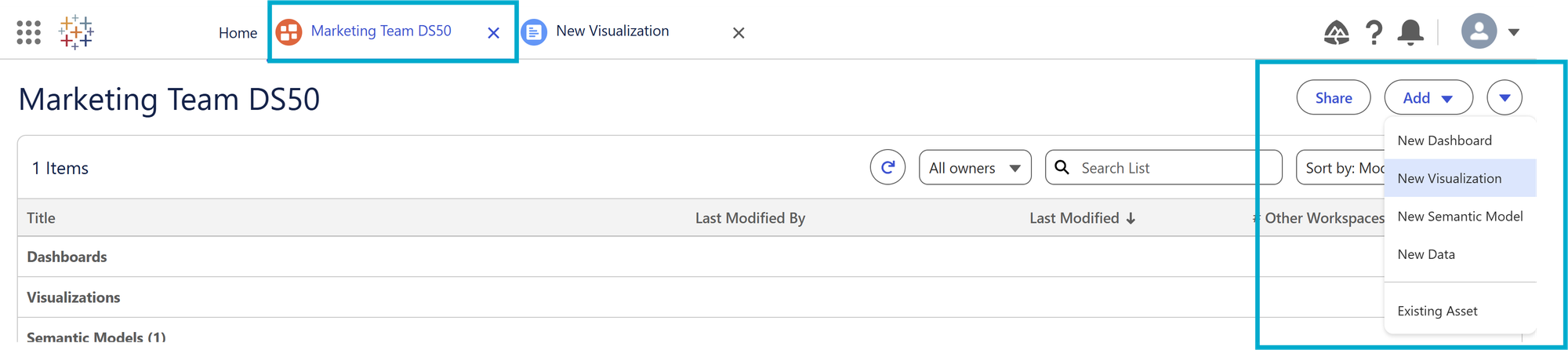
First navigate to your chosen Workspace, and select 'Add' and choose 'New Visualization' from the dropdown menu on the right hand side of the screen - this will now open a new tab for your as yet unnamed Visualization:
This will open a new tab in Tableau Next, where you can create charts, tables or graphs.
Users of other products such as Tableau Desktop will find this new screen very familiar. On this tab you can rename the visualisation, view the available fields, and start building your visualisations:
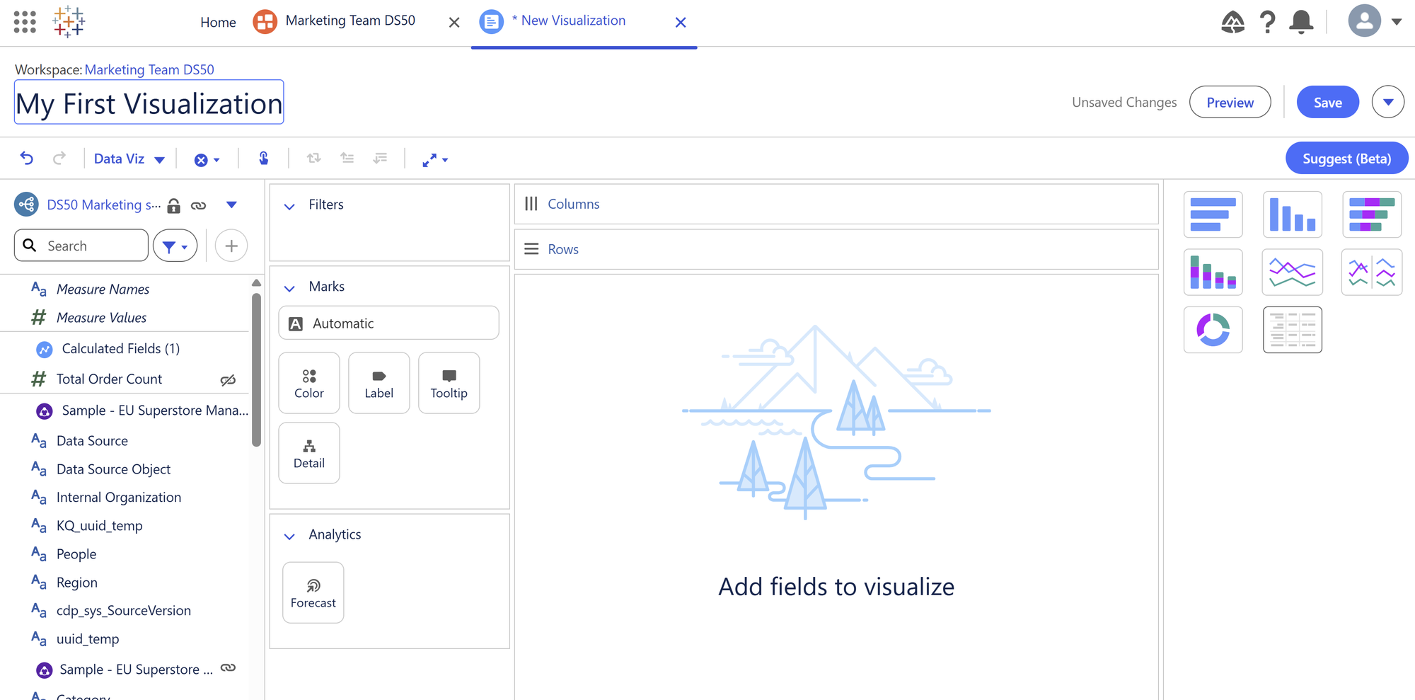
Decide the question you need to answer with data
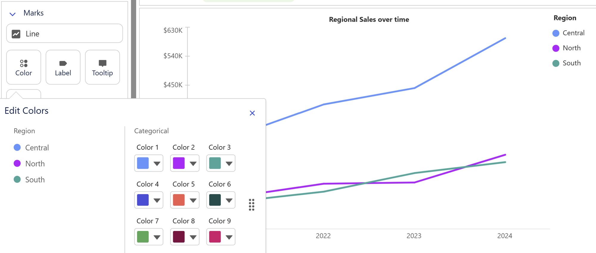
In my example, I want to visualise the sales over time of each region within the dataset. I chose to use a line graph to illustrate the temporal element, and view all regions within one chart for easy comparison across the regions:
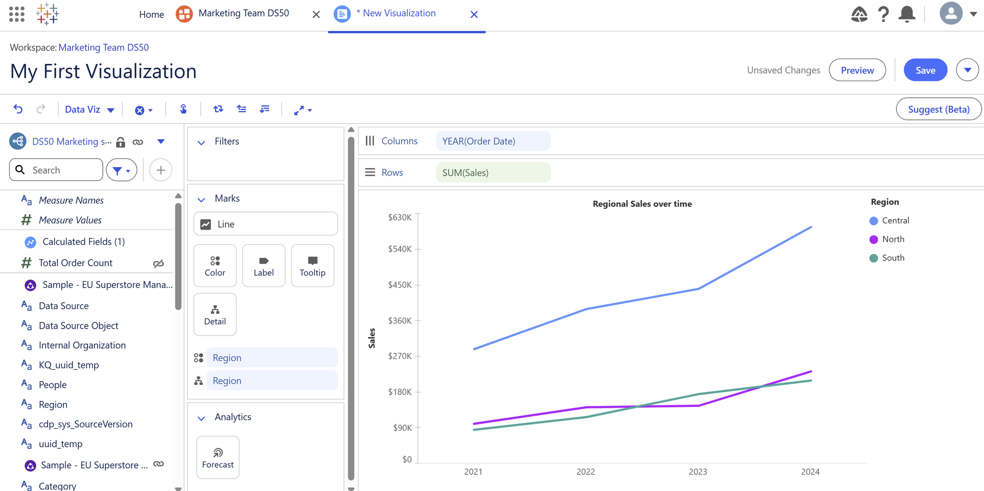
Enhance the user experience further through customisation
Once added to the view, the graph can be customised to further enhance the user experience. If the user knew the regions to be represented by specific colours, these elements are fully customisable by selecting 'Colour' on the 'Marks' card on the left hand side of the graph:
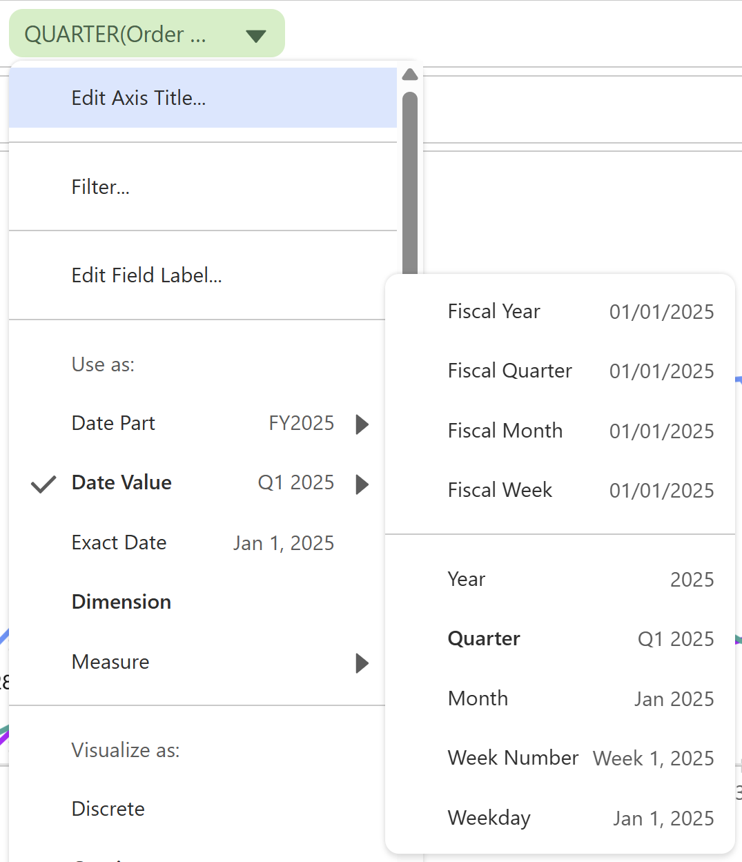
Edit the temporal element
Easily switch between viewing the data by Year, Quarter, Month, by selecting the Year field:
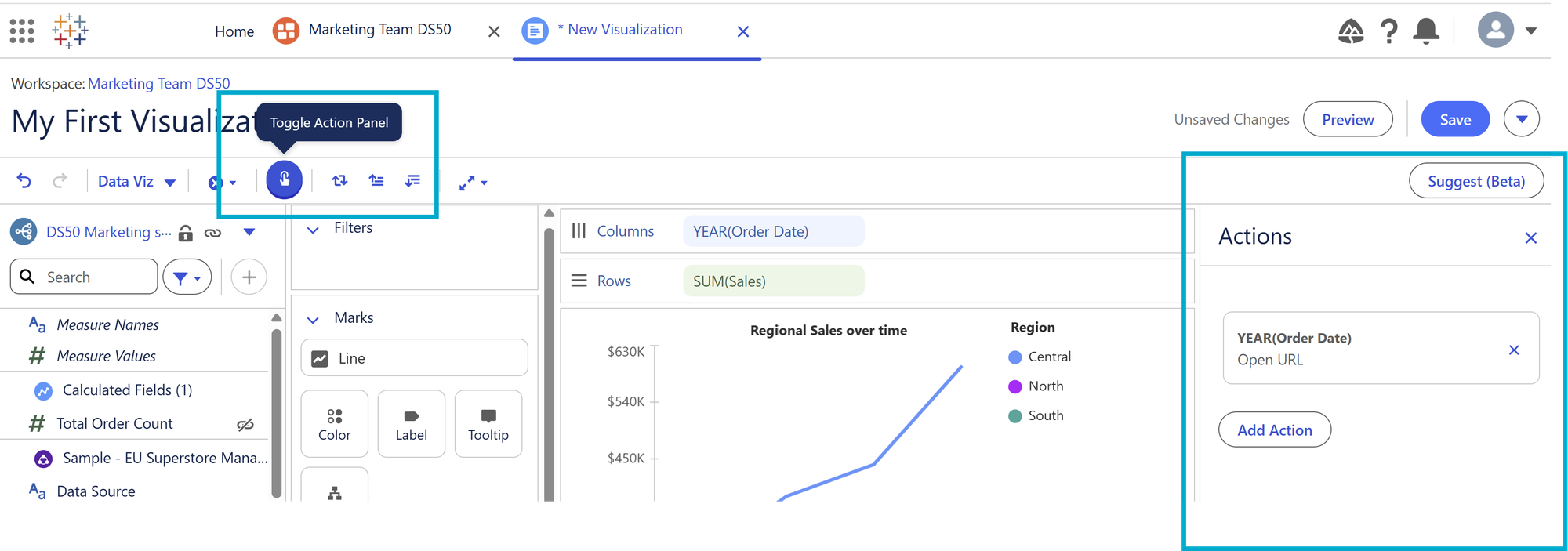
Add Actions to Visualizations
Through the Tableau Next Action Panel, it is possible to add navigation to the graph. Select 'Toggle Action Panel' from the top menu, and the 'Actions' panel will appear on the right hand side of the graph:
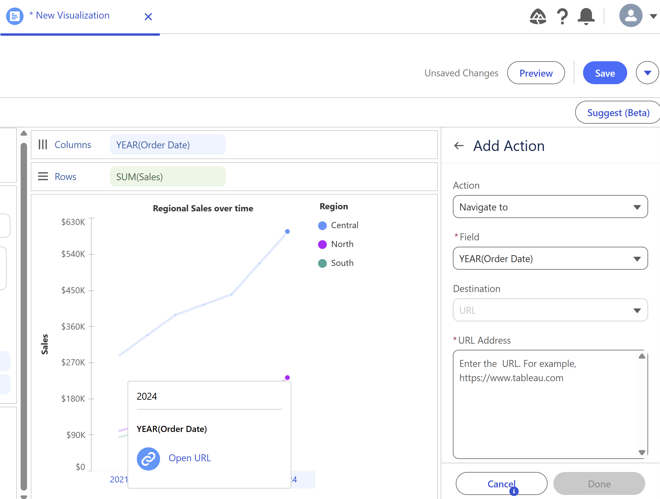
From here, you can add an action to take users to either a specific URL, or a Salesforce resource through a record ID - the navigational elements can further enhance the user experience, taking them directly through to relevant information from the visualisation. In the below example, a URL navigation has been added, which appears when a user selects a specific year on the graph:
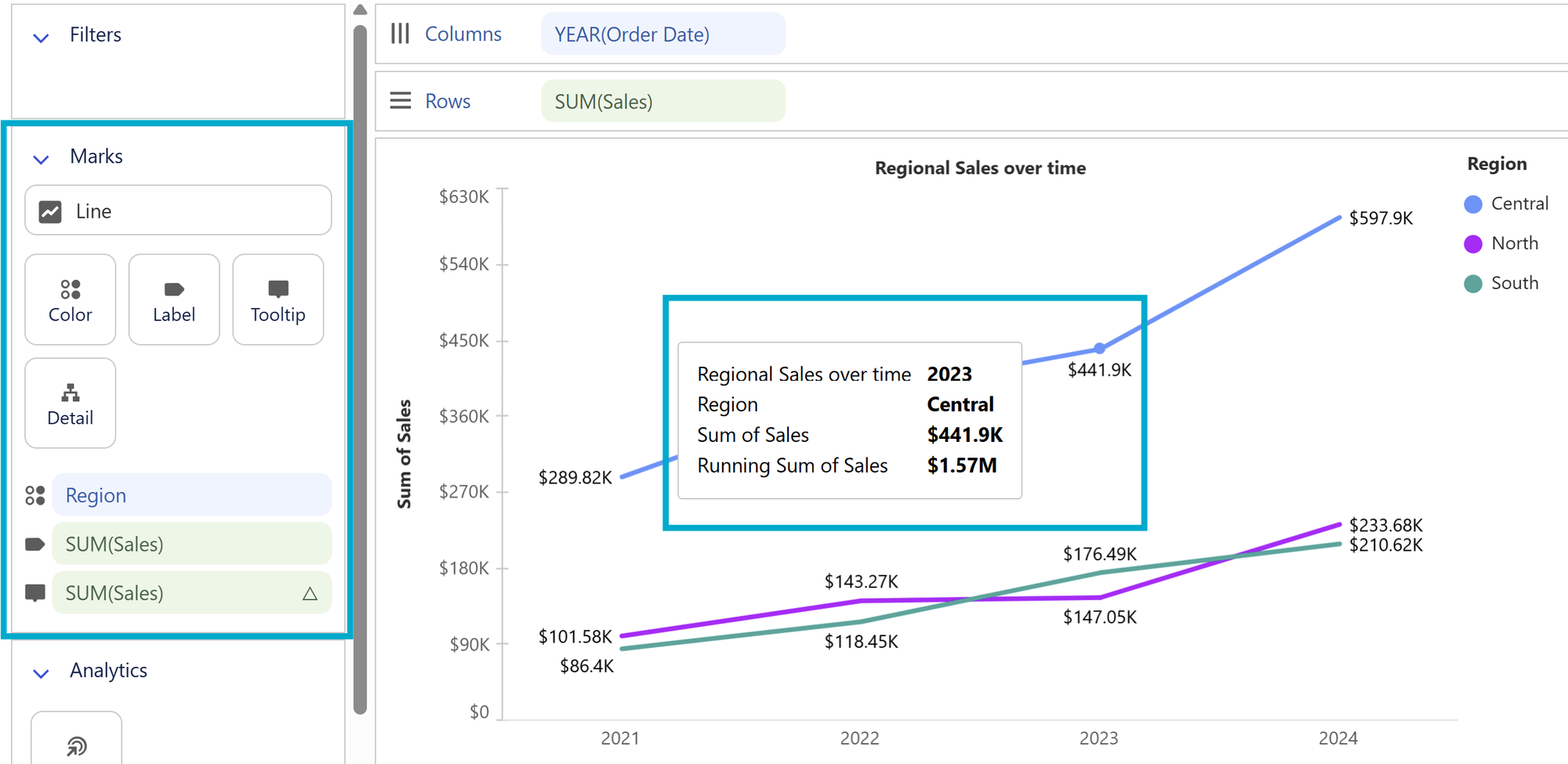
Edit Labels and Tooltips
Simply by dropping fields into the Label or Tooltip Mark, you can customise the information that is shown. If a user wanted to see the sales over time, but also the Running Total of sales over time, these can both be added using the Label mark, and Tooltips:
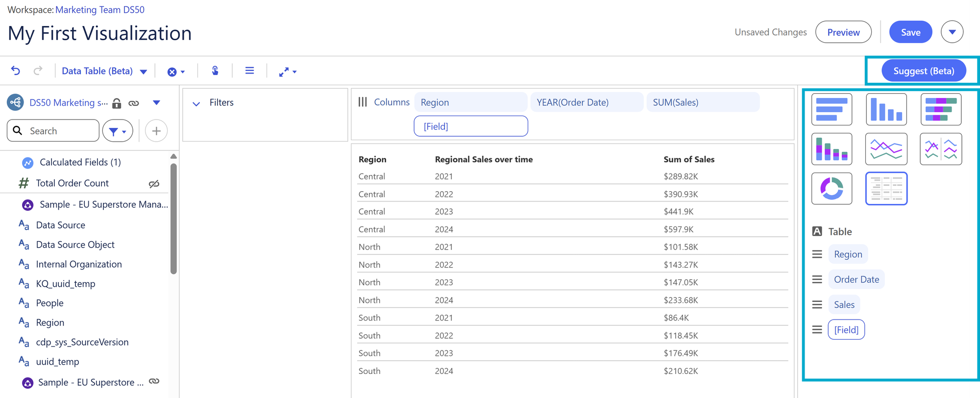
Easily switch between chart types
Still currently in 'Beta' - select the 'Suggest' menu on the right, and open a panel with different chart options to choose from, such as switching the visualisation quickly to a table:
Save your new visualisation
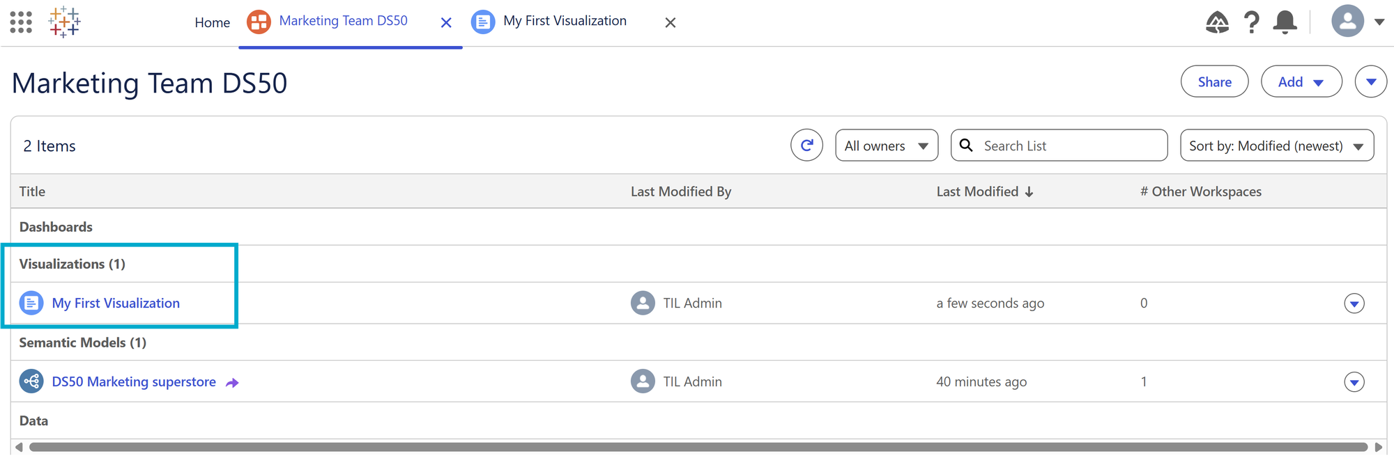
Once you are happy with your visualisation, click 'Save' at the top right of the screen, and now your visualisation will be safely stored within your workspace, ready to be added to a dashboard:
Happy visualising in Tableau Next!