


Day 3 & 4 of Dashboard Week, the challenge has been to create an summer themed Infographic Style Dashboard using IMDB data. My chosen programme was The Great British Bake Off series, which capture the summery theme of the challenge, and I thought there would be lots of appealing visuals I could bring into the dashboard.
In Figma, it is possible to create coloured backgrounds, and a stylised layout with which to eventually add as a background image within your Tableau Dashboard as an image, and then 'float' charts and other visual elements on top of.
I had not yet used Figma to enhance any work I have done as of yet, so getting to grips with the tool was a bit of a challenge.
Within Figma, you can create different shapes with styled backgrounds, whether that be changing the fade effect, the opacity, or adding shading. Figma has more font options available than Tableau, so your desired font can be added to your Figma background, and will have no issues rendering in Tableau, as it will be saved in the image. Figma also allows you to merge shapes, create cut outs, round off corners, and group different assets to create different effects. Once you have chosen your arrangement, you can group your items together, and then preview how the results will appear when exported in your chosen file type.
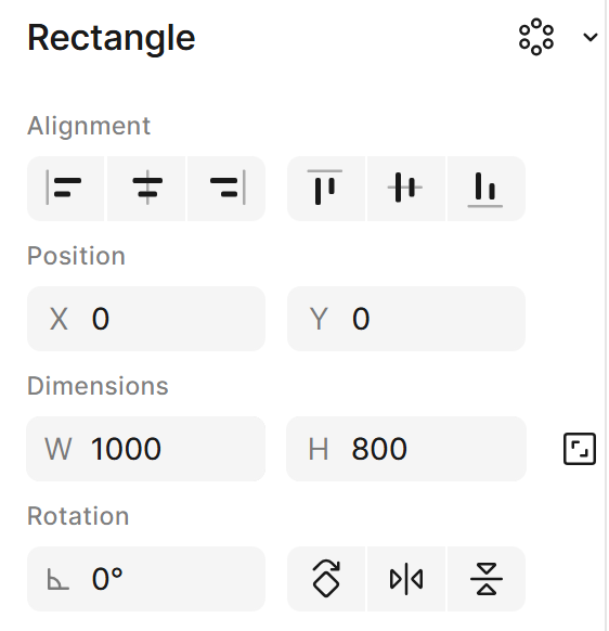
Top tip for getting your export ready for easy aligning with your Tableau dashboard, is using the alignment and positioning section to line up with your Tableau Dashboard layout:
In Figma, you can set the background layer exactly to your Tableau Dashboard dimensions, and set the position of the Figma background at X 0 & Y0 positions on the canvas:
Within the grouped layout, you can then note the positions of each individual element using the Figma coordinates. When the background is brought into Tableau as an image on the Dashboard, the exact coordinates of each element can be used to exactly position the Tableau Dashboard elements as desired. This will ensure all items are precisely aligned or positioned, even though the items are essentially 'floating' in Tableau on top of the Figma background.
There are so many ways Figma can be used to enhance dashboards, and with the wealth of resources, tips, and advice available, I’m looking forward to continuing to learn how to design assets that support clear and effective data communication.