


Colour can quickly communicate what numbers alone can’t. Conditional formatting allows you to automatically change the appearance of visuals based on the data they display, helping highlight key insights, trends, or issues at a glance. In this blog I’ll walk through how to apply conditional formatting in Power BI using the Sample Superstore dataset.
There are a couple of ways to apply conditional formatting in Power BI. The first method is by setting up rules, which let you define how colours change based on specific values or thresholds. I’ll start by showing how to use this rule-based approach before moving on to how you can achieve the same effect using a measure.
Method one: Rules
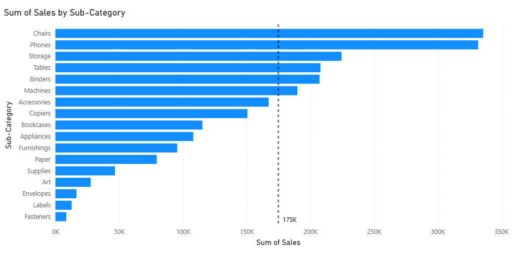
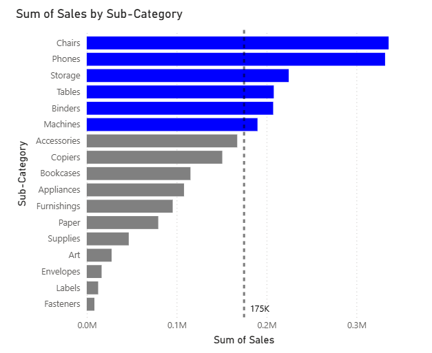
We are going to use total sales divided by sub-category, with a sales target of 175K. The goal is to highlight all sub-categories that have sold over the target in blue, and those under the target in grey.
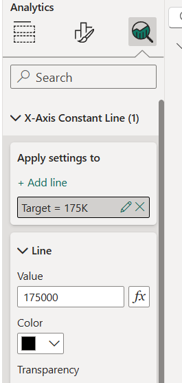
To add the reference line (the target value in this case), click on the chart and you’ll see a magnifying glass icon with an option for an X-axis constant line. Enter the target number and select the colour you want the line to be.
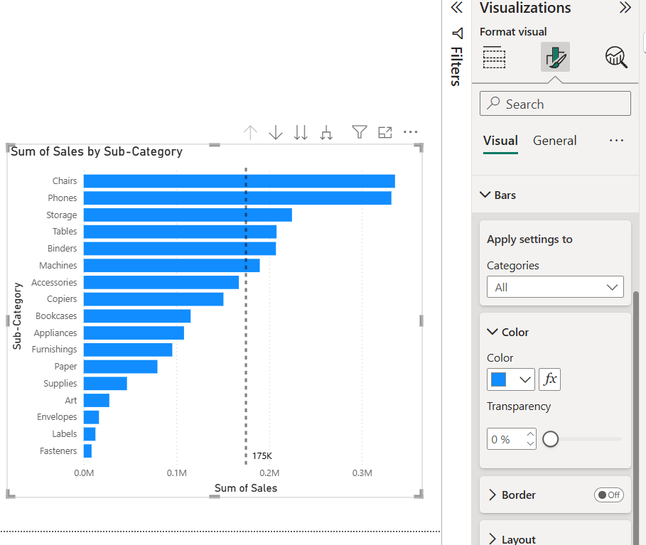
Next, go to the Format your visual pane. In the Visual section, find Bars and you’ll see a Color option with an Fx icon beside it. This icon opens the conditional formatting settings.
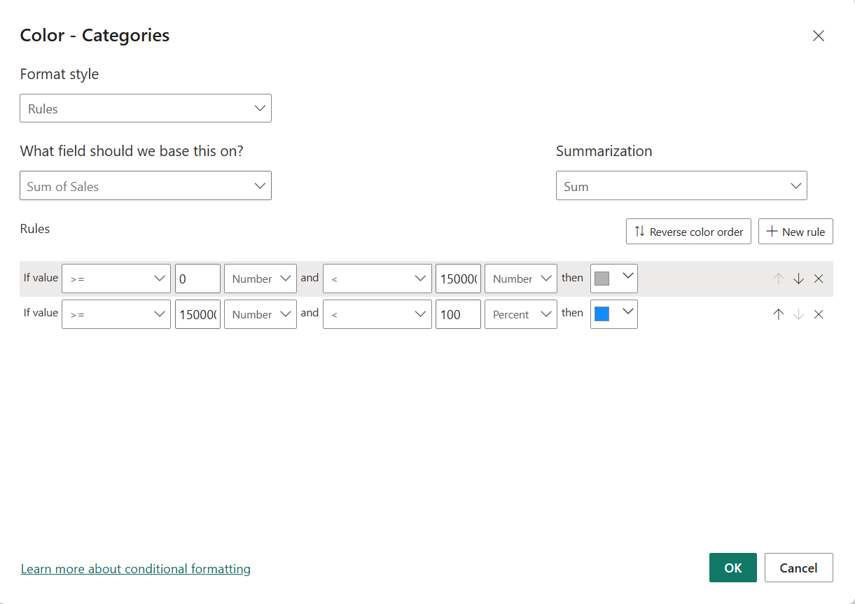
Once you click on the icon, a pop-up window appears. For this example, the format style will be set to Rules. The field this is based on is Sum of Sales, as this determines the length of each bar in the chart.
Now, we’ll define the values for each rule. The rules act like an input IF statement. For the first condition, if the value is greater than or equal to 0 but less than 175K (our target), the bar will be grey. The second condition applies to all bars that reach or exceed 175K, and for this we will set the upper limit to 100% and colour them blue.
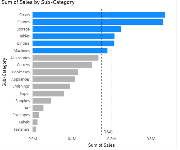
After pressing OK, the bars will update to reflect the formatting. All bars that have met or exceeded the target are now blue, while the rest remain grey. In this example, Chairs, Phones, Storage, Tables, Binders, and Machines have all hit the target.
Method Two: Measure
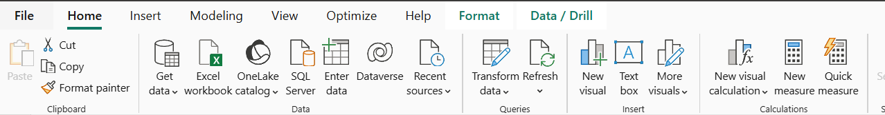
We can achieve the same result using another method, by creating a measure. To create a new calculation, go to the Home tab and select New Measure under the Calculations section.
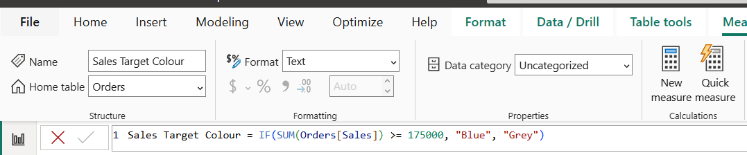
Similar to the rule-based method, we will now write an IF statement in DAX, which is Power BI’s formula language. We’ll call this measure Sales Target Colour. The logic for this statement is straightforward: if the total sales for a sub-category are equal to or greater than the 175K target, the result should be “Blue”. If the value is below the target, the result should be “Grey”.
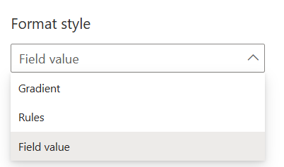
Next, go back to the Format your visual pane, find the Bars section, and in the Color field click on the Fx icon again. This time, select Field value as the format style.
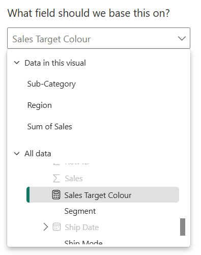
For the field, choose the Sales Target Colour measure you just created and select OK. The bars will now display the same outcome as before, with all sub-categories that reached or exceeded the 175K sales target appearing in blue, and those under the target appearing in grey.
Conditional formatting is a simple but powerful way to make your Power BI reports more insightful. Whether you use rules or measures, it helps highlight what matters most and makes your visuals easier to interpret at a glance. Experimenting with both methods can help you find the approach that best fits your reporting needs.