Today’s task was to get a hold of some baseball data and make something of it.
The data came from https://www.retrosheet.org/gamelogs/index.html who track and record all of the match data since the 1800’s!
Now personally I love baseball and am probably one of only a small handful of brits that do! So I was really quite excited when we go our remit. I instantly started to imagine all of the possible things I could do with it, demonstrating how much of an impact the legends of the game had on team successes, creating skill rankings, and so forth. However, that dream was short lived.
Baseball should also have a special place in any budding data analysts heart as it was the actions of general manager Billy Beane and his attempts to revolutionise baseball by using raw data to assemble a competitive team that brought the real power of data to the masses. His team, Oakland Athletics went on to achieve some of its greatest successes in the following year, so much so that Billy Beane was then approached to manage the Red Sox (a top tier team) and offered the largest salary any general manager at the time would have made. Despite turning down the offer, the Red Sox employed his tactics anyway and went on to credit this for their winning of the World Series two years later.
Anyway, history lesson over, back to the task at hand:
The main issues we had was that the data was not detailed enough to attribute events within each game to a specific player, and as each row was a single game, citing both teams and their statistics, we had trouble establishing trends for a specific team.
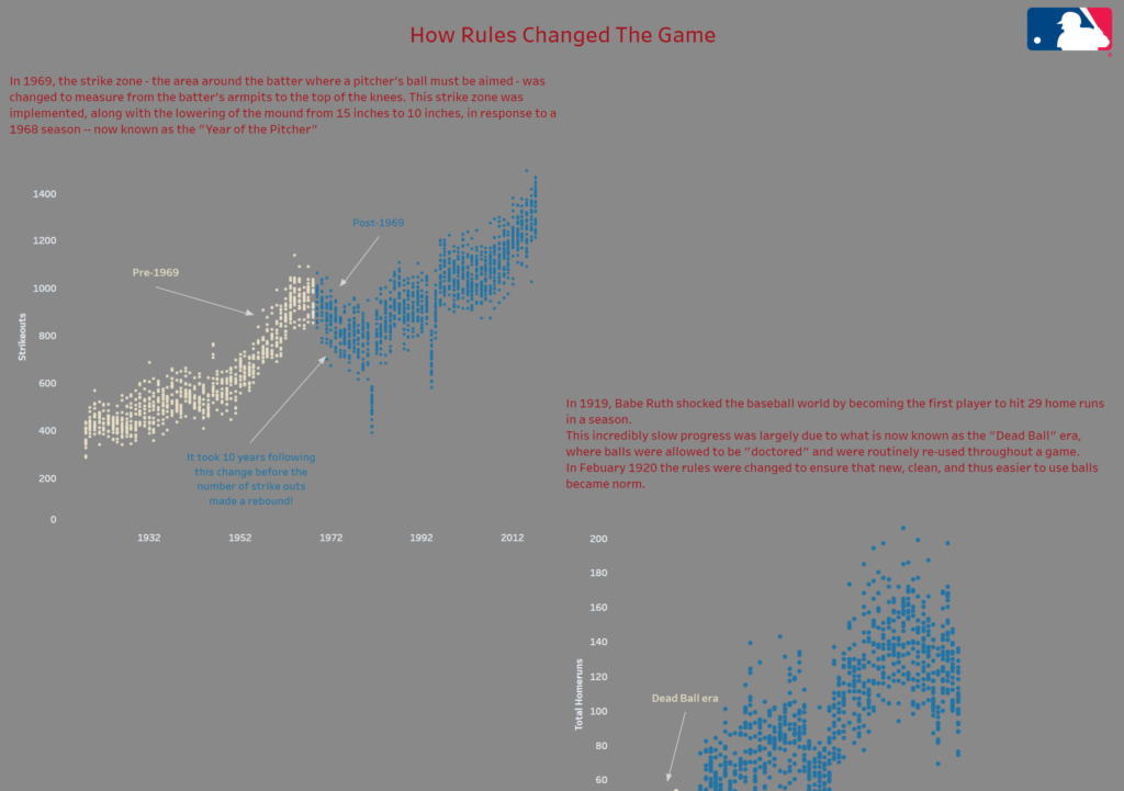
I decided to use my advantage of some familiarity with the game, and created a viz that showed the effects of some of the most significant rule changes the game has experienced. So for instance, you can see a significant increase in home runs after the “Dead Ball” era – when the regulation regarding the re-use of balls and their standardisation was introduced.
The design of my viz is rather simple and in fact utilises the same style of graph in each segment, but it gets the job done and presents the information in a clear way.
Anyway, here it is so you can see for yourselves!