


Sorting Nested Data:
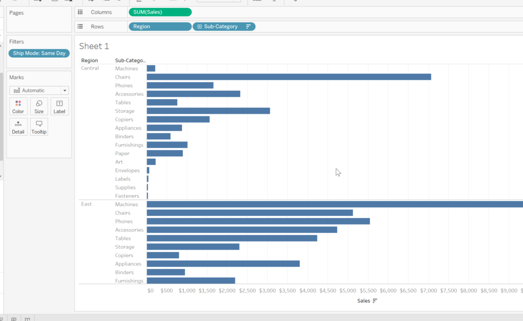
Using Superstore data as an example, if we were to produce a bar chart looking at Sales not only by Region but by Sub-Category also, and also for extra fun, stick Ship Mode on filter and choose only “Same Day”, we would have a load of bar charts listed in alphabetical order by Region (or whichever is left-most as Tableau reads left to right). If we tried to sort these bar charts, either by clicking the drop down on the dimension names, or by clicking the sort button next to the Sales axis, you may notice that not all the bars are sorted correctly. That is because the graph is nested (split up by region) and the data is trying to sort the aggregated sum across all values:
There are three ways to correct this issue, and make each section sort independently:
The “Negative Measure Sort”
Duplicate the Sales measure, either by dragging the current one whilst pressing Ctrl, or simply fetching a new one from the data pane, and drag it down into the shelf with your Region and Sub-Category dimensions. Double click on this new Sales “pill” so that you can do a “quick calculation” and simply type a “-“ (minus sign, without the “”) in front of the word “SUM” and then hit enter. Next, click on the dropdown menu on that same pill, and convert it to “Discrete”. The pill should have turned blue. The last stage is to simply drag this new blue pill in between the Region and Sub-Category ones, placing it in the middle. BOOM! The graphs have magically sorted themselves. Now to tidy the page up, simply right-click the new pill again, and de-select “Show Header” and “Include In Tooltip”.
The “Ranked Sort”
This one is very similar to the above option, we start by duplicating the Sales pill, and bringing it down onto the shelf with Region and Sub-Category. Again double click the new Sales pill to edit its calculation, but this time type “RANK“. If you press the autofill or enter it will replace SUM, which means you simply have to re-write it, but if you do this a million times as I have, it gets a bit frustrating! To avoid this, don’t press the auto filter, just type it out yourself, and remember to place a new bracket both directly after RANK and at the end of the calculation – It should now look like this: RANK(SUM([Sales)).
Again turn this into a discrete value in the dropdown menu, and move it into the middle. BUT THAT IS NOT ALL! So unlike the previous option, it has not yet sorted the columns. You need to first select “Edit Table Calculation” from the drop down menu, then “Specific Dimensions” , and finally, tick Sub-Category. Voila!
This may seem like a longer and more complicated version…. Well it is…. But it is very helpful when you have more than two dimensions on a shelf as it gives you greater flexibility as to how to sort the data to your preferences. Oh and don’t forget to clean up the page again by de-selecting “Show Header” and “Show In Tooltip”.
The “Combined Fields Sort”
Ok, the final option. For this one we are going to start by simply double clicking the white space next to your Region and Sub-Category pills in the shelf. This should open a new “blank” pill ready for you to type into. This time simply start typing “Region” and either let it autofill or type it out yourself, type a plus sign “+”, and then finally type Sub-Category. This way will require you to cycle through the sorts, either via the axis sort, or in the new combined field’s dropdown.
In the next blog we will be talking about joins and splits, it would be helpful if you could use the newly created “Combined Field”, simply pick it up and drag it to the data pane and rename it if you wish.
Have a good one!