Hey Everyone!! So today I will walk-through my thought process for my latest Makeover Monday. I usually like to spend a bit of time on Makeover Monday (~3hr) to iterate on all the smallest, and probably pointless, design quirks. But not today. I gave myself a strictly timed 1 hour.
The Original Viz
What works and what doesn’t?
I don’t mean to be too rude but I’m not sure that much stuff works in the original viz. I’ll try to succinctly list off my bullet points for why (sorry, I’ll be super critical);
What works
- I guess you could say all the information is there. With enough time, you can decipher the trends but it isn’t immediately clear.
What doesn’t
- It’s sorted ascendingly but you have to refer to the key every time. The key is also long and a bit wordy.
- The colours also aren’t really a great selection. Grouping gender or teacher class by colour could have been a great opportunity to differentiate but it all seems a bit random.
- The X axis is missing it’s currency symbol.
- There doesn’t seem to be any story telling going on. What is the key insight? Seems like a bit of a lazy sort.
Makeover Time
Well, I’m no expert, but I can try my best to rectify the problems I saw in the initial viz. The first thing I do when I get a completed dataset is to look at what it could be telling me. I go through each indicator on the dataset, compiling graphs, until I find some interesting insight.
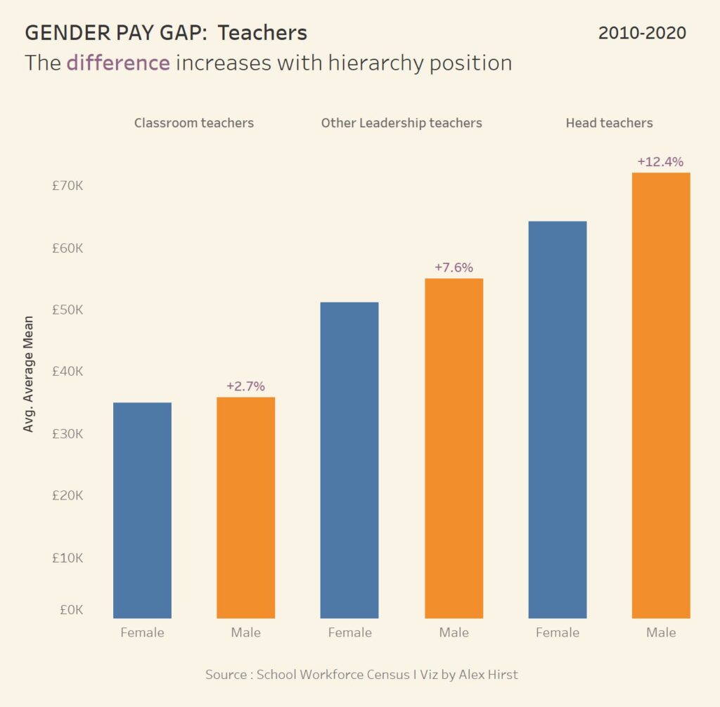
Now, for this viz it seems like it’s targeting the gender pay gap. More specifically, the gender pay gap across different hierarchies of teachers. This is the chart I saw this in;
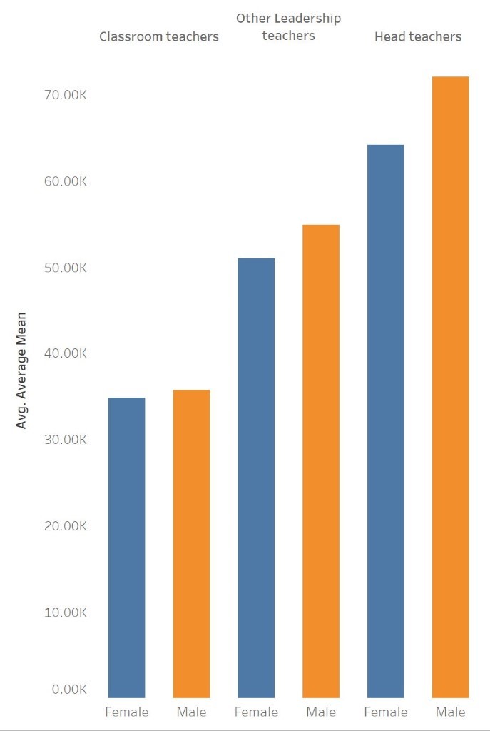
You can see that not only is there a difference, it looks like the difference increases the higher up in stature you go. This is my insight for the viz.
I haven’t got long so now I just need to quantify that gap. It wouldn’t be wise to use the currency as it’s hard to value that increase in difference easily. Ok, male head teachers earn 8k more than their female counterparts, and male leadership positions 3.8k more than female leaders. But there’s a 18k difference in salary across teacher roles. % increase will give the reader a far quicker and more accurate interpretation.
Percentage difference doesn’t have to be a long expression either.
Duplicate the average pay pill in the rows column > Right click > quick table calculation > percentage difference > right click on pill again > compute using > pane (across) > drag the pill in rows onto label.
Now we have quantified the difference in an easy way for the reader. What’s next? A quick change of the number format to include currency. Right click on average pay in data pane > default properties > number format. I have added the prefix of £ and taken the 2 decimal points away. A suffix of K is also added to show thousands. Also, lets not forget to add the time period for the dataset.
Finally, a bit of story-telling. Something to indicate to the reader what’s going on. The title ‘’GENDER PAY GAP: TEACHERS’’ sets the story for me. The sub-title ‘The difference increases with hierarchy position” gives my insight.
Okay, here it is. A very simple viz. Nothing fancy, but I think solved most of the problems. I appreciate the difference label can be confusing. I’ve tried to colour code it but I’m still not sure it’s too clear.