Welcome to the end of week 2 habitual blog post. Here’s a roundup of the best tidbits that I took on board:
Presentations, presentations, presentations.
We have completed a further 2 more presentations this week – that takes the total number to 3 now. Specifically, we gave a ‘Tableau Demo’ to a room full of our DS6 colleagues to prepare us for client work in 13 weeks’ time. We also presented our first group project work back to the client – which was nerve-racking with the majority of TIL Core Team present at the same time.
Presentations are part and parcel of the work we do at The Data School, as we aim to increase Tableau usage in general and communicate insights back to our clients. A large chunk of our time each week is given up to honing the art of presenting succinctly.
Having a background in management consulting, I had to get used to presenting. Presenting is one of those things we all dread; however, it certainly gets easier the more you practice and, as we are regularly recorded and streamed worldwide by Andy, on receiving feedback from our peers.
Fixed vs. Floating Layouts for Dashboards.
Having only put out several vizes, I was unaware of the difference between building a dashboard using fixed or floating objects.
David Krupp, a week earlier, shared the opinion that the floating option was ‘best-practice’ as it is less likely to skew when a user uploads their Viz to Tableau Public.
To do so, he gave a top tip:
- On your dashboard, set the size to ‘Fixed’ and decide on a size
- Then go back into the same menu and set the size to ‘Automatic’
- This gives you an excellent starting point to then switch the sizing to ‘Floating’ pixels
I’ve spent the last week trying this approach out by specifying pixel dimensions for each of the objects I add onto my dashboards.
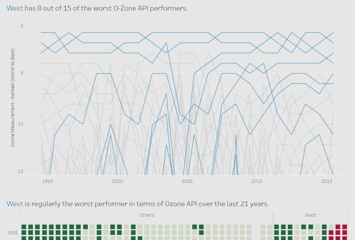
The result was a polished finish – as you can see from last week’s makeover, here:

What the heck are parameters?
We had Sasha in from DS1 this week giving us a masterclass on ‘Parameters’. She opened with a wonderful statement that I felt accurately conveyed the role Parameters play in making the dashboard more user-friendly – “Parameters give the user control over the visualization”.
Whilst here, she also dropped a REALLY useful piece of guidance:
“I usually start all viz’s by moving the ‘Measures’ onto the chart area first. This is useful as it automatically sets the axis.”
Top Logos.
With each viz I make my confidence to experiment more with design grows – in my next viz, I want to make use of some new tools, such as graphics/logos/custom maps. Here are some top sites to look over if you’re interested in doing the same:
What does Tableau Server do?
We had J-Mac come in this week to run through what Tableau Server does. So, if you’ve ever wondered – here is a very brief run-through of ‘what Tableau Server is useful for’:
- A central online repository for your organization’s Tableau content
- Admin can manage access permissions – keeping sensitive files locked down
- Data sources will update automatically – therefore the viz will always remain up-to-date
- Has the capability to send personalized alerts – for example, if your organization’s profit margin drops below a certain level
- Can edit Tableau vizes on the move via the web – useful if you don’t have Tableau installed on your laptop, a client’s tablet, etc.
AJ
