


I took a hiatus from writing my weekly blog last week – as we penned no less than 5 blogs in a series Andy imaginatively calls ‘Blog Week’ – but, not to worry, I’m back with my big hitters from last week.
Hate having to manually code your colour palette?
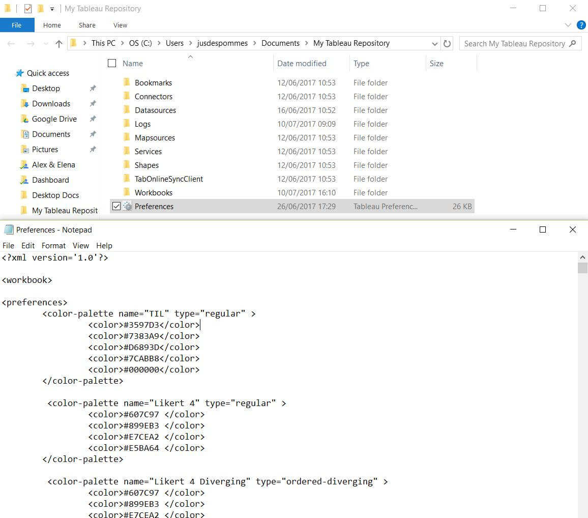
Big bugbear in Tableau – when you finally get to the point where you are happy with the content you’ve come up with and it’s formatting time but you fancy using a custom colour palette. Before I knew the below trick, I would spend time searching for the specific HTML colour code, then code them individually into the ‘Palette’ file in the Tableau Repository.
Old method:
Not anymore – when you’re working with a specific client, as for example, we were last week with Inchcape Shipping Services, it’s nice to make use of their palette in the dashboard you are delivering for them. This is the ‘411’ on how to achieve this in seconds.
New method:
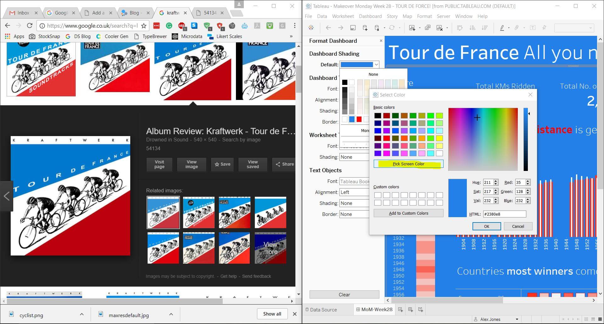
- Visit the said client’s website – or find an image with nice colours
- Arrange your desktop so it shows both the site and the Tableau dashboard you’re mocking up simultaneously
- Click on ‘Edit Colours’ on the section you wish to edit
- Click ‘Pick a Screen Colour’
BOOM. Game changer – gone are the minutes of rigmarole you previously used to face the same issue, you’re welcome. Big shout to Lee Gibbons for this tip!
Want to show off a lovely pic of your latest dashboard?
Shout out to Marcus Grant for this tip. Unfortunately, you will need a copy of Tableau Desktop though – but to make a full-screen pic of your dashboard, go to the ‘Dashboard’ menu and select ‘Export Image’ – simple, but I used to spend ages trying to screen capture this before knowing the right way!
How do I show ONLY the latest number on a graph!?
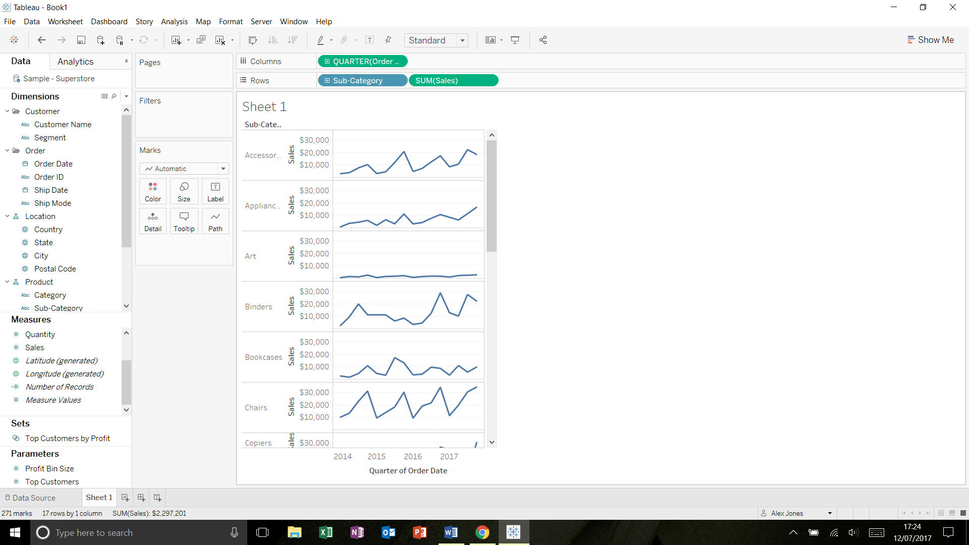
So, when I used Excel I used to chuck this feature onto a lot of my dashboards as clients always seemed to want to have the latest figure highlighted to them. Since starting to use Tableau, it’s been puzzling me how I achieve the same effect. To show you, I’m going to recreate some snazzy ‘Sparklines’, which will include the formula that adds the last (most current) figure to the end of the graph. For those not aware, ‘Sparklines’ are ideal for showing the trend in a value, rather than specific values. It’s still nice to show the end result though, as this gives some idea of current performance:
Using Superstore as our dataset (this can be downloaded from Tableau, it’s their default dataset – https://community.tableau.com/docs/DOC-1236)
- Double click on ‘Sales’ in the measures – this will automatically create your axis
- Drag on ‘Sub-Category’ in front of it on the ‘Rows’ shelf
- Place ‘Quarter – Order Date’ on the Columns, make sure it’s continuous (i.e. Green pill)
- Reduce size of the chart to look like the below
- Right click on ‘Edit Axis’ on the ‘Sales’ axis
- Set your axis to be ‘Independent axis ranges for each row and column’ and uncheck ‘Include zero’
- ‘Create a calculated field’ called ‘Current Sales’ – the formula you will need for this is:
- if last() = 0 then zn(sum([Sales])) END
*** What this is doing is using the ‘Last’ function (which acts as an index going in reverse for the values in your window – i.e. 0 is the last, then 1 is the next to last, and so on). ‘Zn’ function merely sets any nulls (i.e. blank values) to zero. ***
- You can then drag this value onto your Label shelf
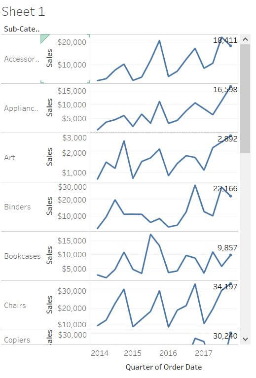
DONE.
See you next week! 😊