


So, my first week at the illustrious Data School is up and, aside from now knowing how to make a pie chart, here is what have I learned:
Introductions – “You need to get used to that…”
One week in, three introductions down. Andy (our head coach) forewarned us that we were going to get very used to introducing ourselves in the first few weeks, and he wasn’t lying. Around the DS6 table, we’ve got a real mix of backgrounds. I’ve learned, for example, that we have a sports’ better, an ex-England rugby player, a Nepali with the same name as me, a Macedonian, a handful of economic degrees, and so on – all brought together through a common love of data and desire to learn more about Tableau. A fact I find comforting at this stage is that the majority of us are fairly new to Tableau, which should make learning how to use the tool over the forthcoming months very much a collaborative process.
“Start by asking questions of the data” – James Eiloart
As a polished speaker who clearly knows a lot about Tableau, listening to Tableau’s SVP for EMEA chat to us on Tuesday was a complete pleasure.
One point that resonated with me was how he felt Tableau affords a user the unique ability to approach their data in a different manner to other, similar programs. Tableau users should not necessarily have preconceived ideas of the kind of results they want to see and instead should question their data by playing with it to discover insights – which, for someone with a background in Excel, was a refreshing idea to hear.
Show caution when uploading your new DS profile picture.
On day one, Marcus uploaded his most professional looking LinkedIn profile photo – cue en masse Photoshopping. Welcome to TIL, Marcus. 🙂

Why are my data fields showing as blue and green?
As a relative Tableau newbie, I’d noticed (but not necessarily dug into the detail around why) my fields were showing up as either blue or green on Tableau’s sheet view.
Well, now I know – in a nutshell:
Blue – represents Discrete data – a finite number of values, these are ‘rows/headers’ that split up your data, right click on your chart axis and it will NOT show the option to ‘Edit Axis’.
Green – represents Continuous data – an infinite number of values, right click on your chart axis and it will show the option to ‘Edit Axis’ – as it is an axis.
(From TIL founder Tom Brown, more detail on this: https://goo.gl/rZzHJs)
I can make ‘Pie Charts’ now.
For something that seems so intuitive for an Excel user, making a pie chart in Tableau requires a little bit more finesse.
Here is a no-thrills approach to creating a Pie Chart from just 2 numbers – an exercise that took us a considerable amount of time to understand:
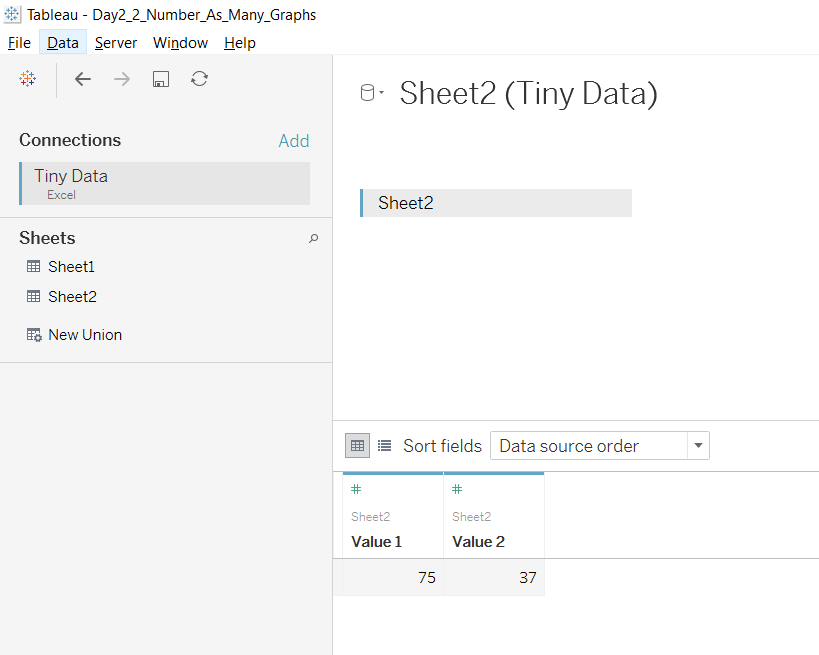
The data set.
- Once you’ve added the above data, load your sheet view.
- Change ‘Automatic’ to ‘Pie’ on your ‘Marks’ shelf.
- Drag ‘Measure Names’ field onto ‘Colour’ in ‘Marks’ shelf.
- Drag ‘Measure Values’ field onto ‘Angle’ in ‘Marks’ shelf.
- Drag ‘Measure Values’ field into the ‘Filters’ shelf and turn off ‘Number of Records’ in the resulting window that pops up.
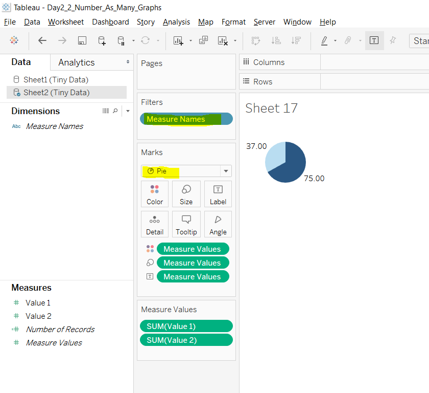
Result.
“But what are you ACTUALLY sorting” – Carl Allchin
Carl came in to lend a hand with coaching this week and cut straight to the point around what you’re actually sorting when you sort your data.
In his words, “When you sort, you are sorting on the discrete (blue pill) values” – mind blown. Thanks, Carl.
Create as many graphs with 2 numbers (37 and 75) in 15 minutes – *Andy cues Jeopardy music*
A useful task for exploring the art of the possible in Tableau – have a go yourself. Here is my resulting effort:
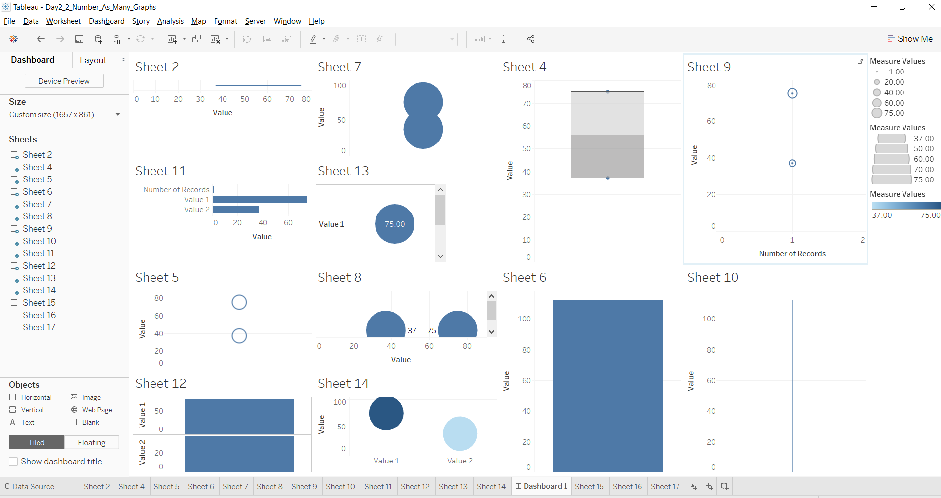
AJ