


This week brought with it the arrival of Alteryx training for DS6. For those not in the know, Alteryx is a piece of software that works wonders when cleansing data in preparation for importing into Tableau (or similar tools) for producing visualizations. Without oversimplifying the power this tool has under the hood, Alteryx can help you clean a messy data file in a fraction of the time that it would take you to use Excel to complete the same task.
Alteryx Basis.
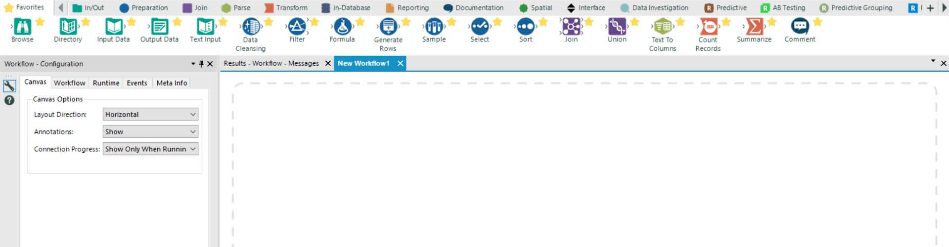
When you work in Alteryx, this is the screen you will spend 99.9% of time working on. It’s where you make all the magic happen. DSers this week have let out audible ‘wows’ when the realization hits home how much time they have previously wasted employing Excel to do a similar (substandard) job.
To use Alteryx, you drag and drop those big blobs at the top of the figure above onto the ‘Workflow’ – it’s that simple. These manipulate your data in ways that make complete sense – particularly when, as we are advised to do, we explain what we want to happen in ‘plain English’ actually happens.
Many of the tools you see on my favourite toolbar sound similar to those you would find in Excel – for example: ‘Filter’, ‘Sort’, ‘Comment’ – however, there are also some new data functions that you wouldn’t necessarily find there – such as ‘Join’, ‘Union’, and ‘Data Cleansing’.
I can do that in Excel.
I know my Excel. I’ve grafted hard for the last 4 years to say that. I must make this clear as I meet many people that lay claim to being an ‘expert in Excel’ when they’re simply not. And so, when I say that some of the things that Alteryx can do in say 10 clicks would take literally hours in Excel to achieve the same thing, I mean it.
I suppose the most powerful example of this that I’ve been shown is in the below ‘Transpose’ exercise:
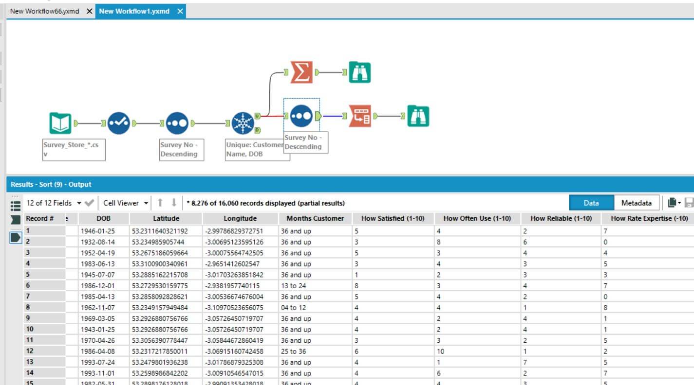
We start with this dataset that can’t be read properly by Tableau. It can’t read the data currently as Tableau needs it in the format of the ‘How’ columns transposed (i.e. brought into one column).
You can see above that I am currently on the ‘blue’ tool before I perform the transpose function represented by the red icon next to it.
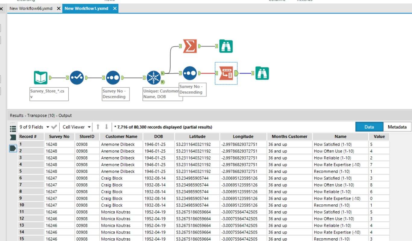
Once I run this function, you can see the results. The numerous ‘How’ columns have been transposed into one column – that can now be read by Tableau, thus making my data usable! This process took less than a second to run and at max 5 minutes to code (as I am a beginner) but it has a powerful effect on the data. Importantly, and to reiterate, this would have taken ages in Excel – what a tool!
AJ