


Day 3 of Dashboard week saw us looking at looking at an emotionally impactful viz from the Huffington post showing US gun deaths since the Sandy Hook massacre. The data runs from the day of the massacre (14th December 2012) to March 22nd 2013. During those 3 months there were at least 2244 gun deaths. The viz powerfully illustrates these shocking statistics. There is at least one death on each of the 98 days that the data runs for.
After downloading the dataset I started by recreating the dashboard in the Huffington post. This was pretty straightforward in Tableau and so I then went about seeing what else could be done. The rather morbid dataset consisted of a list of all the incidents with the victims names and geographical data and date along with URLs to news reports. Detaching from the emotional aspect for a second, this was a simple dataset and despite this, Tableau still allows the analyst great variety in creating a dashboard to illustrate this data.
Recreating the original dashboard:
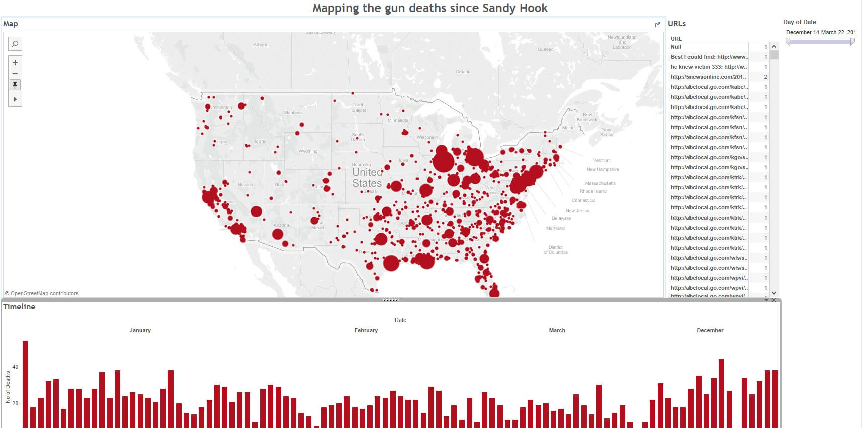
I then added a running total and some bar charts showing the worst cities and dates:

This makes the data more analytical but it almost becomes easy to forget that each of the data points is a fatality and a tragedy. So I wanted to move away from the analytical and back to the emotionally hard hitting and real. I remember a while back seeing another viz on US gun deaths and wanted to see if I could recreate something similar.
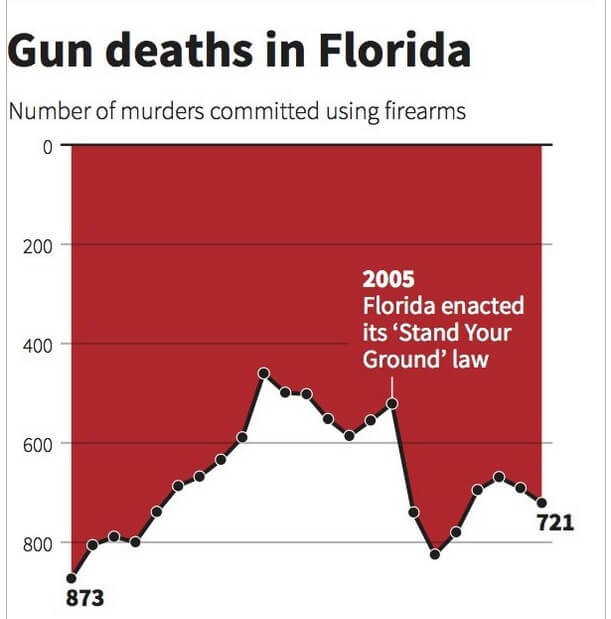
While the viz arguably does not follow best practice – the reverse y axis becomes misleading particulary when looking at the 2005 ‘Stand your ground’ law implying a drop in deaths when the opposite is the case – it gives this gruesome appearance of dripping blood and becomes quite emotionally hardhitting. I think the reverse axis is easy enough to understand in terms of seeing the worst days with the highest deaths but the 2005 annotation, while certainly an important point then becomes confusing as we expect a jump up rather then down to represent an increase in deaths.
I managed to recreate the bar chart easily in tableau but then wanted to make it more hard hitting. I wanted to make my viz have an animated component like the Huffington post one. Using pages I wanted to see if I could create a animated dripping effect of the data points. I thought this would have real impact because then each individual data point (corresponding to a fatality) would be shown rather then just the aggregated total amount. By aggregating the data, we seem to take away the human aspect by converting individuals into numbers. The dripping effect would then make it seem very real as well. There was certainly an emotional aspect to building this dashboard and Tableau helps to convey this.
Below is a screenshot which doesnt show the animation – it can be found on my Tableau Public profile. Please feel free to take a look and any tips or constructive feedback is appreciated.
