


On Thursday after presenting Wednesday’s rather morbid dashboard on gun deaths in America, we looked at a UN statistics challenge dataset and were tasked with making a dashboard for this. The data had already been downloaded and Pablo tidied it up in Alteryx so we all had the chance to work from the same dataset. The first thing that struck me upon looking at the dataset was that it was huge! It was also pretty complicated and I spent quite a while just studying the metadata. This was in stark contrast to other dashboard projects this week where we have been dealing with small, simple excel spreadsheets and in the case of Monday, just two numbers!
Normally when I have transposed the data in the past, it has been pretty straightforward to see what is going on in terms of the transition and understanding how it will look in Tableau but this was quite different. This probably had something to do with the fact there were over 160 rows representing over 200 countries over a period of 15 years. Needless to save the dataprep was going to take a while on this one!
I have never seen so many NULLs in my life! This was mainly due to countries only having data for some of the years and also that there were 160 measurables! After getting a better understanding of the data, I then spent a while catagorizing all the measurables into folders in the data window so not to have to scroll up and down repeatedly. The search function at the top also came in very useful! Then it was a case of where do I start?! There was so much data and lots of obvious measurables that you would think would be good to compare but even then, what to include and what to leave? Many countries only had data for a small, limited number of years so it was difficult to produce a timeline and see that change however given that the total dataset went from 1983 to 2015, with solid data only really appearing in the 1990s perhaps this was not a long enough timespan anyway to see the profound changes that the UN is supporting.
A while back while discussing poverty, a friend said that the single biggest cure for elevating countries out of poverty was empowering women and so I thought this would be a good basis to analyse my data from. Sure enough after putting some scatterplots together, the results certainly seemed to back this theory to an extent and make for some interesting discussion points.
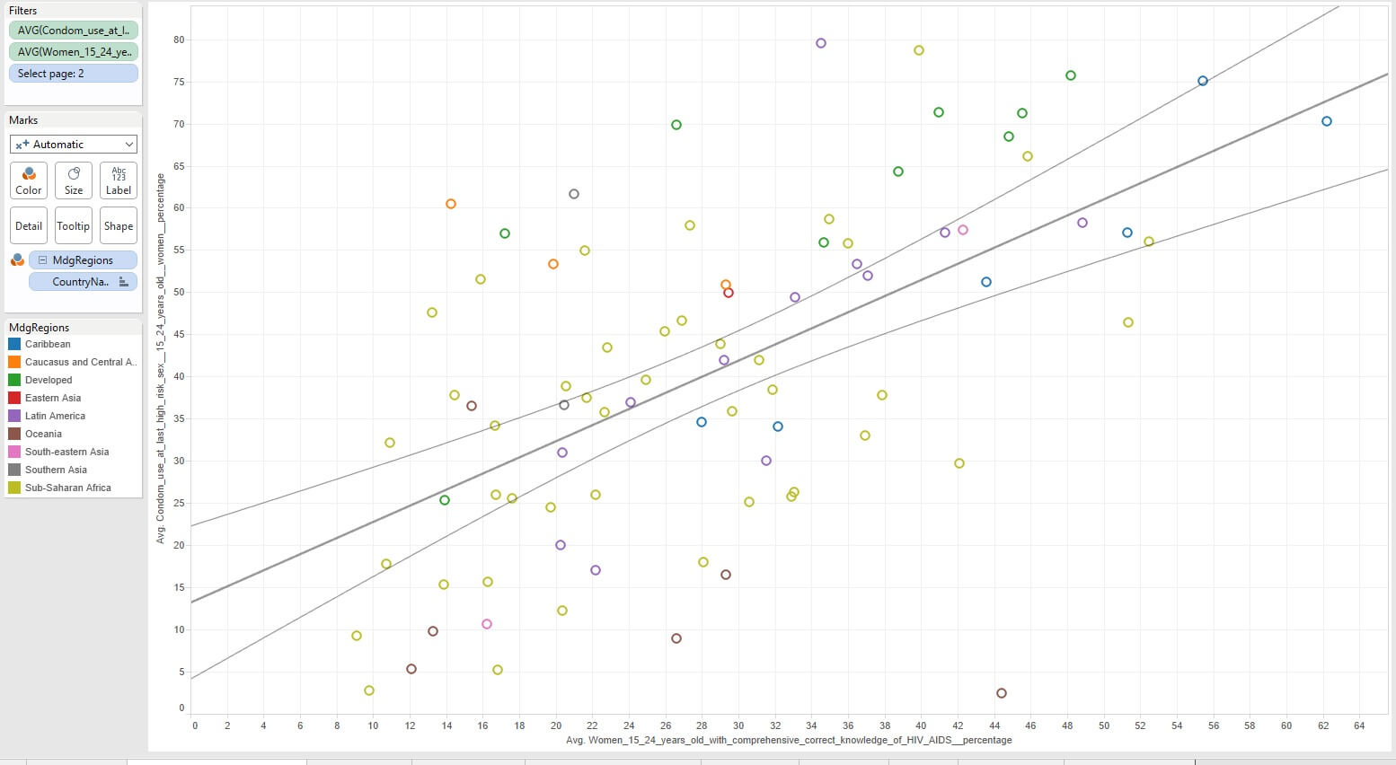
First of all I looked at the 3 major diseases that were given in the dataset – Malaria, Aids and Tuberculosis (TB) and thought it would be interesting to compare them to literacy rates for women. While one may not assume the two are directly linked in the same way as say condom use and spread of Aids there was certainly a correlation. Admittedly these diseases are predominantly widespread in Africa and parts of Asia but where these rates were high, often there was a relatively low average percentage literacy rate for women. My dashboard uses a parameter to bring in a set of scatterplots one after the other with a matching narrative. My second slide compared condom use with average percentage of young women who understood HIV/Aids. Hear there was a strong positive correlation indicating that the higher the percentage who were well educated about HIV/AIDs the higher the percentage using condoms. I also added onto the size the number of deaths and we could see that of the noticably higher Aids death rates by country the highest one occured with a 46% condom use among young people. In other words as the use of physical contraceptive got higher, the average deaths from Aids got smaller. When comparing this AIDs death rate with the literacy however there doesnt seem to be much of a correlation until we see on the x axis that the highest value is at 62% and only a handful above 50% who are well educated about HIV and AIDs. So in our dataset the vast majority of countries in this chart have less than 50% of women who are well educated about HIV and AIDs.
I then went on to look at adolescent birth rate and children under 5 mortality rate. I recalled from school that countries originally had relatively high death and birth rates before improvements in medicine and living conditions brought down the death rate and eventually the birth rate as well. So I wanted to see therefore how birth and death rates compared in countries and whether there was any correlation. There wasn’t particulary but as the countries were grouped as developed and the non-developed by continent we could see strong categories between these sub-categories. One outlier that was a group of Latin America counties that had low death rates but still high birth rates. My instant thought was if religion had an effect on this but as I did not have the data for this I couldnt compare. I did have data for condom use of course but this was not avaiable for the countries of interest.
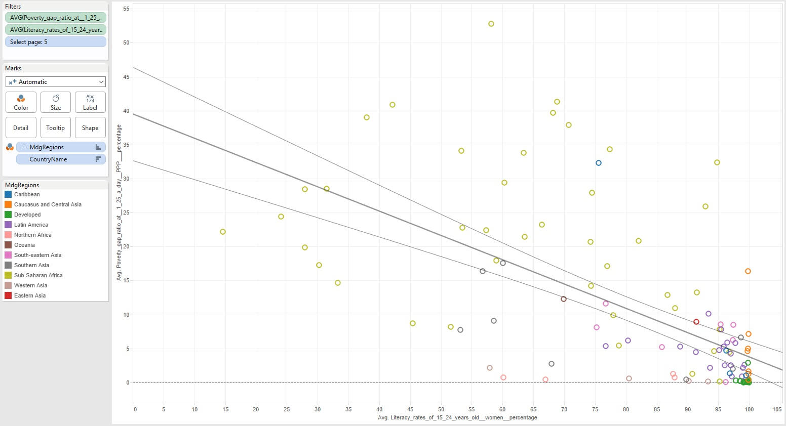
I then compared female literacy rate against birth rate and against a poverty indicator. In both instances that were strong correlations showing countries with high female literacy rates had both low birth rates and low poverty indicators generally.
I think when women are empowered through education, equality and by having control over their own reproductive cycles, then communities can really start to begin, over time of course, to move out of poverty. There are many other challenges not least disease, access to food and clean water etc and my last viz comparing female literacy rate to GDP shows that. Just because women can start to become empowered, it does not mean of course that a country will be instantly out of poverty but it is the fundamental start and I think without this, communities are doomed to remaining in poverty. The rest of my Viz of course is on Tableau Public.