


Day 3 into the dashboard week (I don't have a dashboard for Day 2 as I was in a placement call for half of the day yesterday). Today we were given the bike counters data from the City of Seattle.
So initially there are 12 files for the streets that have the bike counters installed. So I have union-ed all the file together. However every data set has their own naming convention. All of them followed a similar pattern with the street name and the direction of the bike goes, but the name of the columns are quite different. Some of them are called "North", "South", some of them are called "Bike North", some of them even counted the pedestrian etc. etc.. So it was quite a challenge to get the data union-ed together. I have used Tableau Prep to pull in all the data.
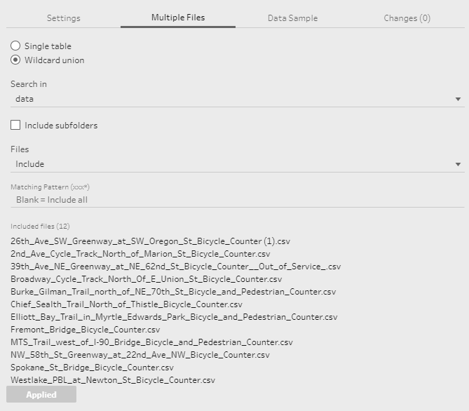
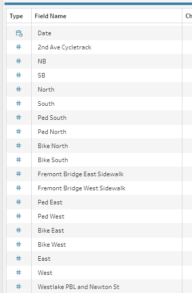
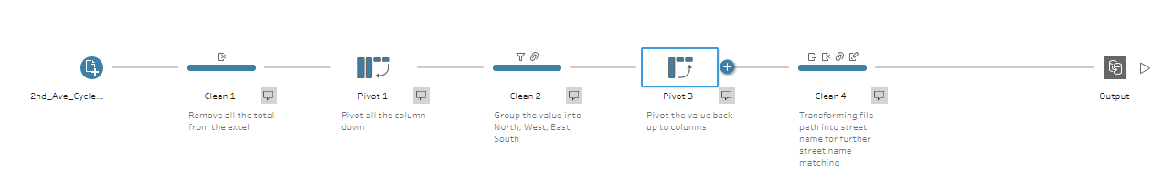
From the screen capture above you can see that the columns for each files are quite different. I have decided to group them into 4 main direction (North, West, East, South) and also excluding the pedestrian data. That requires a pivot down, grouping value and pivot them back up to the column. My Prep flow looks like something as below:
One big challenge from this data set is that the street name, it is quite messy to be cleaned. Originally I planed to compare the bike count towards the bike facilities or even the collision data. But the data set itself does not have the geo point data. So I have found a City of Seattle street data to try to join them in order to get the geo data. However the street name is really messy so I failed after trying to spend maybe an hour or two trying to map the name together. I ditched that idea after a short while as I know we do not have much time in dashboard week.
Today we have an additional challenge which is we will have to use Tableau Public web edit to finish the whole dashboard. This has make the whole task more challenging as web edit's functionality is quite limited, and which applies to the data source connection level. Tableau public does not support lots of different form of connection like spatial file. So my initial plan of doing a spatial join was deemed impossible. So I found a way to work around it which is using blend in Tableau desktop, create a data extract and push it up to Tableau public (it's kind of cheating I know...). The dashboard look like something as below:

So what I did after I failed to join with any other geo data, I used only the bike counter data to see if I can get any useful data/ chart / anything really. Luckily there is still something coming up, we can see clear seasonality and heatmap distribution on bike count. The map was a product of data blending, which requires quite some manual work (do not recommend). So this is dashboard week day 3 for us. I think the whole purpose of dashboard week is for us to learn how to fail quickly, and find a way to work around that. Take today as an example, we have some limitation - no Tableau desktop, hence the limitation on formatting and data source connection. We quickly figured out ways to work around it, which I think is a very important skills to have as a consultant/ analyst. So today's learning is definitely fruitful.