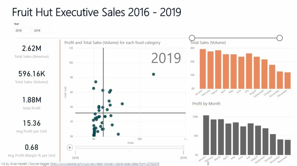
Today is the last day of dashboard week and we were tasked with making the visualisation on Power BI. Not only will we be working with a new software, but we have a 1pm finish today instead of 5. The data that we worked with was from Kaggle and looked at sales data for a grocery shop, between 2016 – 2019. The specifications of the task included that the dashboard we were making was to be a KPI dashboard.
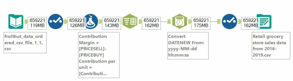
Using Power BI was an interesting change, it made some tasks very easy, but other tasks that I consider fairly basic, it made quite a challenge. I used Alteryx to do some minor adjustments and calculate profit and profit margin %.
As it was a KPI dashboard I wanted to have some BANs with key figures, the ones that stood out to me included sales in volume and revenue, profit, and a few metrics that looked at average unit level results.
I created a matrix so that the person looking at the dashboard could see the food categories split into quadrants based on how popular and profitable they are. Lastly, I created 2 bar charts to look at volume of sales and profit over time, to see the seasonality of their results. The full viz can be seen by clicking the image below.