This blog will critically evaluate the visualisation ‘Who’s winning the Cola Wars?’. It is based primarily on Coke and its contenders across a variety of categories.
You can find the visualisation here:
https://public.tableau.com/profile/andy.kriebel#!/vizhome/TheColaWars/WhosWinningtheColaWars
Before:
Use of Colour
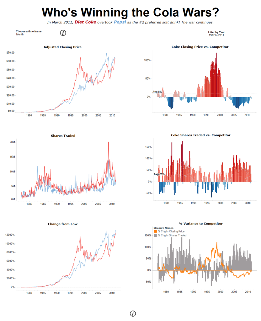
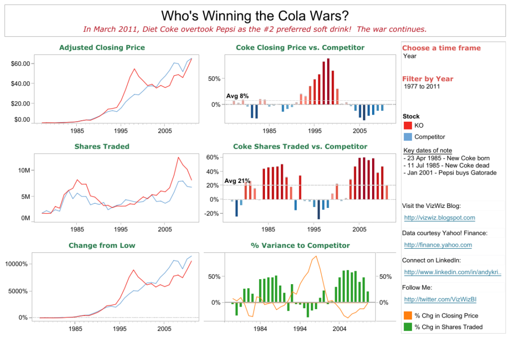
At a first glance, it seems as though the colours used reflect the brand and its competitor. Therefore, red for Coke and blue for Pepsi. The ‘% Variance to Competitor’ includes 2 different colours as it is a separate chart which works well however, this could be improved by making the bars grey and increasing the size of the line chart to make it stand out. Also, this varies the colour of the chart titles to the % change in shares traded. Personally, I don’t like the green titles and so changed these to match the main title in black. Generally, there are not too many issues with the use of colour at first, but more so in other areas related which I will explore below.
Formatting – Fonts, Lines, Dividers
The font used is readable and clear. The subtext is in italics which helps it stand out a little bit more. The issues arise with the lines and dividers for me. Personally, I think that the whole visualisation needs some space. I understand why there are borders, primarily to separate the charts, but I do think that this is achievable with space and more simple lines instead.
Title
We are given a question as a title which works well. The subheading gives us a little bit more context ending with ‘The war continues’. This leaves the user ready to explore this further within the categories given. I personally would ensure that the title is formatted much bigger and get rid of the border around it
Text Usage, Annotations and Context
The visualisation does not have too much text at all however, at the same time, it may arguably have too little. This to me is not the greatest issue as the aim of it is to explore coke vs its competitor which it effectively does. There is text on the side to mention key dates of note which adds context to the charts. I’d be tempted to also combine this into a hover icon.
Key Message
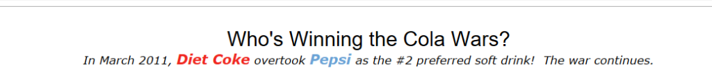
The visualisation starts with the key statement that ‘In March 2011, Diet Coke overtook Pepsi as the #2 preferred soft drink! The war continues.’ Therefore, the key message of the viz is to explore this ‘war’ within the key categories mentioned. Although making the statement in the subtext, it does not later conclude but rather allows the user to make their own from the information given.
Call to Action
The viz can also be tidied up, with space saved by adding the hyperlinks into a hover information icon.
Instructions and Explanations
There is simply the panel on the right with filters and a colour legend rather than detailed instructions. The filters do state ‘filter by year’ or ‘choose a time frame’. Both seem to be clear enough. I do not think much more of an explanation is required.
Filters
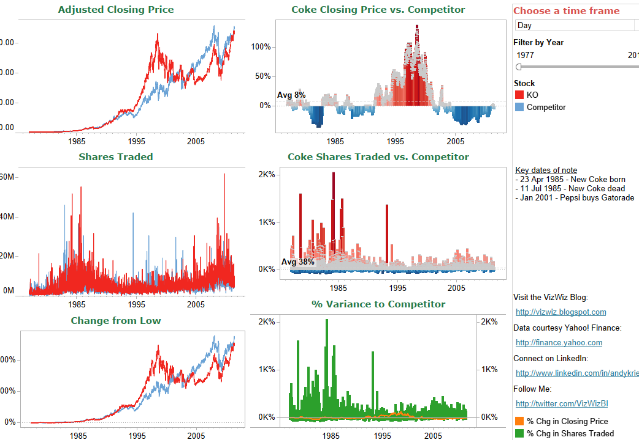
The filters used are simple and effective. I would suggest maybe the addition of a filter for day or month just in case the user wants to look at trends.
My issues arise at the next part –
Interactivity
The filters allow for interactivity which is great for the user who wants to drill down to see specifics. However, as I started to use the filters to drill down, I realised the lack of space became a greater issue. In the image attached, I filtered by day and this was the result. It was impossible to read.
Legends
The stock legends are not clear to me as I do not know what ‘KO’ or ‘Competitor’ means. The assumption is that ‘KO’ means Coke and the ‘Competitor’ is ‘Pepsi’. If that is the case, why not simply label them that? The % Change colour legends seem fine. They are clear. I would personally incorporate the colour legend for Coke and Pepsi within the subheading as that would be clear enough to the user and clean up the viz.
Labels
Due to the lack of space, we only get to see intervals of 10 years. The % Variance to Competitor Chart is a dual axis. The axis is synchronised and therefore we do not need both headers.
Tooltips
The tooltips used seem to be fine and quite precise. I am conscious that there is an element of time added but never changes. It seems that all of them are ‘00:00:00’ hours so changing it may be useful as it does not actually tell us anything.
Chart Types
I would say that the chart types used are appropriate. It just happens to be that the lack of space means that we cannot explore them in depth as I have mentioned before.
After: