


So many people look back on their dashboards after 7 weeks at the data school and cringe, but I'm super proud of what I created, because I persevered in my application process despite knowing how green I was in using Tableau.
Click to view my Data School Application and follow along.
Whenever we give feedback - to a fellow colleague, client, or future data schooler - it's important to also celebrate and call attention to what works! So I'm going to follow that example here. I would probably approach the data much differently now, so I'll just focus on 3 areas to improve.
- Layout:
I'm super proud of learning how to format containers. I made use of padding and 'Distribute Contents Evenly' to ensure that containers had some logic to the layout and distribution. I kept things simple by sticking with Tableau Book as my font - this is not only easier but also ensures that your fonts work well on Tableau Public. I had more challenges with dashboard layout than I anticipated, because I didn't understand how problematic tiled layouts can be. They seemingly come out of nowhere, but we have tips for how to avoid them!
I used borders to make my big numbers standout. I was on the right track here by ensuring what is most important stands out to the reader. However, I wasn't consistent. I think if I had wireframed my dashboard ahead of time with information I have now about layout, I would have ensured the position of these big numbers were more consistent. For instance: always horizontal, or always vertical.
- Use of LOD's
Looking at some of my calculations, clearly I didn't understand the purpose or use cases of a Level of Detail expression. The purpose of an LOD is to control how much detail Tableau uses when calculating a number.
For this project, I created a field that identified my best estimate for a dog being unique. I wanted to find out how many male dogs and how many female dogs there were in the data set. A simple way to do this is using a boolean: If the gender is female, return the unique dog identifier. Then, count distinct those dog identifiers (because they will occur more than one time if they had more than one license.
Instead, I wrote this calculation:
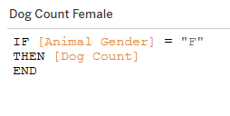
At a quick glance, it looks like I'm on the right track with trying to count the number of female dogs. But what is [Dog Count]?
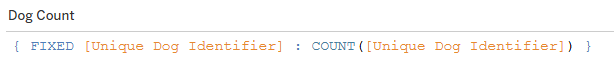
A disaster. What is this even saying?! For each unique dog, count the number of unique dogs. That doesn't make sense.
If I recreated this dashboard, I would revisit and optimize my calculations, and get rid of ones that don't make sense or are unnecessary.
- Color story
Feedback I received for the draft I submitted before my final version included a link to this helpful blog about telling a story with color: https://www.tableau.com/blog/3-storytelling-color-tips-improve-your-data-visualization. This referenced characters and plot, and I definitely improved my use of color from draft to final submission.
However, now I think of color differently.
In this dog project, I considered each question to be it's own plot, with it's own color story. I used subdued hues from every shade of the rainbow.
Instead, I could have considered choosing a color that highlights insights I want to call attention to – is something good, or is something bad – and used that color throughout.
Conclusion:
I might revisit this data set again during my time here at The Information Lab, and I'm certain my dashboard would tell a different story. I had gotten stumped on dates before, and now I feel much more comfortable with how Tableau deals with dates. But it is awesome to have this reference point to see how far I've come!