


I learned the hard way yesterday that translating Tableau Visuals to a new tool like Tableau Next needs to start with the questions we're trying to answer instead of trying to recreate the visuals. Different tools have different strengths, and trying to get caught up in recreating exactly one chart type from another might not be effective. The time to insight for one tool might be different from another based on what functionality is available.
Today, we're inspired by a Makeover Monday visual I created a few weeks ago in Tableau Public about use trends across demographics for various social media platforms.
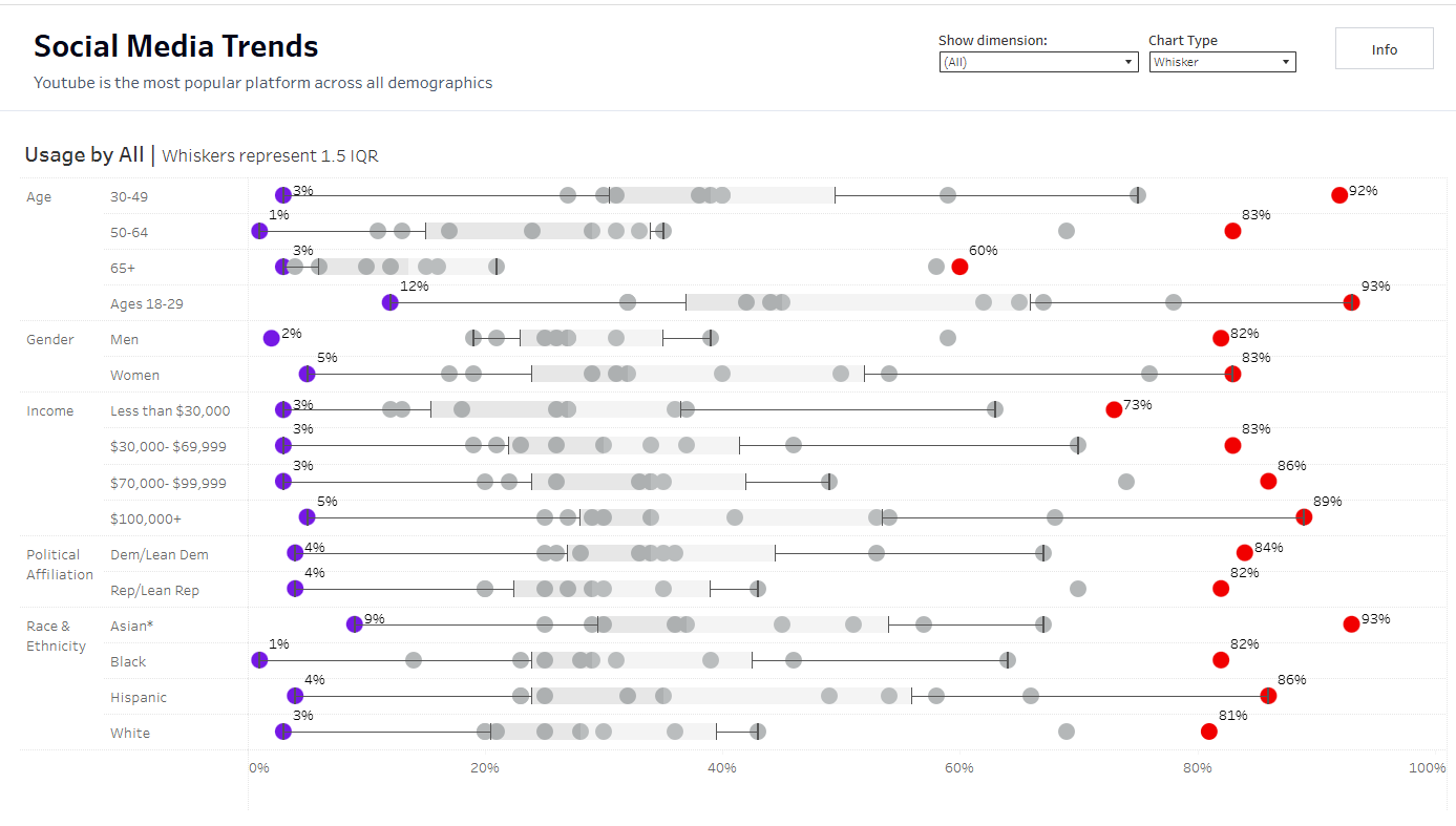
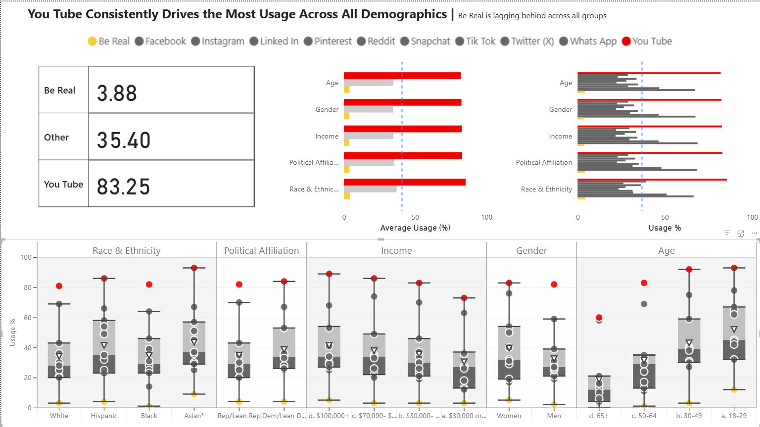
Across all demographics, YouTube was always the leader in usage, while BeReal always fell behind.
I chose the Box and Whisker plot here so that you can easily see that YouTube is always the farthest to the right, while BeReal is always the farthest to the left. But you also have that additional context as to how different the usage is between those two platforms, as well as how different from expected usage for that demographic each platform falls.
But maybe I've overcomplicated it (I'm sure I have). I get really excited about interactivity and parameters, and that's where a lot of my time went in creating this visual in less than 2 hours.
Alternatively, my colleague Gabriel Bryan used the same data set, had the same time constraint, and created a much simpler visual with a much quicker time to insight.
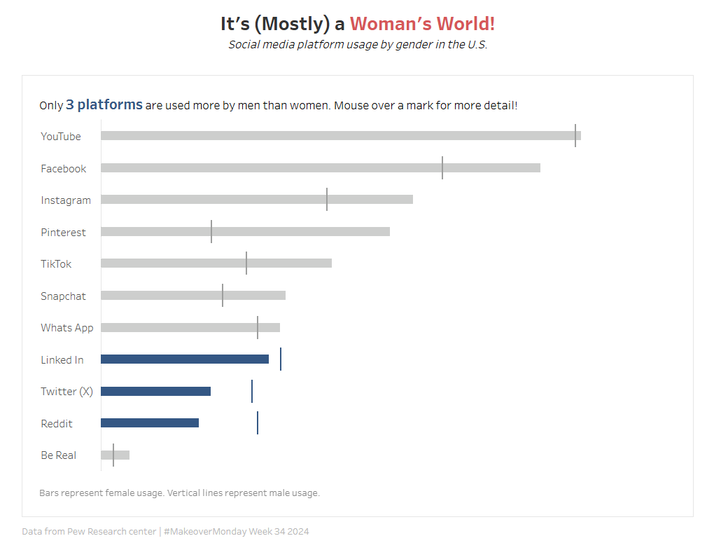
Other than the tooltip, this viz has no interactivity, but your attention is quickly drawn to the 3 platforms which have more male usage than female usage.
So if I'm trying to translate insights from this data set to Power BI, a tool I've never used before with different strengths, I might want to reconsider my questions.
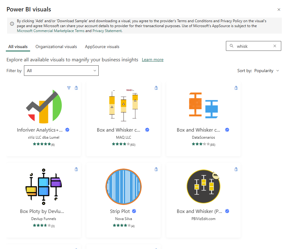
Turns out box and whisker plots are not native to Power BI. This visualization type must be downloaded separately, with one of the most recommended versions coming from MAQ Software.
Before I jump into adding a new visualization tool, however, I figured I would play with what already exists - the tried and true Bar Chart.
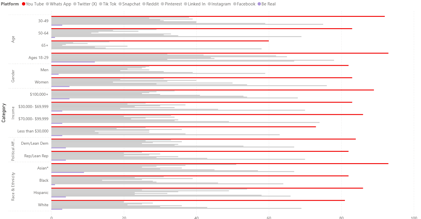
Sorting this bar chart by both dimension and percentage was not available from the visualization editor. Instead, you have to go to Power Query via Transform Data, then double sort according to this tip.
Re-coloring the legend was not as straightforward as in Tableau. In Tableau, If I want to only color the max, or min, or one specific platform, I can create a calculated field that decides if the platform is what I want to be coloring. I can drag that onto the marks card so that I can group multiple categories together to be colored the same based on that category.
Turns out, you don't even need a calculation to create a column in Power BI and Query.
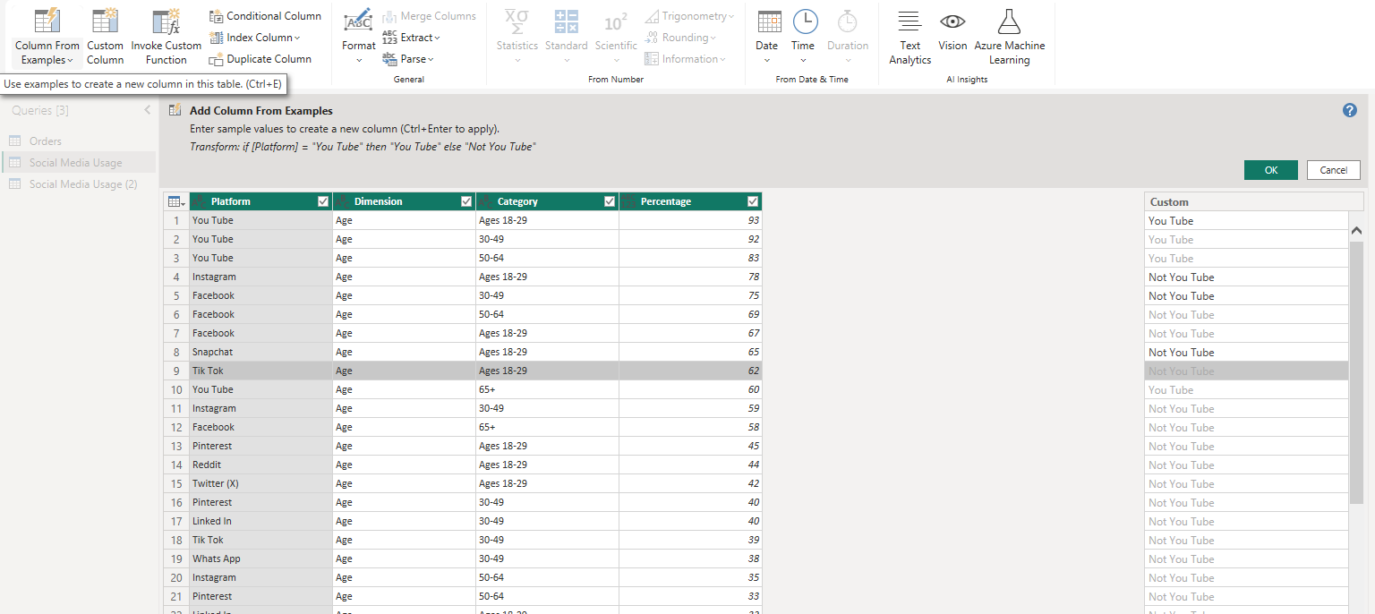
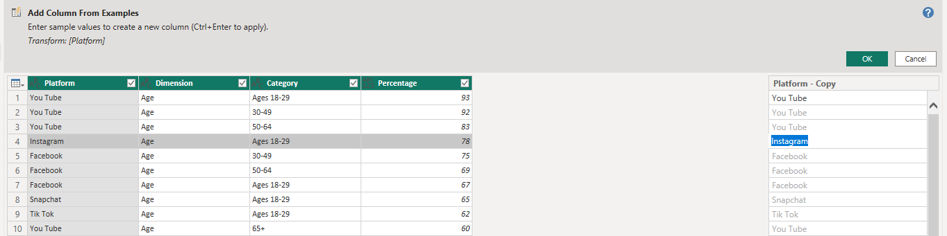
There's an option to create 'Column From Examples' which allows you to type in what you would prefer, based on another selected column. I typed 'You Tube' for the row that contained You Tube, and 'Not You Tube' for everything else. After two of three swithces for Instagram, Facebook, and Snapchat, Query understood the pattern and created the column to follow "IF [Platform] = 'You Tube' THEN [Platform] ELSE 'Not You Tube' END" if I were creating a calculated field in Tableau.
The complication came when I tried to add this to the legend. Turns out you can only have one column on Legend. Since Legend works similarly to the Details shelf in Tableau in that this will define the detail in the view, if I had my new column of only two values on Legend I would now not only have just two bars for each demographic.
Next, I tried to implement the Box Plot. This was fairly straightforward. I appreciate how the overall categories could segment the set of box and whiskers further broken down into subcategory on the bottom.
My final product implemented KPI cards, two bar charts, and box and whisker:
Ultimately, I would love to better understand interactivity in Power BI, but this is what I accomplished in a day of self-study.