


Day 3 of dashboard week, and today we were getting stuck into building apps in Alteyrx, working with tableau server and building a dashboard in Tableau.
Brief
Use the UK Streets Crime data to build an Alteryx App that allows the user to pick a specific date range, category and area (using a map interface tool) or postcode to update a data source onto our tableau server/your Power BI workspace (or tableau public using google sheets) to feed into a Tableau or Power BI dashboard.
Use case scenario:
- User runs the app
- Selects area of interest and timeframe
- Viz updates accordingly
Plan
My initial plan for the day was as follows:
- 9am-11:30am - download the data and create the app
- 11:30am-12:30pm - user stories and sketch
- 12:30pm-1:30pm - lunch
- 1:30pm-3:00pm - build dashboard
- 3:00-3:30pm - light touches and practice presentation
Creating the app
This part of the process took much longer than I anticipated, particularly due to this being my first time creating an app with a map interface tool, I ran into a few unforeseen obstacles. As a result, I decided to adjust my initial plan slightly by giving myself until 12:30pm to finish this.
After downloading all the files from the website, I began working on a workflow to bring all the files together and use interface tools to turn the workflow into an app that meets the criteria in the brief.
My final workflow/app can be seen below - don't worry, I'll break this down!
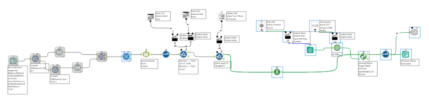
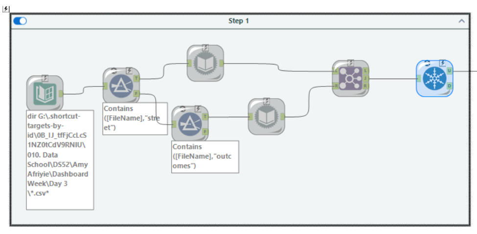
Step 1:
Since for each location and year there is a file for Street Crimes and a file for Crime Outcomes, both of which are slightly structured differently, step 1 of the workflow uses a Directory tool to bring in all the files from each of the folders they are saved in from the master/parent folder, and then applies a Filter tool to separate out all the files with 'street crime' in the title and 'outcomes' in the title.
I then used the Dynamic Input tools to pull in one of each 'Street Crime' and 'Crime Outcome' file and find the rest of the files within the sub folders of the master/parent folder from the Directory tool. After this I joined the Street Crimes files with the Outcomes files on the Crime ID field and removed duplicate Crime IDs from the data.
Step 2:
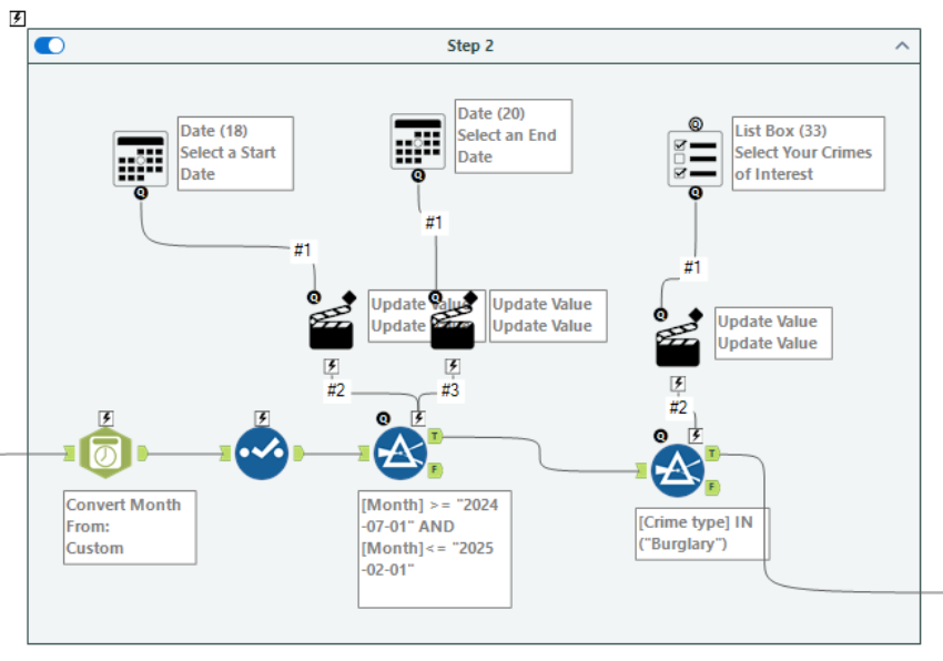
I went on to convert the Month field to a date, using the DateTime tool and used the Select tool get rid of the original Month field which was a string field.
I used two Filter tools, which I planned to connect the interface tools to allow the user to select a start date, end date and category of crime.
Filter 1 focused on filtering the data to a specific date range. I thought the calendar interface would be most appropriate to allow the user to select a start (from) date and an end (to) date.
Filter 2 uses the IN formula, instead of CONTAINS or IS, to allow the user to have more flexibility when it comes to selecting the number of crime categories of interest. Since I wanted to allow multiple selections for this, the List Box tool was most appropriate to achieve this.
Step 3:
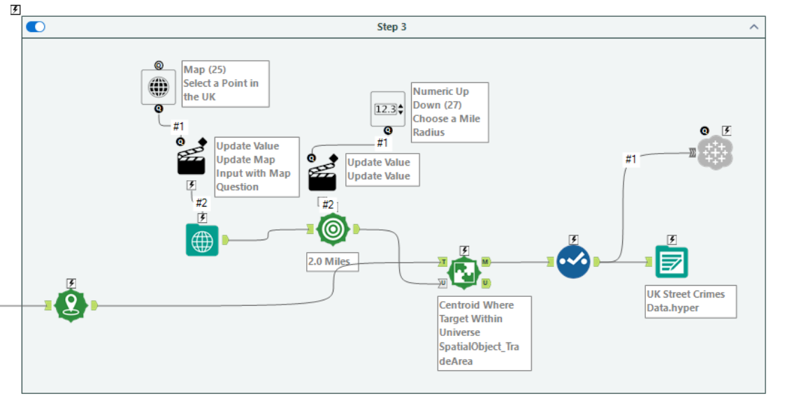
To create a spatial point for each of the longitude and latitude points for the Crime IDs, I used the Create Points tool.
The next stage was to allow the user to select a point on the map. For this, I used the Map Input tool and connected a Map tool from the interface folder to it, so that the selected point in the from the interface will update the selected point in the workflow.
After this I used the Trade Area tool to compute a 2 mile radius from the selected point. To allow the user to have autonomy over the distance from the selected point, I used the Numeric Up Down tool, setting a maximum of 50 miles and minimum of 2.
I went on to use the Spatial Match tool to identify all the longitude and latitudes points I created at the start of step 3 that were within the selected mile radius from the chosen point on the map.
I finished this step off with a Select tool to rename some of the fields.
When it came to outputting the data, since the brief requires the app to update the data source on tableau server OR Power BI workspace, I had to download the Tableau Output tool from Alteryx Marketplace. You can check out this useful blog post on how to configure it once downloaded.
User Stories and Sketching
Although I adjusted my plan and gave myself up until 12:30pm to build the app, I ran into further unforeseen issues when it came to outputting this to tableau server which ultimately ate into the time I had set aside for my user stories, sketching and dashboard building.
The User Story I decided to go with was:
As someone looking for an area to move to,
I want to know which area or areas are safest
I can identify which area has the lowest crime rate
By comparing the prevalence of different types of crimes in selected areas
My sketch I put together can be seen below.
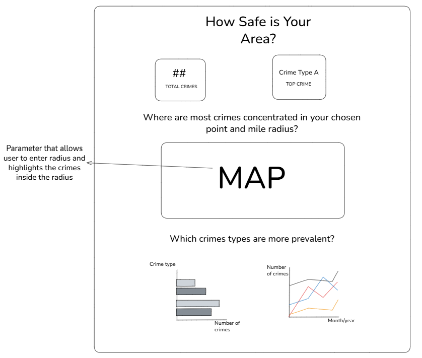
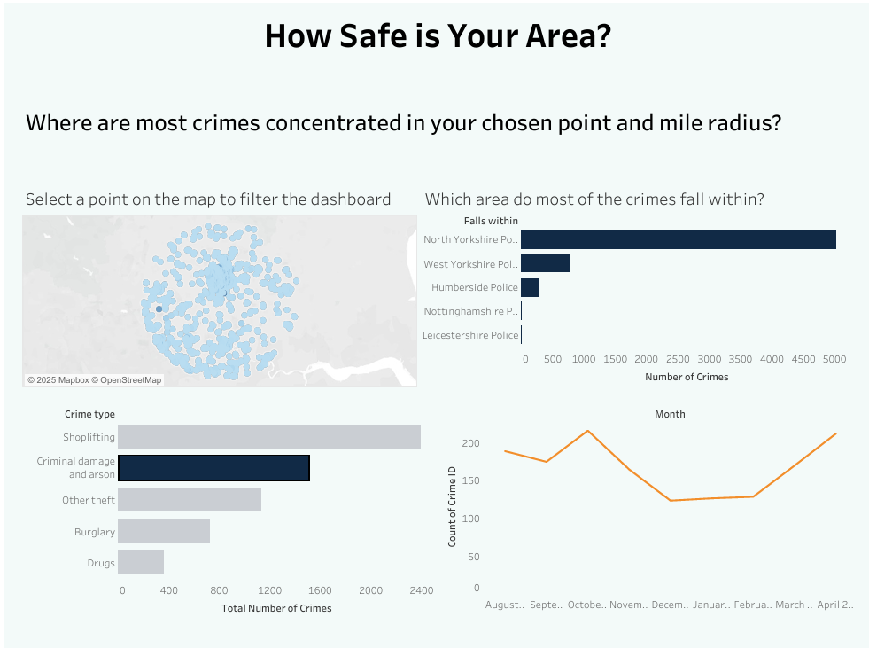
My Final Dashboard and App Interface
Below you can see the final dashboard I was able to create with the time I had left. Unfortunately, I wasn't able to add the feature where the user can enter the number of miles radius from the selected point on the map, which would have highlighted the crimes within the radius on the map a different colour.
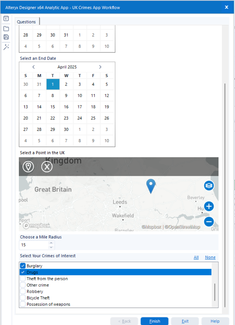
The prompts in my app interface from my alteryx workflow/app can be seen below. Every time a user changes the selection for start and end date, a point on the map, the mile radius, and the crime categories the dataset in the above dashboard will update once refreshed and show new data points - pretty cool!
Reflections and Takeaways
Overall, although intense due to the time constraints, this was a really cool project to do.
Upon reflection, when building my app I would have put the user selection for the start and end dates earlier at the start of the workflow, as although I cached part of the workflow so it could run quicker, the workflow can't cache when running the actual app, so it took a while to render the results.
Having the calendar interface allow the user to select the Start and End date, automatically shows the calendar month for the current month and year, which isn't relevant to the dataset and means the user has to skip through dates that are not relevant to the dataset. To work around this, I would have have kept the original Month field, which I removed once I created a date version with the DateTime tool, and used this to create a dropdown selection for the Start and End date.
Since the dataset includes fields of various outcome types, it would have been insightful to include this in my user story and dashboard.
Finally, creating my user stories and sketches before creating the app may have guided me with the app creation, and would have meant I wouldn't have been so rushed for time for this part of the project.