


For today's brief we had a bit more flexibility and options in our deliverables. Read below to see what it entailed.
Brief:
- Using the cleaned data
- Find a cool story in the data and create a dashboard
- Use any tool to clean/reshape the data
Plan:
Seemed like a simple and straight forward brief, nonetheless a plan is always imperative to success. My plan for the day was as follows:
9:00am-9:45am - explore the data
9:45am-10:45am - sketch and user stories
10:45am-11:00am break
11:00am-12:30pm - data prep
12:30pm-13:30pm - lunch
13:30pm-15:00pm - build dashboard
User Story and Sketch
Based on my feedback from Day 3 of dashboard week, I decided to focus on my user story and sketches before doing any data prep, to allow this to drive the direction of my data prep.
As someone who doesn't know the first thing when it comes to anime, I naturally decided to go down the route of creating something for someone like me who might want to get into watching anime. The user story I initially went with was:
As someone who doesn't watch Ainme,
I want to know which Ainme's are worth watching
I can identify the most popular Ainme's (and hence the ones I might enjoy most)
By comparing the ratings across genres and different types of Animes
Due to the size of the dataset, and not knowing anything about anime, this project quickly became quite overwhelming when deciding which fields to focus on and explore. I went through a lot of back and fourth with my user story and the direction to take this project - this took up a lot of time.
Data Prep
I decided to create a data dictionary for one of the datasets to help me better understand the data, and get more of an insight into the data profile of the fields. From here I decided to narrow the scope to focus on looking at the Anime data specifically for TV shows.
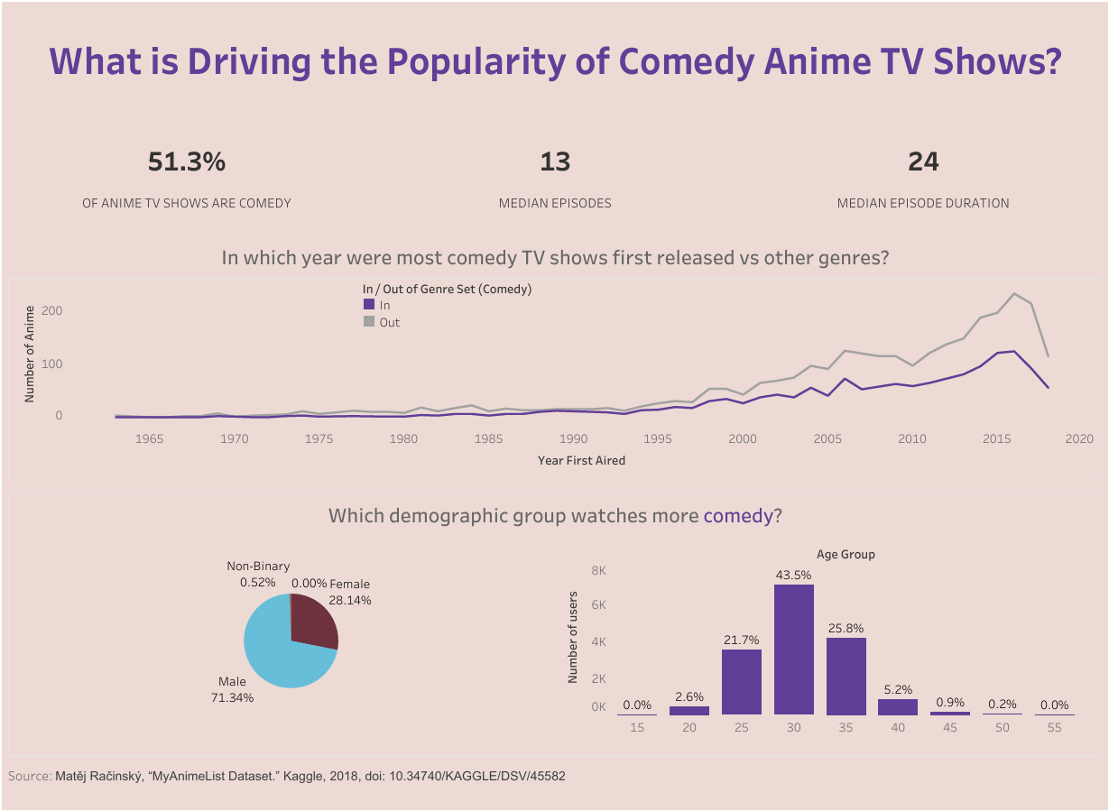
Comedy appeared to be the most popular genre in the dataset, so I decided to change my user story into looking at why Comedy anime TV shows are more popular compared to other genres.
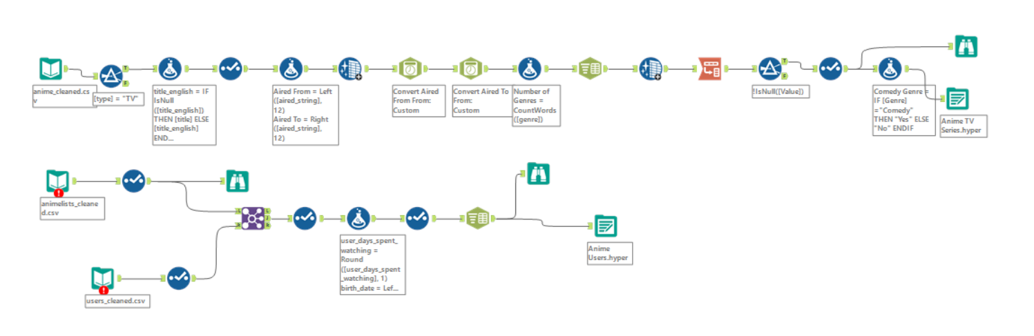
I opted to do my data prep in Alteryx, I filtered the data to keep TV shows only and began tidying up some of the other fields so I could use it for my analysis e.g. sorting out date fields, splitting out the genre field (as it had multiple genres in each row) and pivoting the data. My full workflow can be seen below.
My Final Dashboard
Given my indecisiveness when it came to my user story, sketch and the direction I wanted to take this project in, I found myself pressed for time when it came to building my dashboard. However, I had a general idea of things I wanted to include.
You can see my final dashboard below. Although short for time, I would have liked to include some charts to compare the average number of episodes and average episode duration in comedy anime TV shows vs other genres and whether we see the same demographic split in viewers for this.
Reflections and Takeaways
Indecisiveness was my biggest enemy today, but understandable given the size of the dataset, the limitless directions available to take the project and also my limited knowledge of Anime.
Upon reflection, I would've stuck to my initial user story, as I think I could've found some cool insights with this, and narrowed the data e.g. maybe only looking at specific fields or data from users of a similar demographic as me etc, so that it wouldn't have been so overwhelming.
Looking forward to what the final day of Dashboard Week entails!