We've reached the final day of dashboard week!
Read below to see what today's task involved.
Brief
Pick one (or multiple) API’s from of your choice NASAs API list, to pull your data from and use to build a Tableau, Power BI workbook or Alteryx App that outputs interactive charts and reports.
Plan
My initial plan for the day can be seen below. Given the mistake I made yesterday with my indecisiveness, I was determined not to allow that to trip me up again today!
9:00am - 9:30am - choose an API
9:30am - 10:20am - data prep
10:20am-10:30am - break
10:30am - 11:30am - user stories and sketch
11:30am-12:30am - build dashboard
12:30-13:30 - lunch
13:30-15:00 - continue building dashboard
I can happily say that, I stuck to my guns and gave myself 30 minutes to choose an API. Whether I understood what it was, or not, I wasn't changing it!
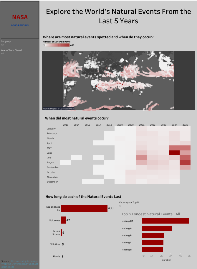
The API I chose was the EONET (Earth Observatory Natural Event Tracker) API - looking at natural events that have happened across the world.
Data Prep
I did my data prep in Alteryx, using a combination of Download and JSON Parse tools, amongst a few other tools . My full workflow can be seen below.
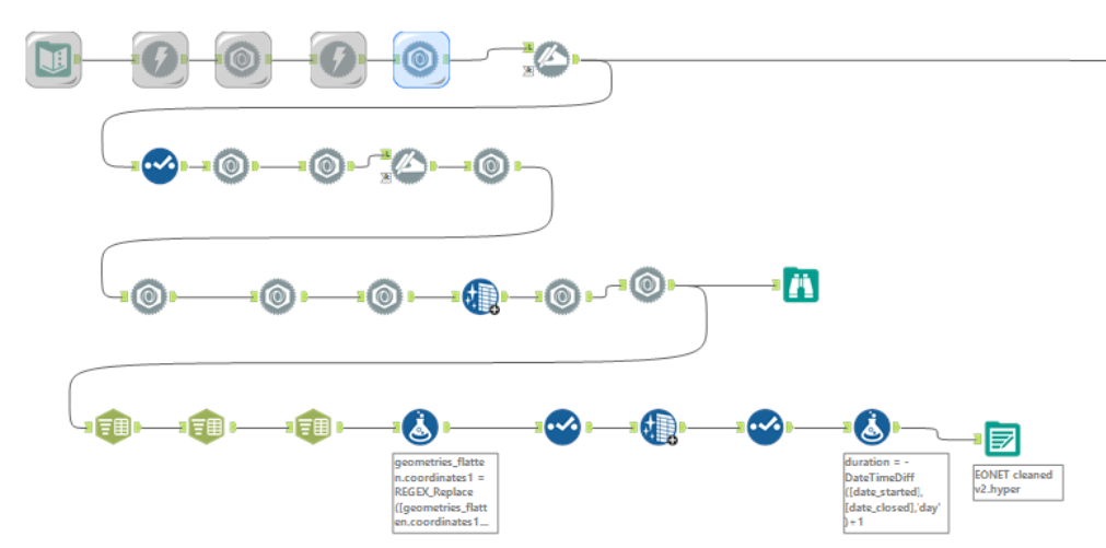
When bringing the API into Alteryx, I used one of the URLs provided in the documentation to get a better understanding of the layout of the dataset and whether I wanted to filter out any fields in the API URL.
After doing this, I decided to focus on all categories of natural events from all sources in the past 5 years. The URL I used for this was https://eonet.gsfc.nasa.gov/api/v2.1/events?days=1825&status=closed.
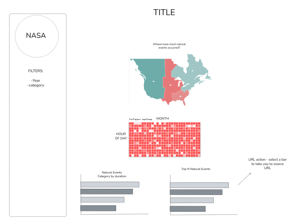
Dashboard Sketch
After exploring the data, I noticed it was quite limited in terms of the number of fields - however I was able to pull the longitude and latitude points for each natural event so I knew I definitely wanted to include a map visualisation, along with making use of the date fields.
Based on the above, I put together the below sketch for my dashboard.
Final Dashboard
I opted to do my dashboard for this project in tableau. To enable user interactivity, I enabled the filters for category and year to be applicable to all charts in the dashboard, including the map. I also enabled the bars in the chart showing the median duration of each category of natual events to filter the bars in the Top N natural events bar chart.