


Conditional formatting in Power BI visualisations is a powerful way to apply pre-attentive attributes—visual cues like color, size, and position. Leveraging these, enables you to significantly enhance the user experience, making it easier for viewers to spot trends, outliers, and key insights at a glance.
There are multiple ways to implement conditional formatting in charts, all of which can vary depending on the chart type and the message you want to convey. In this post, we’ll explore how to go about applying conditional formatting to a number of Power BI visualisations.
- Creating a Colour Legend
This is a good option when you want to colour a chart based on a categorical field.
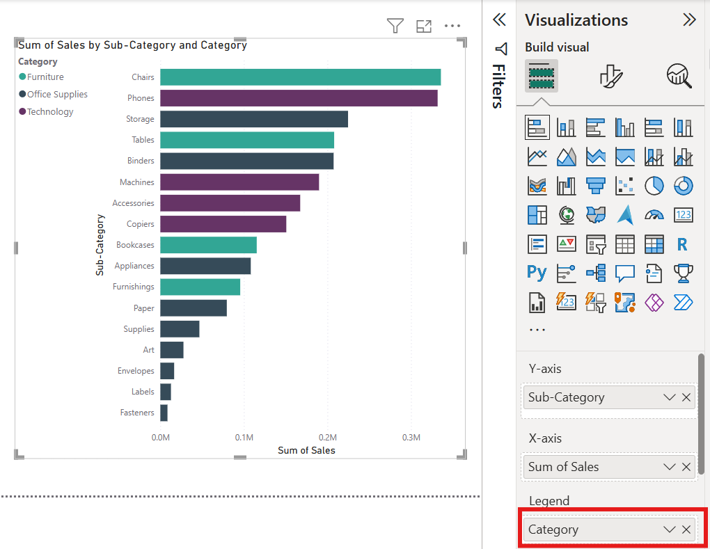
Using the sample superstore dataset, a basic bar chart you could create might look at the the total number of sales in each sub-category. To add an additional layer of context and granularity, we can colour code the bars based on the category that each sub-category falls under.
To do this, you would need to do drag the field you want to use for the colour legend from the data pane (in this example it would be category). This automatically colour codes the bars based on the category that each sub-category falls under as well as adding a colour legend, which can be formatted under 'format visualisation' tab in the Visualizations pane.
- Creating a Rule
This is great for when you want to colour or highlight something specific in a chart, e.g. values that are above the average.
Creating a clustered bar chart, that shows the total sales for each segment, allows us to add a reference line for the average sales in the 'analytics' tab of the 'Visualizations' pane.
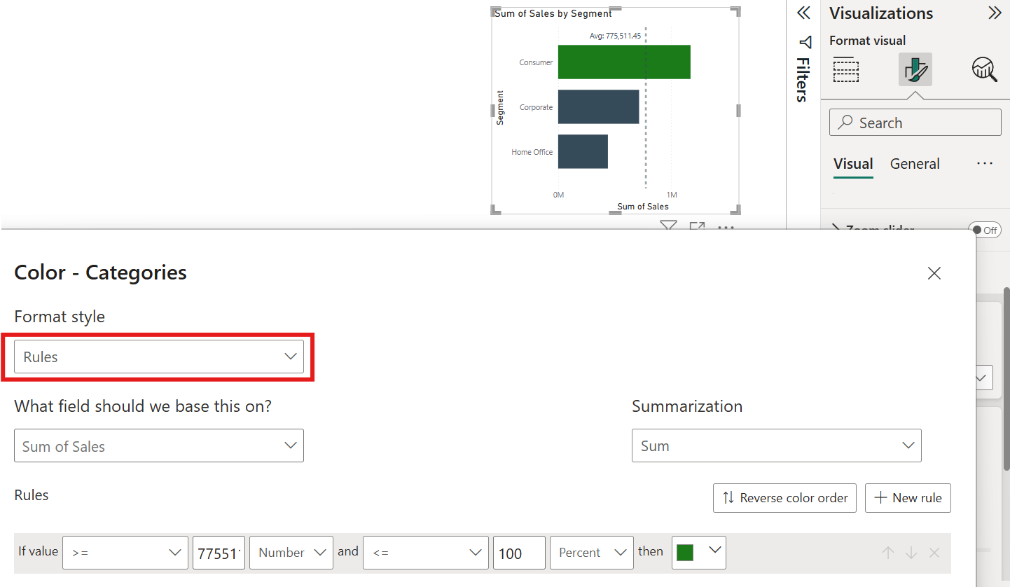
To change the colours of the segments that had sales above the average, we need to go to the 'Visualizations' pane > 'format visual' > bars > colour > then select the 'fx' button. This enables us to colour the bars based on a specified condition.
Select 'Rules' for format style and 'Sum of Sales' for the field, as this is what the chart is based on. We can see the value of the average sales from the label on the average line, so we input this into the condition and select number. The second part of the condition is "<= 100 %", as we want to highlight values that are above the average sales amount but less than 100% of the sales in the dataset. You can then go ahead and choose the colour you want.
- Gradients
These are a great pre-attentive attribute choice for visualisations, where you want to add visual depth and highlight variations in the values in a dataset.
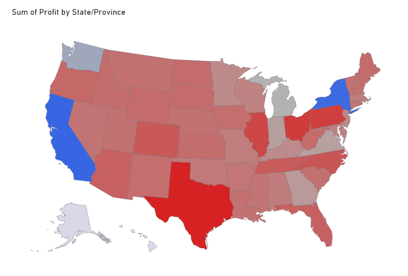
We can create a map showing the total profit per state (again using the sample superstore dataset). After selecting the map choice (in this example I've opted for the Shape Map), add the profit field from the data pane to the tooltips shelf in the 'Visualizations' tab. We do this instead of adding it to the colour saturation shelf, as this option only uses the saturation of a single chosen colour to indicate the amount of profit in each state instead of a gradient.
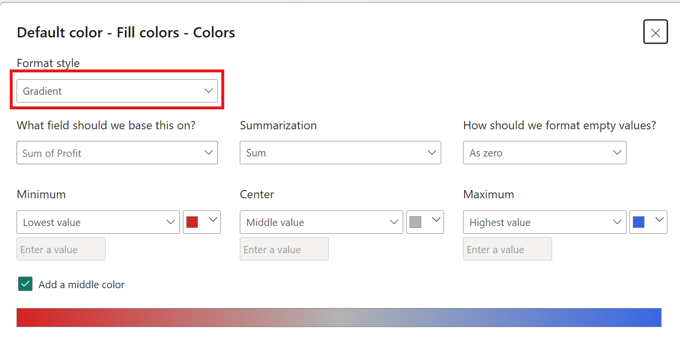
Next, go to 'format visual'> fill colours > then select the 'fx' button. Ensure 'Gradient' is selected for the format style, and 'Sum of Sales' for the field. We can then select a colour for minimum values and another colour for maximum values, as well as optionally selecting a colour for the middle value.
Now that we’ve walked through how to apply conditional formatting to different chart types in Power BI, hopefully this has shown you how versatile and powerful conditional formatting can be.
Each chart offers unique opportunities to guide your audience’s attention and reinforce the story behind your data. Whether it’s using color to highlight a bar chart and add granularity, or gradients to map the max, min and midpoints in the data, as we've gone through above, these techniques are simple but impactful in transforming static visuals into interactive, insight-driven tools.