


If you have had the chance to read a bit about me in my bio (you can check my bio here if not), you would know that outside of work I am a director of an events company alongside two of my friends from university.
Currently we don't do any type of data collection when we get enquiries and confirmed bookings - shocking I know, however this is something we have discussed many times. Through the many client projects I have taken part in, I've come to see how valuable data collection and visualisation can be to be any business, particularly when it comes to developing and creating business strategies.
When I think about my events company and the potential strategies that could be derived, it would be good to know which types of events we get bookings for more frequently and which types of events have a higher profit ratio so we know which event types to push more on social media, offer promotions for etc to boost our profitability. Of course as a business owner sometimes you feel you may already know the answer, due to being so involved in your business and the numbers day-to-day, but it's much better to what you believe backed up (or not) by the data so that any decisions or strategies that are put into place are data driven.
Data Collection
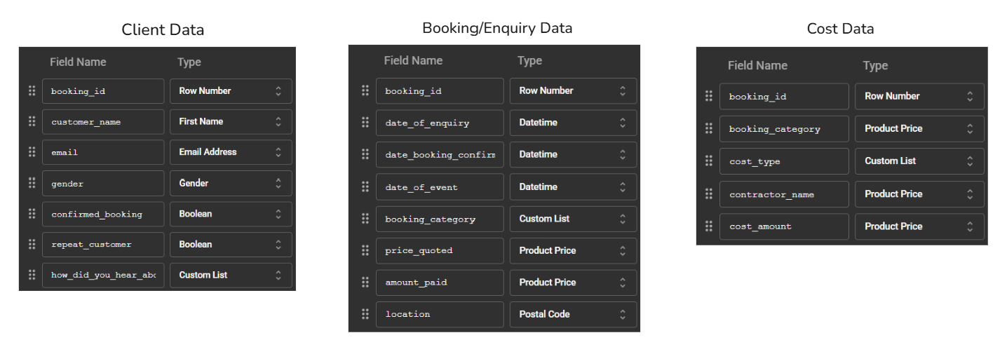
Since we don't currently collect any of our data from enquiries, I have made a list of all the things that would both be good to collect to generate some useful insights, and can be collected based on the information we get from enquiries.
All of our enquiries come through social media direct messages or email so unfortunately we don't have the luxury of automating the data collection process through web scraping or API calls as an option. We would hence need to manually document the information from enquiries to create a dataset.
For the purpose of this project however, I have decided to use mock data to create three different datasets - all of which I know are things that can be collected from the enquiries we receive. Since this is mock data, I will need to decide how the data will be weighted and structured to allow for valuable insights. I may also need to create an alteryx workflow to join the datasets together, or decide whether it would be better to use a relationship between the datasets.
Insights and User Stories
If there's one thing I've learnt during my time of training is that behind every great dashboard is a great user story (or two)!
Below are some useful insights that I believe would be beneficial to see on the dashboard.
- Number of bookings in a given month - bookings & sales over time
- Average profit from each booking type
- Profit ratio by booking type
- Breakdown of cost type - cost of goods for bookings, transportation, admin costs, fines etc
- How many enquiries translate into bookings
From the above insights, I have created the following user stories:
User Story 1
As a director of an events company
I want to know how my organisation is performing.
I can find out how profitable my company is
By comparing the profit ratio for each booking type to the number of bookings for each booking type
User Story 2
As a director of an events company
I want to know how best to organise and prepare for bookings ahead of time.
I can find out if there is any seasonality in bookings
By comparing the number of bookings per event type over time to identify trends
User Story 3
As a director of an events company
I want to know which type of events to push on social media
I can find out which event types are more popular
By comparing the total number of enquiries to the total number of confirmed bookings for each event type over time
These user stories and insights all tie back up to the key actions we want to make from the dashboard - knowing which event types to push more on social media, offer promotions for etc to boost profitability.
Next Steps
Now that I have brainstormed the data I would like to collect and paired this with some user stories and key insights for the dashboard. The next steps for this project is to decide how I want the data to be weighted to allow for valuable insights.
I will then need to do a sketch of the various charts that can be created for each user story and put this in a dashboard, thinking about the layout, colours and flow of the story I want to be told from the dashboard.
As part of this project, we have been encouraged to maximise our outputs, i.e. not just creating a visualisation. For this reason, I am challenging myself to build some cool charts that I haven't yet built in tableau as part of this dashboard (where it is appropriate to do so). A particular chart of interest at this current stage is a sunburst chart. I will continue to brainstorm through my dashboard sketches and identify any opportunities to include this and any other cool charts, which I will then be able to do a detailed blog tutorial on how I created them.
Stay posted for an update on my progress!