Day 3 of Refresher Week and today we were revisiting Stats. I was definitely dreading this session because it's been over 10 weeks since we last did any stats, and over 10 years since I did any stats before that!
From statistical distributions, linear regression, z-scores and more, we covered a lot of material and also looked at creating statistical charts in tableau, as well as working with the predictive tools in Alteryx. This post is evidence that I survived the session, but most importantly I thoroughly enjoyed the refresher! 🥳
This blog post will go into detail on calculating the R Value of a trend line on a scatter plot, specifically in tableau, showing you a top tip when aggregating your data.
For this specific exercise, we were working with a dataset about penguins which had fields for the species type, region, culmen length and depth, flipper length and body mass. We created a basic scatterplot to show the correlation between the flipper length and body mass for each Penguin ID, seen below.
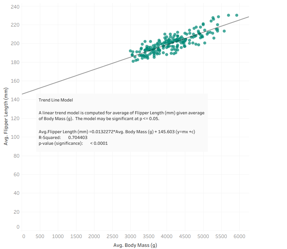
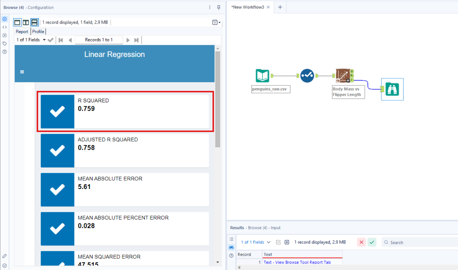
From the details of the trend line, we can see that the R value is 0.704 (3.d.p). However, when we did a similar exercise in Alteryx to test the correlation between flipper length and body mass, we noticed the R value was slightly higher (as shown below).
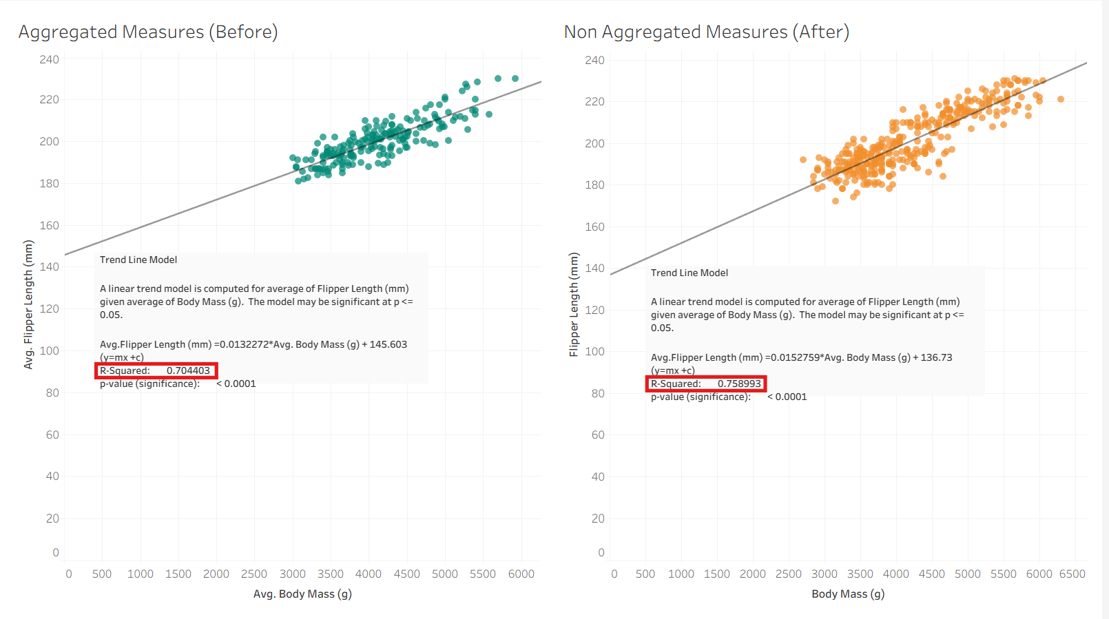
This is when we noticed that the R Value of the correlation in Alteryx had been calculated based on each row of data, whereas in Tableau since we has Penguin ID on details for the scatterplot, it had calculated based on each Penguin ID. This meant that the Penguin ID field was not a unique filed - i.e. there were multiple records for each Penguin ID - due to the data for each penguin being recorded for each year and this had hence been aggregated for each individual Penguin ID.
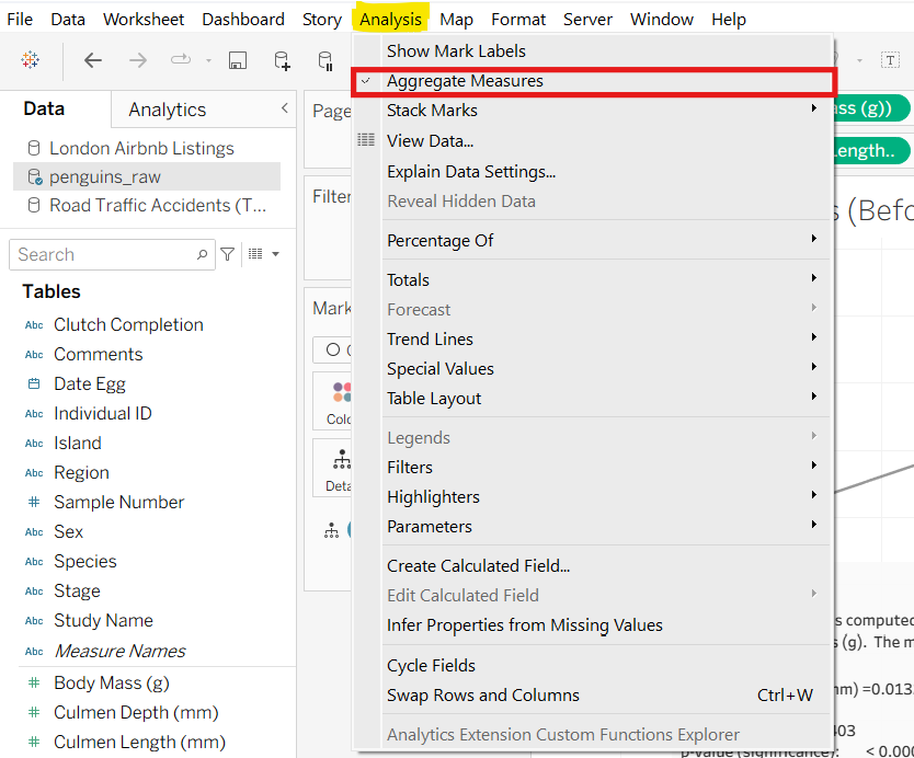
This is where the top tip comes in! To stop tableau from aggregating the records in a view based on what the dimensions and measures selected, i.e. to show all records in your data at a row level, go to Analysis on the bar at the top and untick Aggregate Measures.
Below you can see the results of both options side by side. Aggregating the data points results in more marks in the visualisation and a higher R Value, which is more accurate as it represents the correlation between flipper length and body mass of each penguin in each year/at each age.