I am currently halfway through my second week of training here at the Data School, where our sessions have focused on understanding different mark types, visualisation best practices, and getting to grips with the Tableau Desktop interface.
Some of the material we've covered has actually felt relatively familiar. That’s because, the application process is centered around using a Tableau dashboard to tell a story from a dataset — so in a way, we’ve had some early exposure. Still, being taught by some of the best in the game has taken things to a whole new level. We’ve covered a lot: from pre-attentive attributes and effective chart choices, to using containers wisely and structuring dashboards with purpose.
Much like preparing your data, the key to building an effective dashboard lies in planning and sketching. This early step helps you visualise your final product before jumping into Tableau Desktop. Without a clear plan, it’s easy to end up with a dashboard that feels cluttered and chaotic — especially when you’ve got a head full of graphs and charts you’re eager to include.
From a consultant's point of view, dashboard sketches are a valuable communication tool for sharing your ideas with clients and stakeholders. They’re useful for two key reasons:
- They help set clear expectations – The sketch acts as a visual agreement of what your client can expect, helping you manage their expectations early on.
- They help you work smart, not hard – Imagine spending hours creating a detailed, beautiful dashboard, only to hear the day before the deadline (the first time the client sees your work) that it's not what they had in mind and doesn't answer their questions...heartbreaking, right?
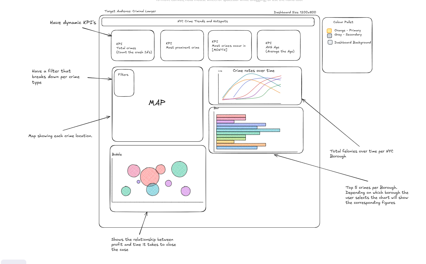
The more detailed your dashboard sketch is, the easier the build process becomes. This includes everything from layout and chart types to colour schemes and the key insights you want to highlight. Here are some useful elements to include in your sketch:
- KPIs/BANs (Big Ass Numbers) you plan to show
- Including the context in the KPIs and BANs if needed, i.e. not just $Profit but $Profit vs Budget or vs Prior Year
- Titles for each section or chart
- Chart types you plan to use
- Filters you may include for user interactivity
- How you'll highlight insights and draw the viewer's attention to key findings and the story you want to tell
There are a number of free tools online to help you sketch dashboards digitally. One of my personal favourites is Excalidraw. Here's an example of a sketch I created using Excalidraw for a dashboard analysing crime trends across NYC:

