


On the second day of Dashboard Week, my challenge was to redesign a dashboard based on TIL’s financial data with accessibility as the core focus. Specifically, the task was to tailor the dashboard for a user who navigates entirely using a keyboard.
In the morning session, we were introduced to several important principles for designing accessible dashboards:
Perceivable:
- Provide text alternatives for non-text content
- Always include alt text on images and buttons
Navigable:
- Ensure users can navigate efficiently without a mouse
- Define a logical tab order
- Allow users to tab through elements
- Use descriptive titles for context that can be read aloud
Adaptable:
- Consider users accessing the dashboard on:
- Mobile or tablets
- Printed versions
- Label legends clearly
- Design for different screen orientations and scaling
Distinguishable:
- Prioritize clarity and ease of interpretation
- Avoid overlapping shapes on lines
- Use colour-blind friendly palettes (beyond just red and green)
- Ensure sufficient contrast
- 4.5:1 for standard text, 3:1 for large text
- Use legible fonts and avoid visually misleading characters
While all these considerations are vital to try and achieve as close to a universal design as possible design, I found that making the dashboard highly navigable with only a keyboard would be the big challenge for this specific scenario.
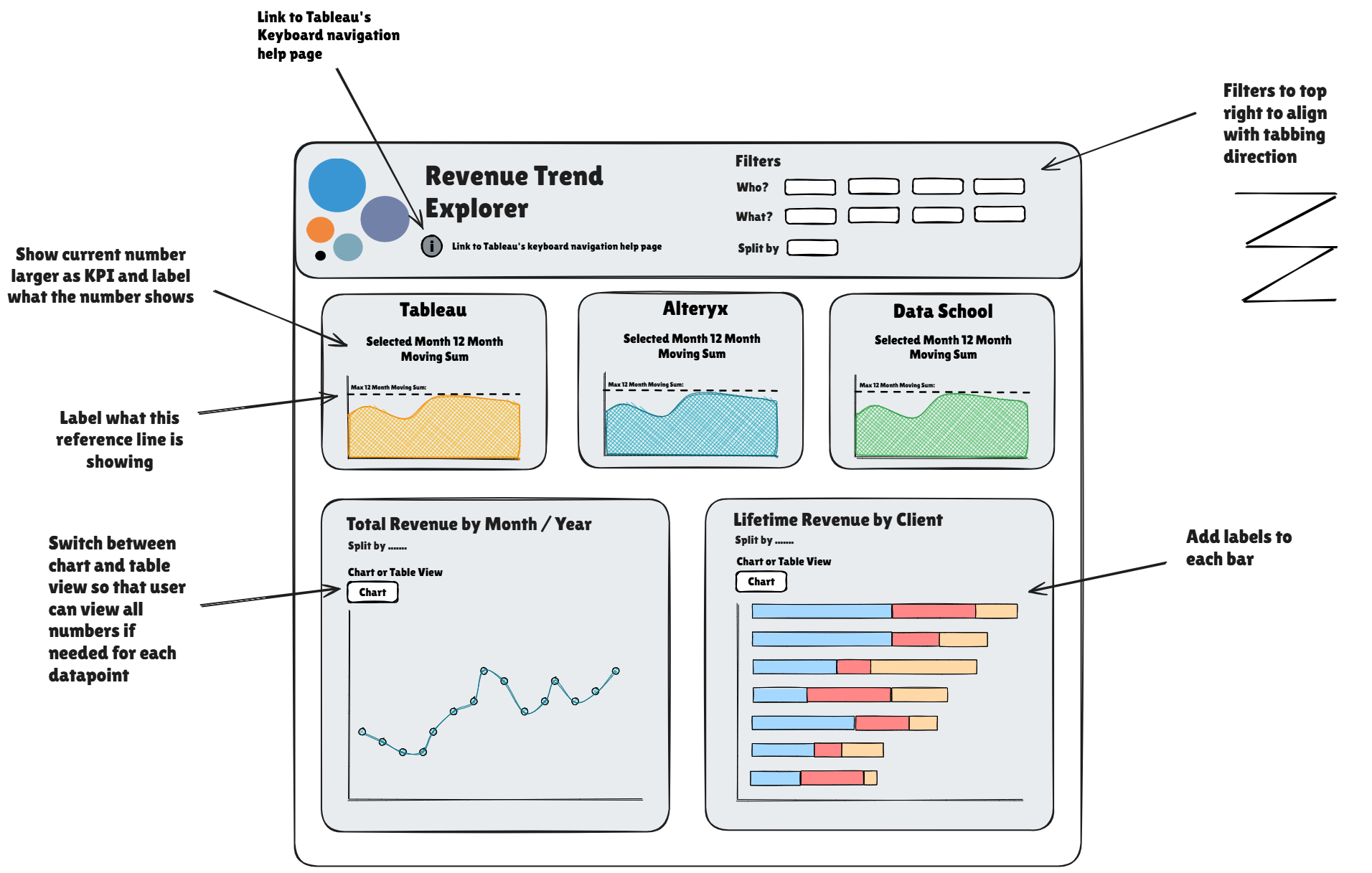
To begin, I reviewed the original dashboard and explored Tableau’s keyboard accessibility resources (https://help.tableau.com/current/pro/desktop/en-gb/access_keyboard_navigation.htm). My aim was to understand the user experience first-hand. I tried adding the Tableau article link directly to the dashboard as a text box, but quickly realized it wasn’t accessible via tabbing. A button linking to the URL would have maybe been more effective.
I also discovered that a Z-pattern navigation flow (left to right, top to bottom) would improve the user experience. However, implementing this was far more complex than I anticipated. I struggled to edit the workbook XML to control the tab order of dashboard elements, and ran into more issues when trying to add the sheets and filters one by one in the desired sequence. This exercise opened my eyes to just how technical accessibility design can be — it requires precision, testing, and deeper understanding than expected.
I attempted to make key dashboard elements stand out — such as KPIs, reference lines, and labels — since the user wouldn't be able to use tooltips. Unfortunately, due to time constraints and the challenges of tab order, I didn’t get to fully implement these improvements. I did retain the original colour palette (as it seemed to be colour-blind friendly), but in hindsight, I should have verified its contrast ratio to ensure compliance.
I finally decided to include a parameter for the bottom two charts on the dashboard to allow the user to view them in table format as well as the chart view, making it easier to view the overall trends visually and also inspect the exact values when needed as they would not have access to tool tips on charts and adding labels to all points could clutter the view.
Summary
This was a really tough challenge that pushed me outside my comfort zone. I underestimated how much technical consideration goes into designing for accessibility, especially around keyboard navigation. Despite the difficulties, the experience has completely reshaped how I think about accessible design and has made me much more aware of the importance of inclusive practices in dashboard development.