


This project was all about the importance of making dashboards accessible. Chloe, from the Mayor’s Office, wanted a dashboard to help promote inclusive tourism in London. A key part of the brief was that Chloe had dyslexia and dyscalculia, and explained how most dashboards feel unusable, too many numbers, icons, or colours that all blur together. My task was to flip that around and design something simple and approachable.
The Brief
The challenge was to use the London Tourist Attraction Accessibility dataset (things like access features and booking policies at attractions) and turn it into a dashboard. The key points were:
- Keep things consistent so she doesn’t have to re-learn how to use it.
- Use plain English and clear instructions instead of relying on symbols.
- Make sure it’s easy to navigate whether she’s using a mouse or keyboard.
- Show scores and rankings in a visual way, not buried in percentages.
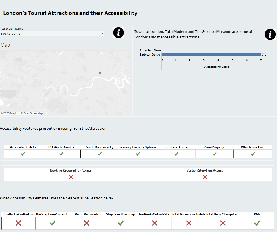
What I Built
The main filter is on Tourist Attraction itself, pick one and everything else updates. A map helps show where the attraction is, and then I created an accessibility score that adds up the features. To make it really clear, I used ticks, crosses, and half-marks to show whether a feature is fully there, partially there, or missing.
I also added the same scoring system for the nearest tube station, because getting to an attraction is just as important as what’s there when you arrive. To help with clarity, I included information buttons that explain how the scores work so Chloe isn’t left guessing.
The Outcome
The final dashboard feels much cleaner and easier to digest. Chloe can:
- See an overall score at a glance.
- Understand accessibility through simple symbols instead of complex numbers.
- Navigate with confidence because everything’s consistent and instructions are always there when needed.
What I Learned
Choosing colours was tough because I wasn't sure what Chloe’s struggles with colour perception were. Formatting the headers for multiple accessibility features was another headache, and I still need to tidy up my scoring system to make sure it adds up perfectly.
But those challenges were useful reminders: accessibility isn’t a one-and-done thing. It’s about testing, learning, and adjusting.