


For day 2 of dashboard week we have been looking at metadata around body mounted camera usage by police officers in New Orleans. The data contains the locations, times and duration of the creation of footage.
I decided fairly quickly that the route I would like to go down would be to see whether police officers elect to use bodycam footage less frequently in poorer areas or in areas with a larger non-white population. With the many cases of police brutality towards black people recently, the high crime levels in New Orleans as well as a high black population I was interested to see whether there was clear prejudice in the number of camera activation in minority areas or a shorter duration of footage (indicating that the camera may have been shut off intentionally).
I looked for some census data for New Orleans; unfortunately the latest data available I could find was from 2010, but I have made the assumption that while numbers may have changed, the percentage makeup of the population is less likely to have drastically shifted. Although the areas in which different ethnic groups live may well have changed. The data was detailed, even going down into Parish and city block levels; due to the size of the police bodycam data set I decided to aggregate up to the level of police district.
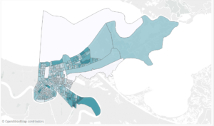
I had to resort to Alteryx (against Andy’s guidelines) so that I could use the spatial tools to find out which Parishes/Blocks were in which police districts.
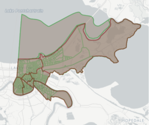
From there I aggregated the population and housing data up to the level of the district and exported. I joined to the police body camera data in Tableau and began my analysis.
I decided that I wanted to first visualise the police districts by their percent non-white population, to initially separate out areas where I expected there to be suspicious behaviour. I chose to colour the districts by whether they were majority white ethnically or majority non-white; I would stick with this colour scheme throughout the rest of the visual. I used a Mapbox map for my background.
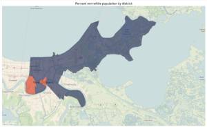
I used this to highlight the other charts in the dashboard, which represent the median duration of footage in each district, the number of recordings per 100,000 citizens in each district and the 30 day moving average of recordings per district.
Compared to yesterday, today’s data was much cleaner and easier to begin working on, but the space for choosing personal direction could have been time consuming. I’m glad I settled on a topic relatively quickly, however I did spend a long time trying to get my data to be as granular as possible, going down to the Parish and block levels of detail contained in the census data. It would have been great to be able to see the number of police recordings block by block visualised against the demographic data but that simply made the data set too large for a spatial file (the limit is 2GB and mine got to over 8GB fairly quickly).
Given more time I would probably add in some research about the absolute number of crimes committed in different parts of New Orleans, to see if a particular area that experiences high arrests also has lower levels of recordings, or recordings are shorter. This could then be tied in with news articles on notable cases of police brutality in those areas, if present.