


At the end of week two, DS 37 was asked to rebuild one of our application viz using what we have learnt this week from Data Visualisation best practice along with new calculations and charting techniques.
I knew, even before opening my Tableau Public profile, that I would like to remake my first application viz that was inspired by data collected by journalists from The Washington Post about unsolved murder cases in the USA. Gladly enough, I remembered feedback given by Carl Allchin during my first interview, so that was a good start.
- Misleading map
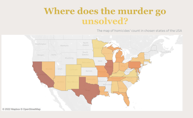
Despite the fact that the map has its own title, the choice of colour and closeness to the main title indicates that this map showcases states and their statistics regarding unsolved murder cases. And it doesn't, it's just the total count of homicides across states considered in the data source.
2. Lots of going on...
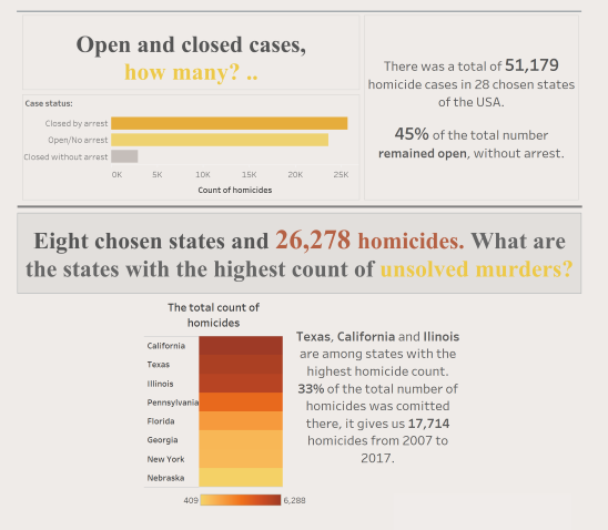
After having a fresh look this morning, the first thing I thought was that my dashboard was overwhelming. Lots of colours indicating different things, different fonts, everything was crowded, packed next to each other. Simply too much.
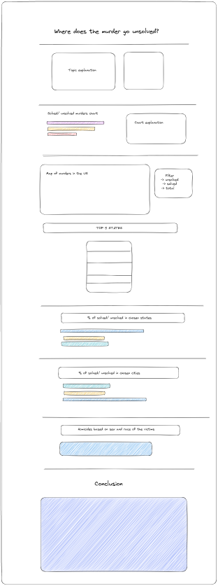
The first thing I did, I drew very simple sketch that helped me to place and restructure all the elements that I wanted to keep in my dashboard. I believe that this part, was the most important one.
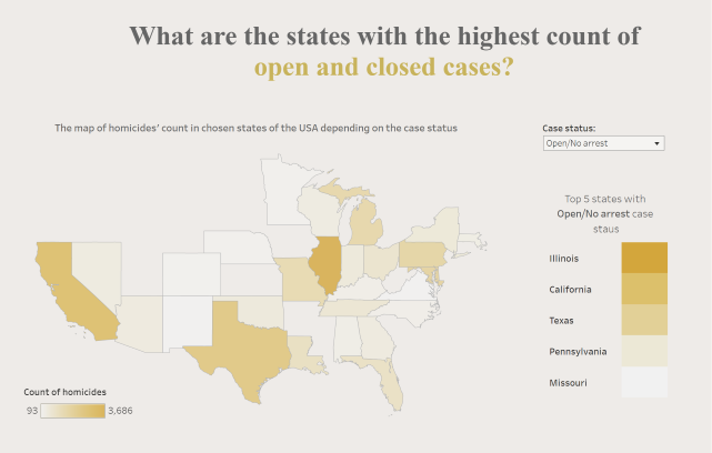
The next biggest change that I made today was the US map, that I made it more interactive. Now, we can filter it depending on the case status and the map updates accordingly. On the right hand side there is a chart showcasing the top 5 states according to the chosen filter.
The final feedback
The final feedback was that I should work more on keeping the same types of fonts across my dashboard, especially that my presentation contains some text explaining the insights from the charts. And that would help to give more flow to my presentation.
The last thing that I would like to do, and I didn't manage to, is to showcase how the unsolved homicide count varies depending on the US average murder ratio and population of different states. I put some explanation within my presentation, however there are no graphs showing that.
If you are interested how my final viz looks like, check it out.